
A living room tour only earns its keeps once you accept that every decision starts with a mistake. My north-facing wall turned a sophisticated sage into dentist-office mint, and that misfire became the anchor for every color that followed: warmer brass, amber wood, an off-white sofa that fought the first one. I now paint a two-foot square and live with it three days before I commit.
Color Schemes
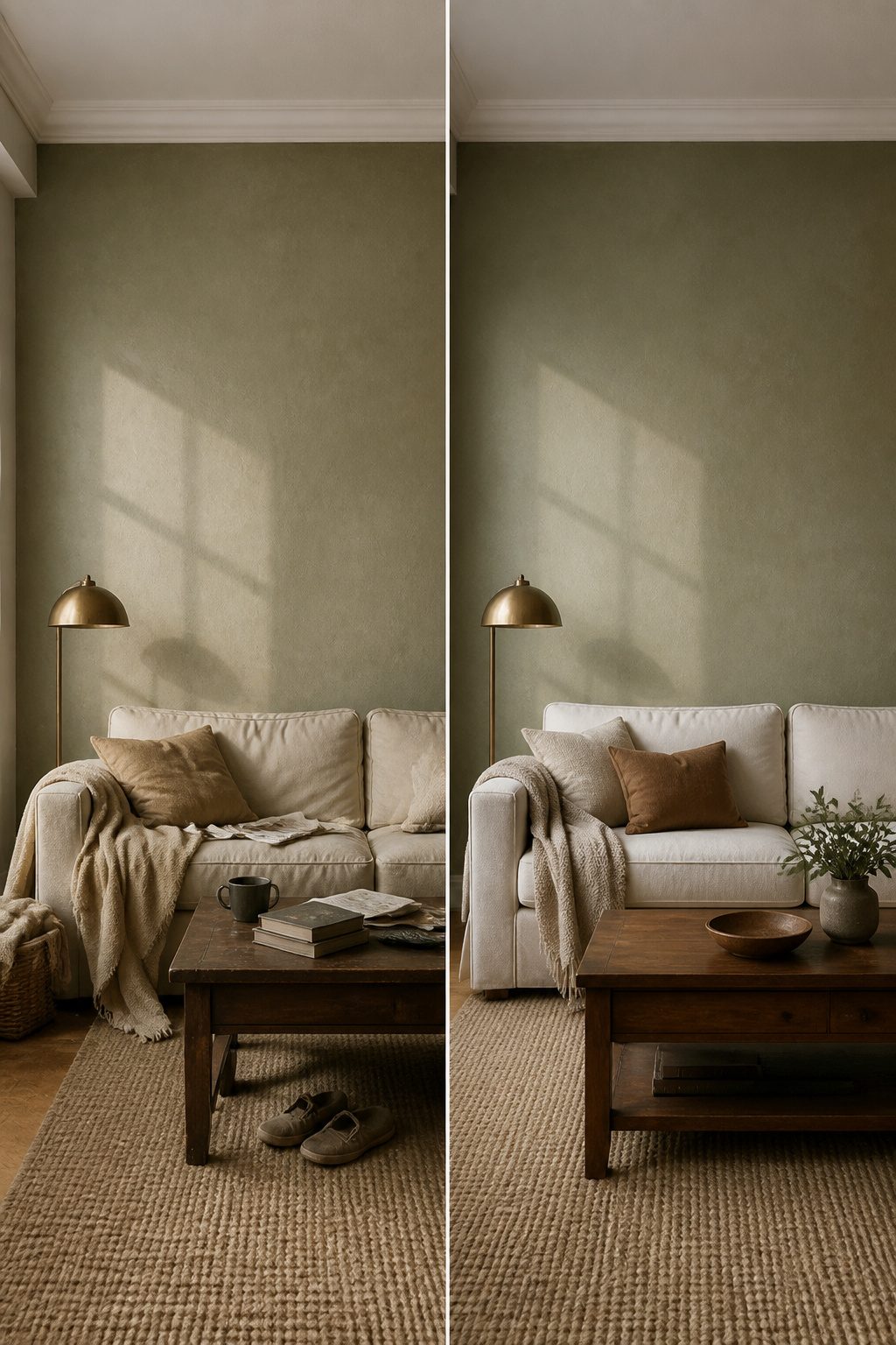
The paint color that runs through my living room started as a complete misfire. I had tested three swatches on poster board, all muted sage greens, and the one I loved under the hardware store lights read as straight-up mint once it hit my north-facing wall. The difference between 4000K fluorescents and the actual daylight in my space turned what looked sophisticated into something that felt like a dentist’s office.
I ended up with a warmer, dirtier green, something closer to dried sage leaves than fresh ones. That wall color became the anchor for every decision after it. The sofa had to be a warm off-white, not a crisp one, or the two colors would fight. The wood tones in the coffee table needed to lean amber rather than gray. Even the brass on the lamp bases had to be the slightly aged kind, not the bright polished finish I had first considered.
Testing paint on the actual wall, not on board, saved me from living inside a mistake. I now paint a two-foot square and live with it for three days, morning to evening, before I commit. The palette doesn’t need to be complicated. One wall color, one neutral for the big pieces, and one metal finish carried through the hardware does more than a dozen competing accents ever could.
Arranged Furniture
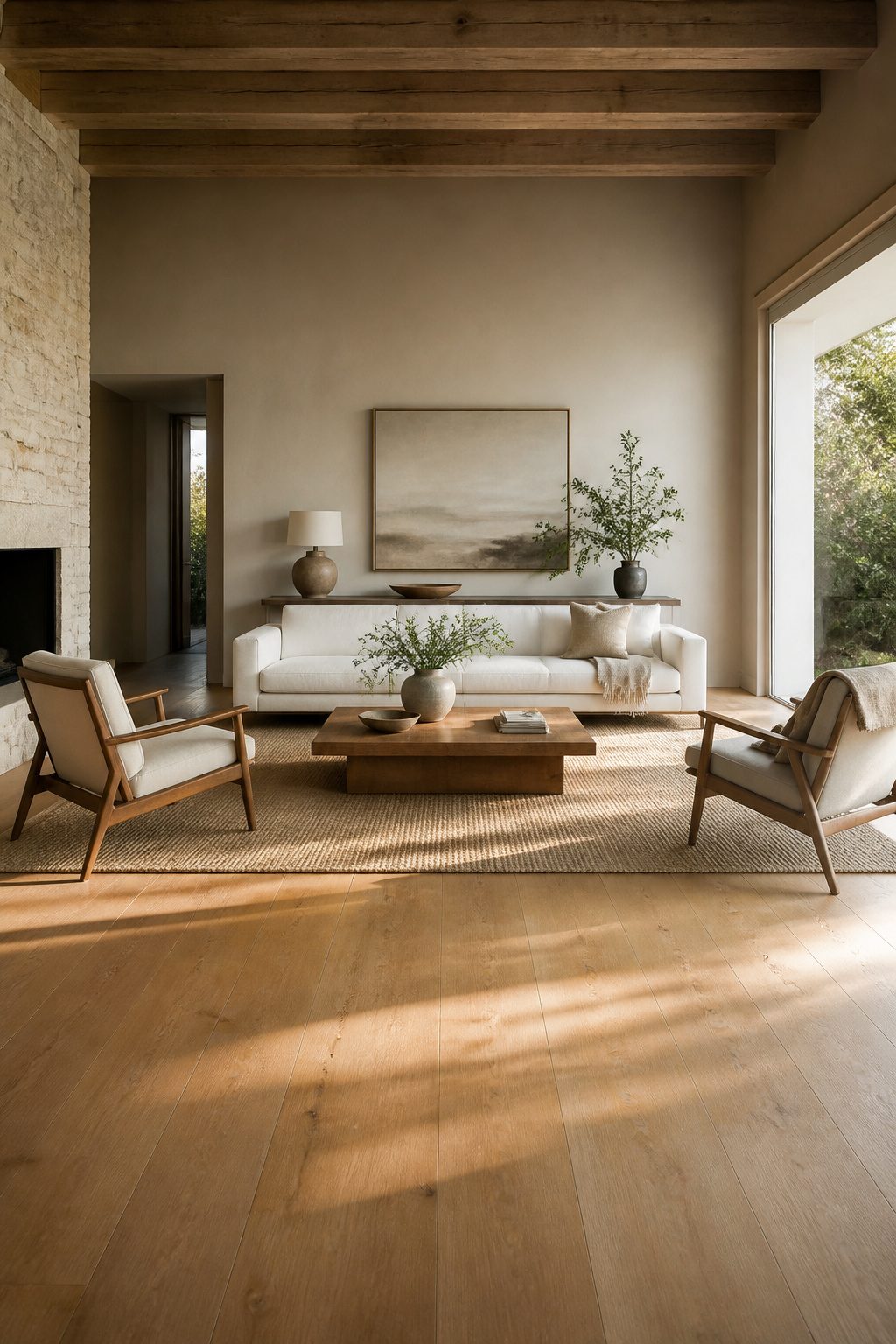
The layout I started with was the one I knew from every house growing up: sofa flat against the long wall, two chairs flanking it, coffee table centered like a target. That arrangement ate more floor space than it gave back. The real problem showed up only after I measured the actual traffic path from the entry door to the kitchen. Thirty-six inches of clearance was what the walkthrough needed; my wall-hugging setup left twenty-eight, and every arrival meant a little dance around the arm of a chair.
I moved the sofa three times that first afternoon. First pullout put it at an angle, which opened the path but blocked the heating vent. Second try squared it off but left the room feeling like a waiting area. The third placement, floating the sofa eighteen inches off the wall with a narrow console behind it, finally let the door-to-kitchen line run clear and gave the seating area a border that felt intentional rather than defaulted.
Traffic paths matter more than the furniture catalog pose. The floating arrangement won because it let the room work for actual living: someone walking through, someone else getting up for a drink, no collisions. A sofa against the wall reads as safe, but it often just preserves space you cannot use for anything else.
Painted Furniture
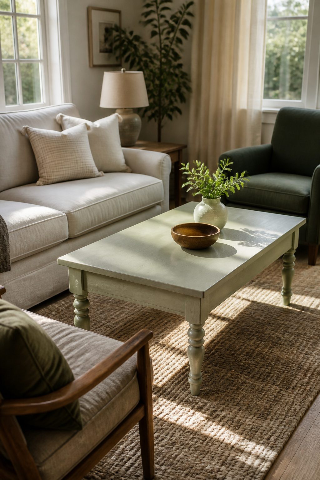
The coffee table in the center of my living room started as a twenty-dollar yard sale find with water-ringed laminate and one wobbly leg. Sanding took 120-grit paper to cut through the factory finish, then 220 to smooth the scratches. Zinsser B-I-N shellac primer was the only thing that bit into that surface without chipping by day three; two coats of latex paint went over it with a Purdy sash brush that left faint ridges along the back edge where my angle got lazy against the trim. I see them every time I walk past with a laundry basket. On a piece with turned legs or carved drawers, those same ridges would have been a disaster in the valleys. A small foam roller on flat planes, with a brush reserved only for corners, would have saved the texture.
Gallery Wall
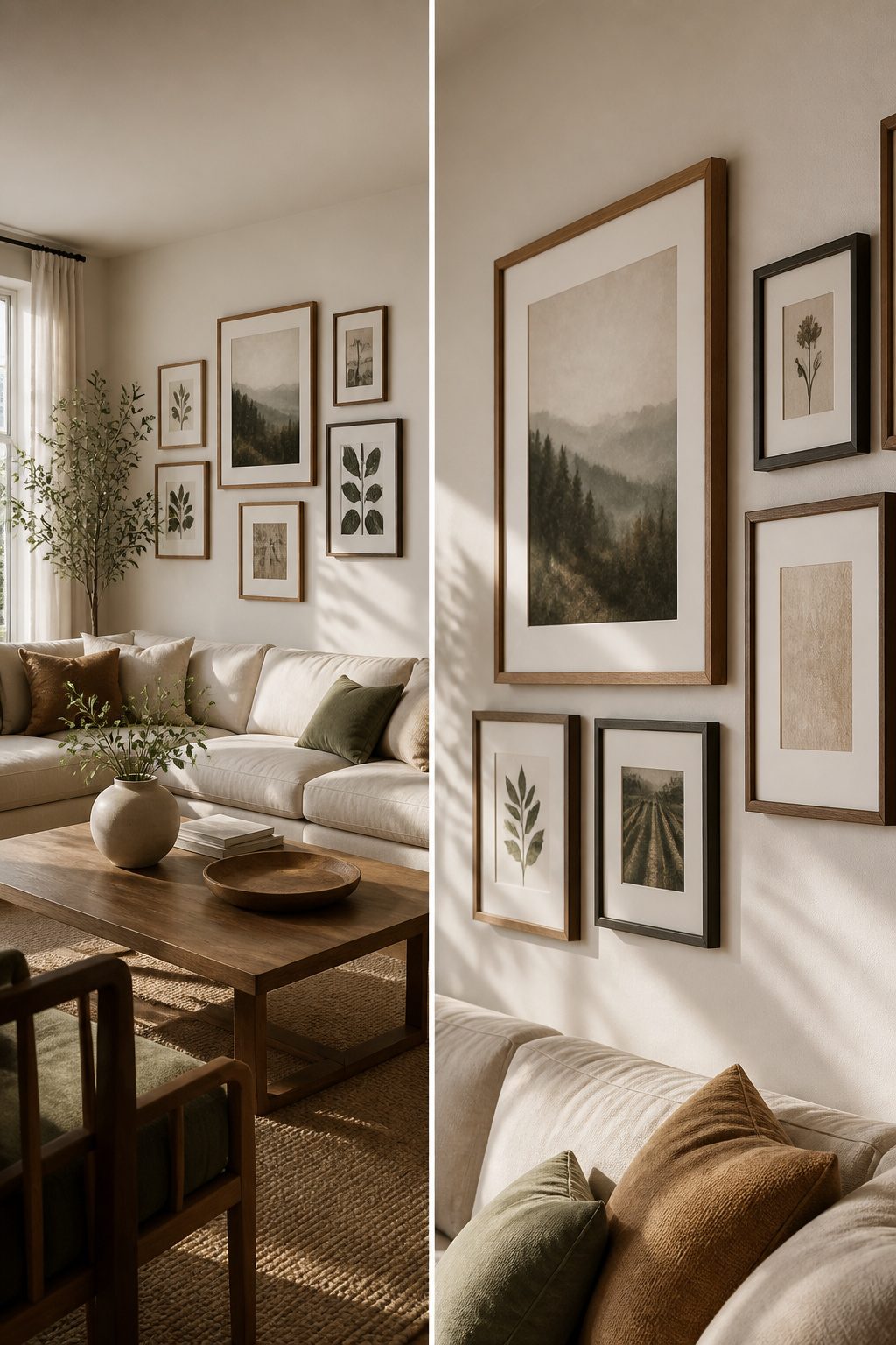
The gallery wall above my sofa started with one frame I already owned, a 16 by 20 inch print, and I built outward from there. Two 11 by 14 frames and four 8 by 10s filled the rest of the arrangement without crowding the narrow wall. The mistake was adding a single 5 by 7; the scale threw off every eye that passed through the room, and I moved it to a side table within a week.
I hung the whole grid without a level by cutting a paper template for each frame and taping them to the wall first. Adjusting tape is faster than patching drywall. Two inches between every frame, measured at the shortest gap, kept the spacing consistent even when the frames themselves varied slightly.
For anchors I used plastic wall plugs rated for 30 pounds. Three pulled clean out of the drywall the first time I tested them, all three in the same stud bay where the builder had left a void. Switching to toggle bolts in that spot solved it, and the rest of the plastic anchors held fine.
Lighting Fixtures
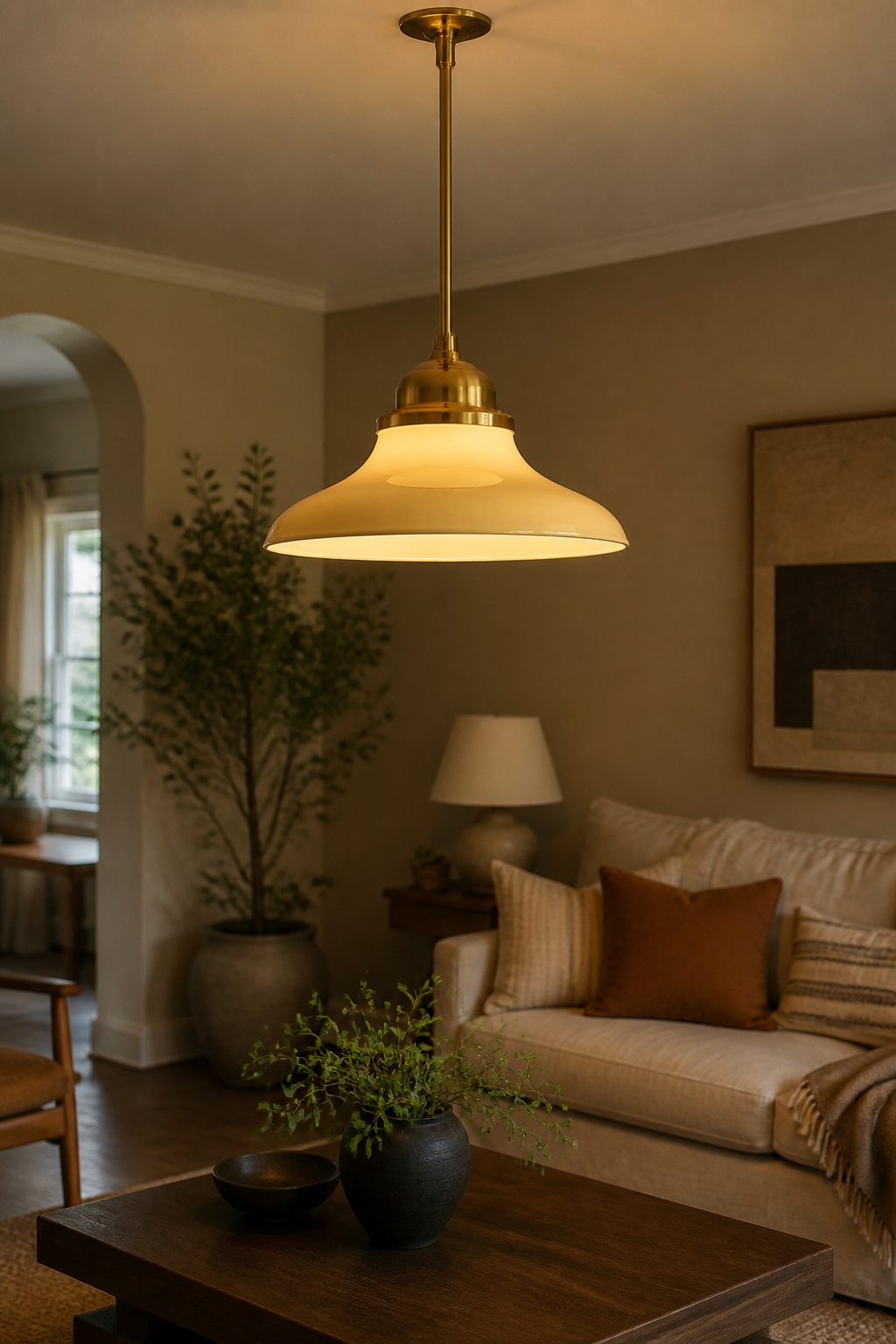
The flush-mount dome light that came with the place had to go. It sat dead center in the ceiling and threw the kind of flat, shadowless glow that makes a room feel like a clinic. I wanted a pendant, something that would cast actual pools of light and give the ceiling some height.
Wiring made me nervous. I had swapped fixtures before, but this was my first ceiling work, and I did not trust my junction-box skills. An electrician ran the new line and mounted the box for $180. Hanging the fixture itself, the hook and the canopy, I did in twenty minutes with a stepladder and a YouTube video. That split felt right: pay for the part that burns your house down, keep the part that only bruises your ego.
The fixture came from Facebook Marketplace, $40, brass with a flared schoolhouse shade. The seller had bought it for a renovation that never happened.
The 3000K bulbs I started with were a mistake. They looked warm in the hardware store aisle, but at night the room went institutional, that yellow-beige of DMV waiting areas. I swapped to 2700K after a week. The difference is subtle on paper, but at 7 p.m. with the curtains drawn, it is the difference between rented and lived-in.
DIY Projects
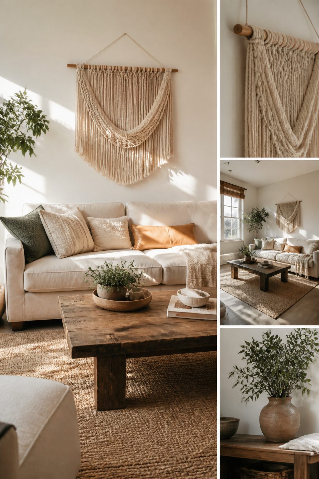
The woven wall hanging above the sofa took about four hours and twelve dollars in cotton rope and a dowel from the hardware store. Guests ask about it almost every time, which still surprises me, since the crate side table took closer to six hours and cost twice as much and nobody notices it unless they need somewhere to set a drink. That table wobbles slightly on the rug no matter how I shim it, so the invisibility might be a kindness.
The macrame project sits in a closet, half-knotted and dusty. Three hours in, the pattern tightened into something that looked less like intentional design and more like a mistake in a fishing net. I kept telling myself I would finish it, but after six months the rope had collected enough cat hair to become its own ecosystem. Some abandoned projects teach you more about your patience than your skill, and this one taught me that knots look easier on video than they feel in your hands with the afternoon fading.
Accessories
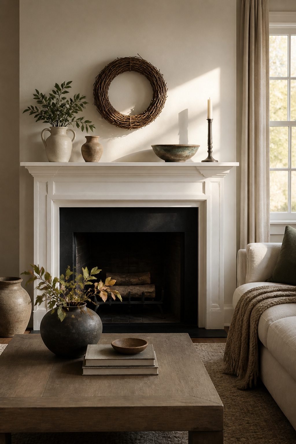
The mantel used to collect everything: mail, a dead succulent, three candles I never lit. Clearing it down to five objects made the room feel larger, not emptier. A round grapevine wreath hangs there from October through January, bare in spring, then swapped for dried lavender in summer. The ceramic bowl on the coffee table cost sixty dollars at a craft fair, which still stings, but the glaze catches afternoon light in a way nothing else does. That one stays. The books rotate by season, the brass candlesticks do not. Five objects per surface is the limit; anything more and the eye stops registering any of it.
The Design Process
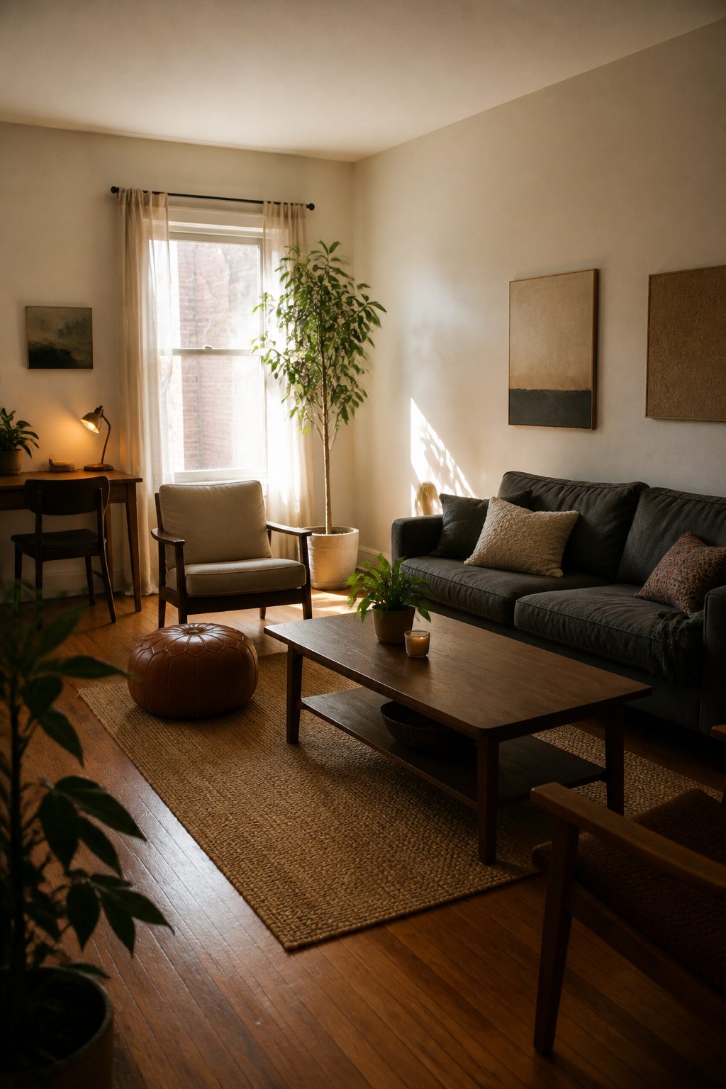
My living room has been "almost finished" for three years now. The sofa has moved four times, the rug is on its second rotation, and there is still a blank spot above the mantel where something should go. I used to think this meant I had failed at the project. Now I think a living room that stays slightly unfinished is probably the honest one.
The real stall happened after I tried to copy a magazine spread. I had the paint matched, the exact coffee table tracked down, the throw pillows within a shade. The room looked assembled, which was the problem. Nobody actually lived in the photograph I was copying. The people in that image did not eat dinner on the sofa, or leave books face-down on the arm, or need a spot for the dog’s bed that was not an eyesore. My version of their room felt like a waiting area.
Let the room reflect what you actually do in it, not what looks finished in a photo. For me that meant the desk stayed in the corner even though every layout diagram said it ruined the sightline. I work there. The dog bed went beside the radiator. The reading lamp got a longer arm than the style blogs recommend because I like light from the left. The room is messier now, and I like being in it more.
What I Got Wrong
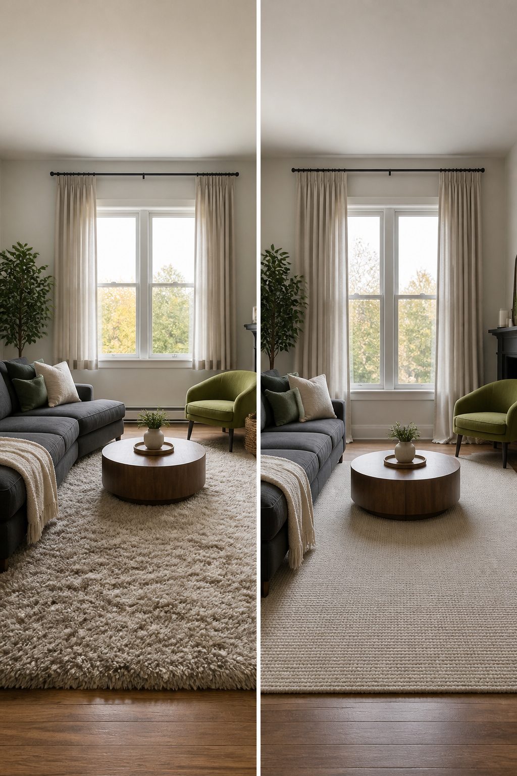
The rug I unrolled first was two sizes too small, which I realized only after the couch legs sat half on and half off the weave for a week. A 5 x 7 foot print looked generous in the store aisle and shrank to a postage stamp under a sectional. I lived with the gap for a month before swapping up to an 8 x 10, and the difference was immediate: the seating finally read as one zone instead of furniture floating on hardwood.
The curtains were worse. I hemmed them to just clear the floor, which in theory looks clean, but in practice every draft lifted them to high-water awkwardness. An inch lower would have pooled; an inch higher would have read as intentional. Where they landed, they just looked short. I added a band of contrasting fabric at the bottom and now the line looks deliberate, almost custom.
The accent chair is rust velvet against a charcoal sofa, a pairing I would not have planned but bought on impulse because the frame was right. It fights. Not loudly, but every time the afternoon light hits it, the warmth flares against the cool. I kept it because the tension keeps the room from going flat. That clash I would choose again. The rug and the hem, never.
Frequently Asked Questions
What elements should I include in my living room tour?
Include the paint color you tested on the actual wall, not on board; a furniture layout that leaves 36 inches of clearance for traffic paths; any painted furniture with the primer and tools you used; a gallery wall with consistent frame spacing; lighting fixtures with the right bulb temperature; and DIY projects finished or abandoned. Let the room reflect what you actually do in it, not what looks finished in a photo.
How can I make my living room feel more inviting?
Use 2700K bulbs instead of 3000K; the difference is subtle on paper, but at night with curtains drawn, it is the difference between rented and lived-in. Warm off-white upholstery, amber wood tones, and slightly aged brass also help, as does limiting each surface to five objects so the eye actually registers what is there.
What are some DIY projects for living room decor?
Paint a yard-sale coffee table with shellac primer and latex paint, using a small foam roller on flat planes and a brush only for corners. Build a woven wall hanging from cotton rope and a dowel. Create a gallery wall by cutting paper templates for each frame and taping them to the wall before hanging, with two inches between every frame measured at the shortest gap.