Chic fall decor spans from a $4 Trader Joe’s bunch dried upside down to a $60 copper pumpkin candle, and the single question is how much tending the season gets from you.
Real wheat rots beautifully; faux eucalyptus survives the weeks you forget to water. The shedding from pampas grass alone, constant and fluffy across dark surfaces, is enough to make some buyers reach for dried amaranth instead.
1. Swap Pumpkins for Pampas Grass
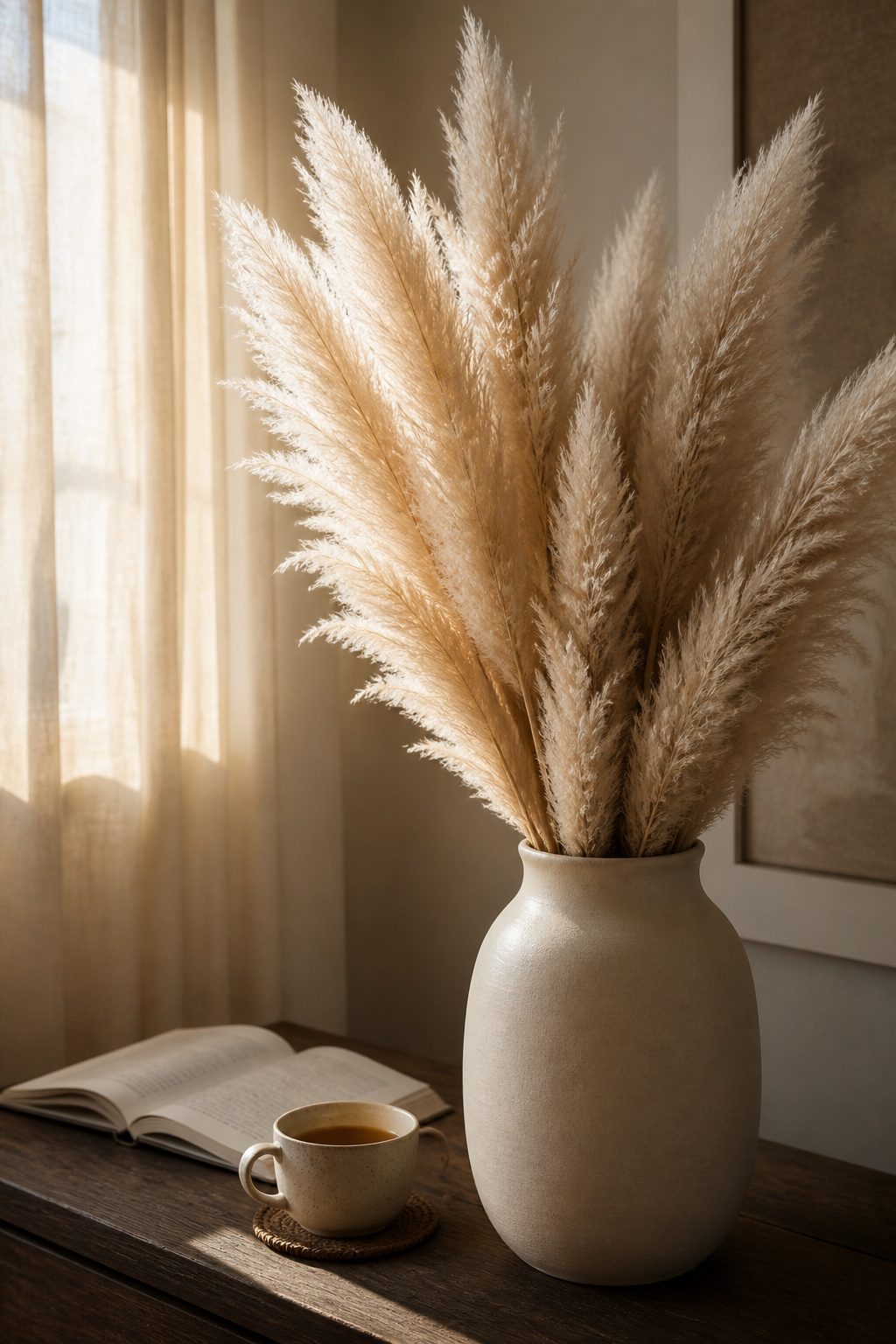
Pampas grass reads as more intentional than pumpkins because it borrows from interior styling rather than seasonal kitsch.
The creamy plumes catch low autumn light the way linen curtains do, and a handful of stems in a matte ceramic vase fills a corner without shouting.
Arrangement matters more than quantity. Three to five stems, trimmed to stand a hand’s width above the vessel rim, give height without looking like a floral shop display.
The stems are hollow and lightweight, so a narrow-necked vessel or a bit of dry floral foam at the base keeps them from shifting.
Sourcing dried pampas has become easier than it was five years ago. Craft stores carry it seasonally, and farm-stands in agricultural areas often sell it by the bunch for less than a single heirloom pumpkin costs.
Online marketplaces list it year-round, though shipping can flatten the plumes.
The shedding is real and constant. I learned this after a stem dropped its fluff across a dark console table within a day of arranging it.
A light mist of cheap hairspray, held at arm’s length, sets the plumes without stiffening them. Shake the stems outdoors first; the loose pieces that would have fallen in your living room come off in the grass instead.
2. Mix Faux and Real Fall Nature Decor
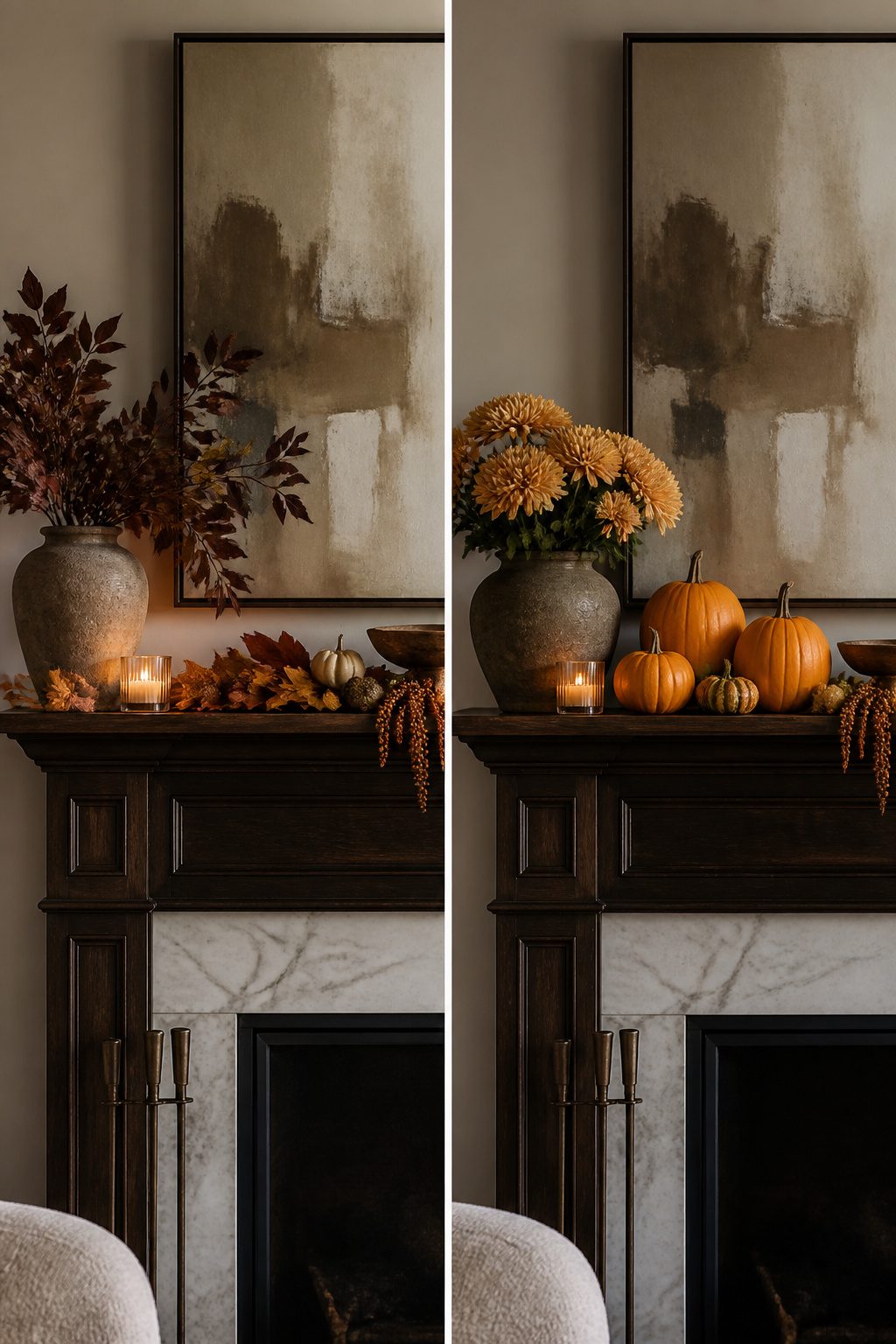
The layered look of mixed faux and real fall nature decor comes from distance: the eye reads the real thing up close and fills in the rest.
Real mums, pumpkins, and dried wheat bundles anchor a mantel or entryway because their texture catches light differently than anything manufactured.
Faux leaves, trees, and filler stems do the heavy lifting in spots where no one stops to inspect, or where watering weekly is not going to happen.
Last season I tried saving money by buying all faux stems for a console arrangement.
The plastic sheen on the cheaper eucalyptus sat right next to some dried oat grass I had preserved, and the contrast made both look worse, not better.
The mistake is placing obviously synthetic stems against obviously organic ones; they need at least a foot of separation, or a real element bridging them, for the eye to accept the mix.
Budget breaks down roughly $15–25 for a large real mum that lasts four to six weeks with root-soaking, versus $12–18 for a comparable faux bush you store and reuse.
Real pie pumpkins run $4–8 each in September; decent foam replicas are $6–10 but never rot. My rule now: buy real what rots beautifully, fake what has to survive the whole season.
3. Use Feathers as Fall Decor
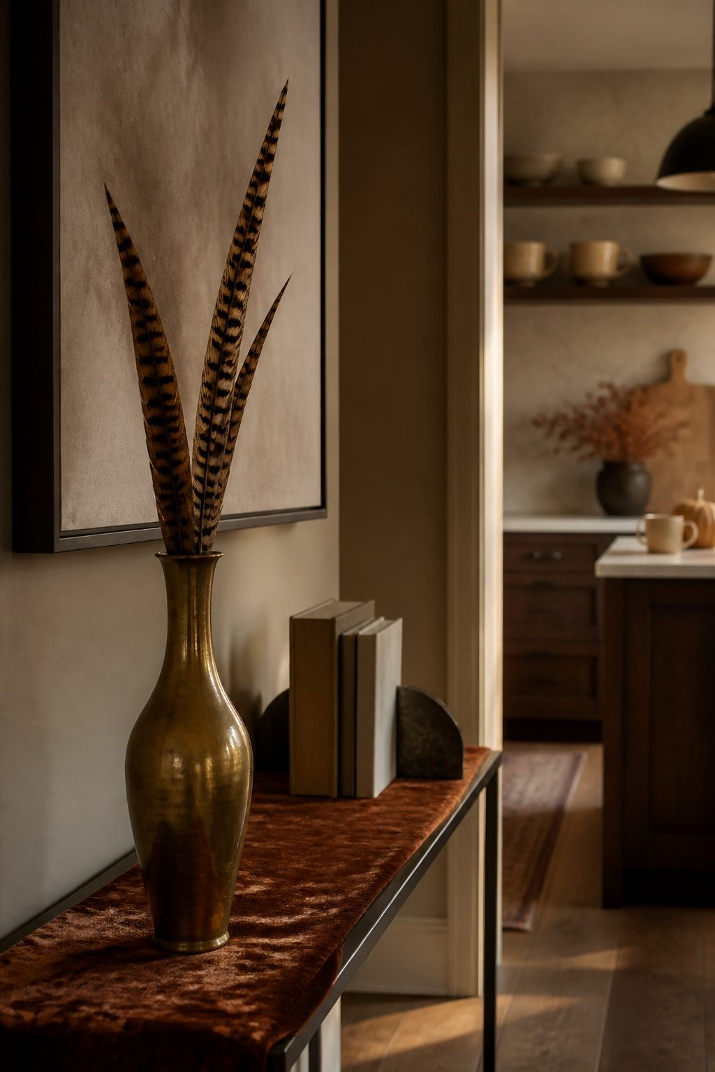
Feather accents read expensive when they sit next to the right textures and cheap when they do not.
My first attempt clustered dyed turkey feathers in a brass vase with burlap ribbon, and the result looked like a leftover from a grade-school diorama.
The problem was pairing too many rustic elements at once; feathers need something polished to anchor them.
The arrangement that worked used three or four long pheasant or guinea feathers dropped loosely into a heavy ceramic vessel with a velvet runner underneath. The velvet catches light differently and keeps the feathers from reading as costume.
Rough linen works too, but only in small doses; a linen napkin beneath a single feather on a tray, not draped behind a whole bouquet.
Sourcing matters more with feathers than with most craft supplies. Craft stores carry packs for $4–$8, though the dye lots vary and the stems often arrive bent.
Online sellers running $12–$20 for a dozen sorted plumes give better consistency and list whether they are naturally molted. Ethically sourced feathers are worth the extra few dollars; the color holds better and the barbs stay intact longer.
For renters, feathers move easily between surfaces: a single plume on a nightstand, a small cluster on a bookshelf. Nothing to store but a tissue-wrapped envelope come December.
4. Use Dried Florals
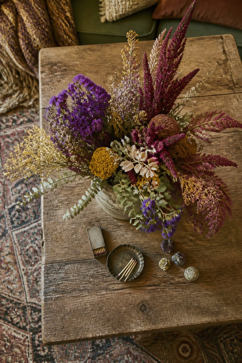
Dried florals hit differently when you choose varieties that hold their shape past Halloween. Hydrangeas, strawflowers, and amaranth keep their structure through January; the eucalyptus I hung in October looked skeletal and elegant well past New Year’s.
Statice and globe amaranth behave almost like dried beads, which makes them forgiving in a loose arrangement.
The grocery store route costs less than you would guess. Trader Joe’s sells bunches around $4–$7 that dry on their own if you hang them upside down in a dark closet for two weeks.
Specialty dried-flower shops charge $8–$14 per stem for the same varieties, though their color palettes run more sophisticated, dusty rose and tobacco rather than bright purple.
I buy the Trader Joe’s bunches for volume and supplement with a few stems from a specialty source when the arrangement needs one specific tone.
The funeral-home look comes from too much symmetry and too little air. A tight dome of dried roses reads memorial; the same stems cut to varied heights and paired with wispy dried grass read intentional.
I learned this the hard way with a batch of dried dahlias. They crumbled to dust by Thanksgiving, petals scattering every time someone walked past the table.
Dried amaranth replaced them, those rope-like tassels that barely shed and catch light like nothing else.
Wire the stems into a chicken-foot grip rather than clustering straight up, let a few tassels droop below the vase line, and the whole thing loosens up.
5. Go Neutral and Omit Traditional Orange
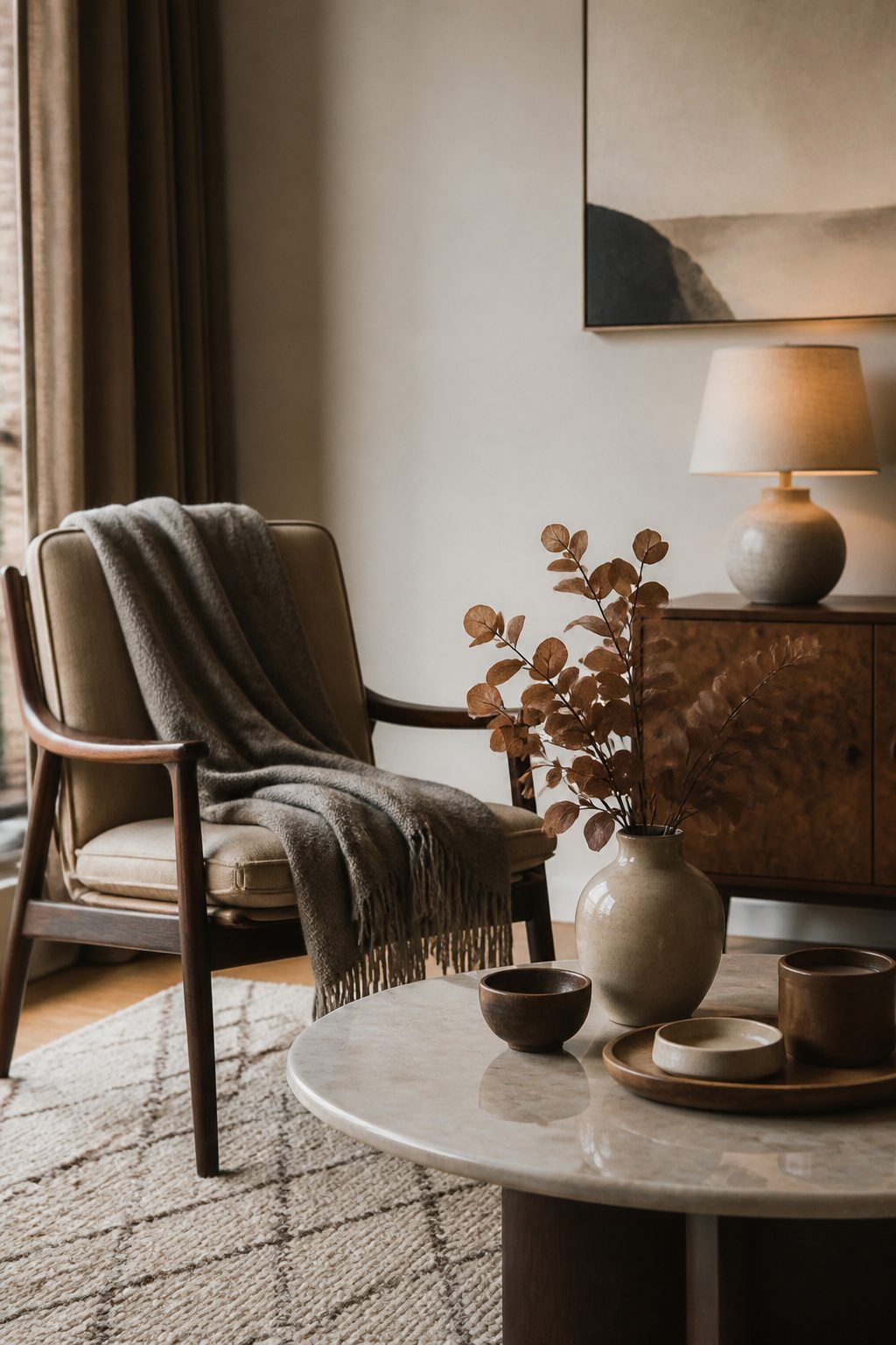
Cream, taupe, rust, and brown read as intentional where orange reads like a seasonal decoration you forgot to put away.
The shift clicked for me walking through a friend’s living room last October; she had pulled every orange pillow and leaf garland, and the room felt like September still belonged there rather than a craft store explosion.
Taupe carries warmth that gray drains out. Benjamin Moore’s Pashmina on a thrifted lamp base kept the light feeling soft at night, where a cooler neutral would have flattened into the wall.
The single exception is a dried rust-colored eucalyptus; it sits right at the edge of orange without crossing into pumpkin territory, and against cream linen it reads like aged metal rather than Halloween.
Brown works best in texture, not block color. A nubby wool throw from Target’s Threshold line last year cost under forty dollars and carries more weight than the same shade in a smooth weave ever would.
The mistake I made first was buying a chocolate velvet pillow that looked rich online and read as a dark hole in person; matte linen in the same depth worked immediately.
6. Use Copper to Add Fall Warmth
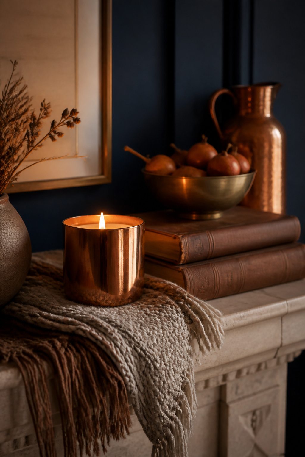
Copper reads warm without shouting orange the way a plastic pumpkin does.
A small copper pumpkin candle, like the Thymes Pumpkin Laurel Statement Candle at $60, sits heavy in the hand and catches lamplight across a mantel or a narrow kitchen shelf.
The scent of nutmeg, cinnamon, clove, and orange peel does the seasonal work so the metal does not have to.
I found my own pieces secondhand, mostly estate sales and the occasional thrift store brass rack where copper mugs and small teapots get mistaken for their cheaper cousins. Polishing is the part nobody photographs.
A quick rub with Bar Keepers Friend takes the tarnish down, but leave a little patina in the crevices or the whole thing turns to costume jewelry.
The FCTWAKS Mid Century Glass Candle Warmer Lamp, also around $50, does something similar in a different material. Its orange-tinted glass throws the same warmth without any metal to maintain, and it stretches a votive’s life while it runs.
I keep one on my desk for evenings when I want the light but not another open flame to remember.
A navy wall behind either piece keeps the look from drifting into farmhouse territory. The pairing reads intentional, not collected by accident.
7. Incorporate Corn Stalks
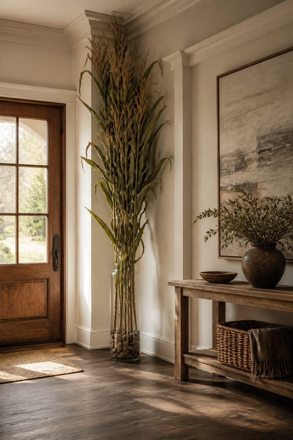
Corn stalks frame a doorway with height nothing else in the fall aisle matches, but the version from a farm stand and the one from a home improvement store might as well be different materials entirely.
Farm stand stalks still carry the taper and irregular joints of actual growth; the bundled sets at big-box stores tend toward uniform thickness and a suspiciously even tan.
The farm stand batch I brought home two years ago came with stowaway earwigs that kept appearing for a week, so now any outdoor haul sits in the garage overnight before it crosses the threshold.
For renters working with standard 8 ft ceilings, keep stalks under 6 ft tall indoors or the vertical line starts to read as accidental rather than dramatic.
A single leaning stalk in a tall glass cylinder works; a full bundle needs to be lashed to a base weight, sand in a planter or a concrete pot you already own, or it will list toward the nearest draft.
Outside, steel rebar driven into the ground and zip-tied to the stalks at two points keeps them upright through October wind without sinking budget into decorative stands you store eleven months a year.
8. Include Apple Decor
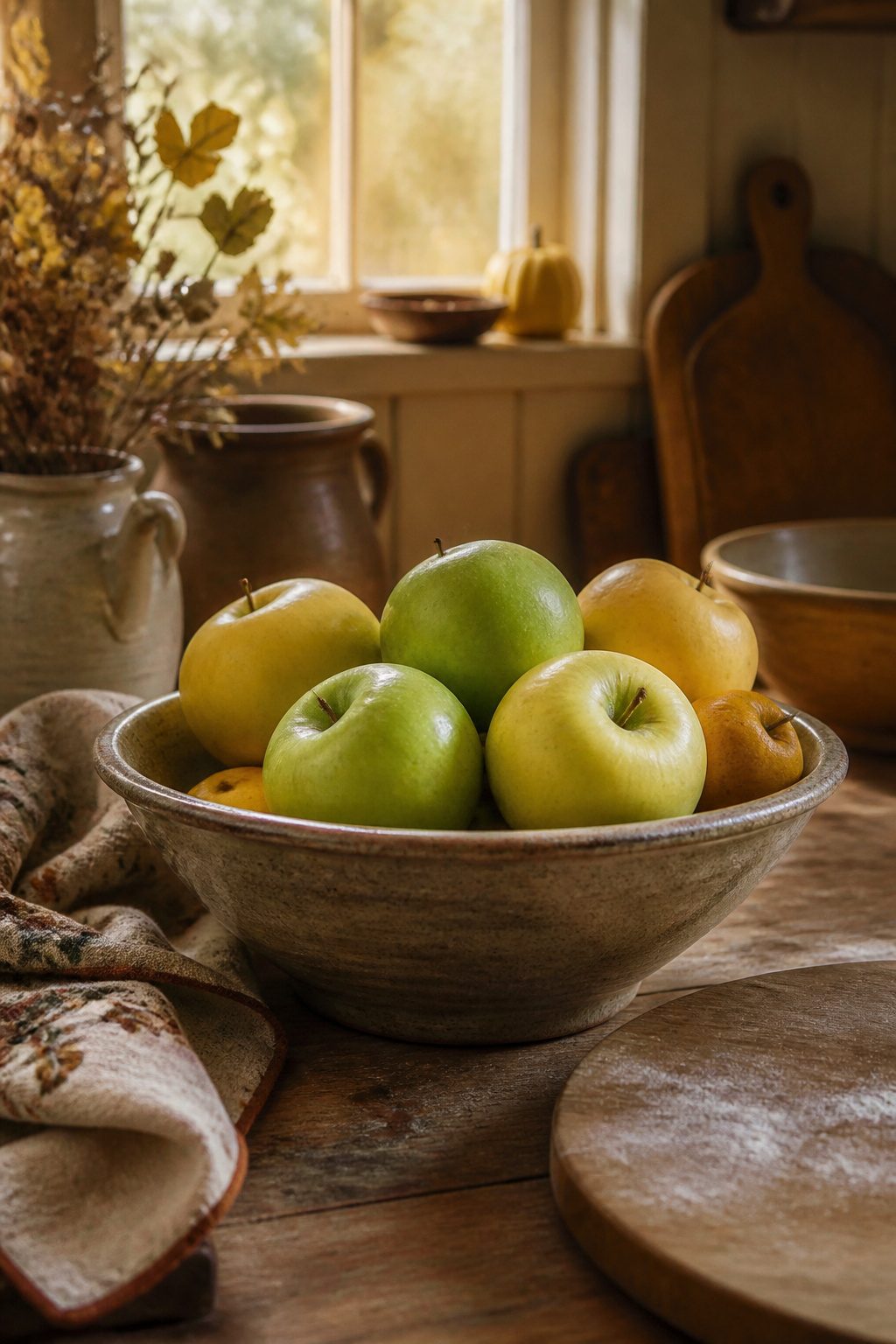
Real apples in a bowl look alive for about four days before one turns soft.
I learned this the hard way after Thanksgiving two years back, when I found a McIntosh gone to mush at the bottom of a ceramic cachepot I had forgotten to check.
Now I use Honeycrisp or Granny Smith if I am going real; their density buys you a week, maybe ten days in a cool room, and the green reads more intentional than country-kitchen red.
For anything longer, faux apples have improved enough that the matte ones pass at arm’s length.
I cluster them in a single low bowl, never a piled mountain, and I always break them up with something structural: a twisted grapevine stem, or a few dried oat grass plumes laid across.
The vessel matters more than the fruit. A heavy-bottomed hand-thrown stoneware bowl in charcoal or warm white does the work.
So does a squat vintage glass compote, the kind with a footed base that lifts the display to eye level.
My own fall shelf runs to a small collection of shaped stoneware, including a Le Creuset Stoneware Pumpkin Mug with Lid that sits beside the apple bowl and catches the same warm light.
The lid makes it useful past October, which justifies the shelf space in a small kitchen.
9. Use Vintage Decor in Fall Colors
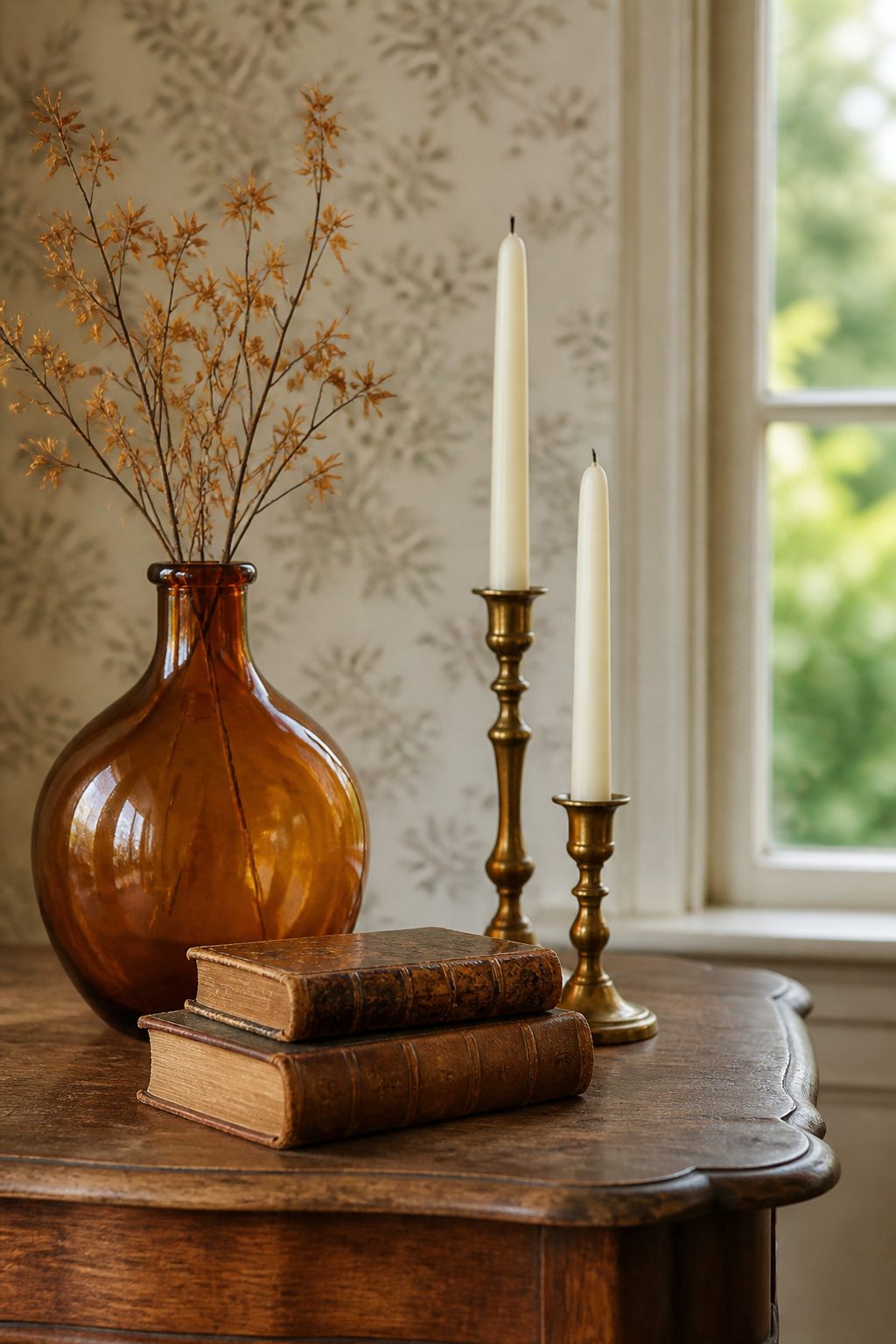
Amber glass, brass, and worn leather read as fall because of their warmth, not because anyone slapped a pumpkin on them.
The trick is hitting estate sales early on Saturday mornings, where brass candlesticks and amber vases usually run $3 to $8, versus antique malls that mark the same pieces to $25 or more.
Vintage books with leather or cloth bindings in ruby red or deep ochre do the same work; designer Crystal Blackshaw plucked leather-bound volumes as a nod to cascading leaves, stacking them on a mantel for what she called "the perfect pop of brightness this composition needed."
"the perfect pop of brightness this composition needed"
That "pop" translates at home to a stack of three or five, never even, with the spines facing out if the colors cooperate.
The piece that looked right in the store but wrong at home: a heavy brass table lamp with a perfect patina that read cozy until it sat on my actual nightstand and blocked the only outlet.
Now it lives on a bookshelf where scale matters less. Leather books with gilt lettering can tip the same way, too fussy for a coffee table, just right on a high shelf catching window light.
Hunt with a measurement in your phone and a photo of the spot; the best finds fall apart in the wrong proportions.
10. Create a Lush Fall Mantel
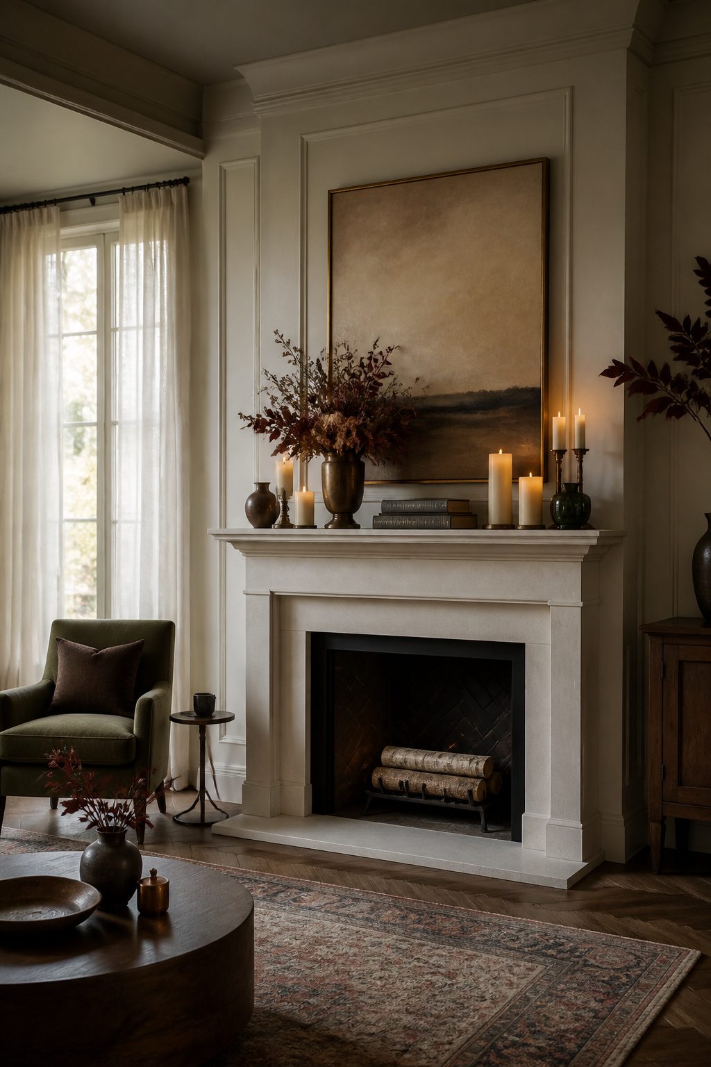
A mantel looks like a stage, and the instinct is to center everything. That instinct is the first thing to fight.
Build in layers that pull the eye sideways, not to the middle: one heavy piece off-center, maybe a brass vase or a stack of vintage books, then let the rest trail lower on the opposite side.
The bookends that worked for me are simple black metal ones, heavy enough to keep a short stack upright without shouting for attention.
Three layers is usually the ceiling before things get tippy. A low vessel or woven basket in front, something medium behind it, and one taller form at the back.
Flameless candles that look realistic earn their spot here; the wax-drip texture and the remote mean you can set them on a timer without climbing up twice a day.
The glow reads as real from across the room, which is the only test that matters.
Asymmetry needs balance, not chaos. The weight should still feel even, just not mirrored.
When I finally stopped centering the mirror and slid it six inches left, the whole wall started working.
11. Style Open Shelves as a Fall Vignette
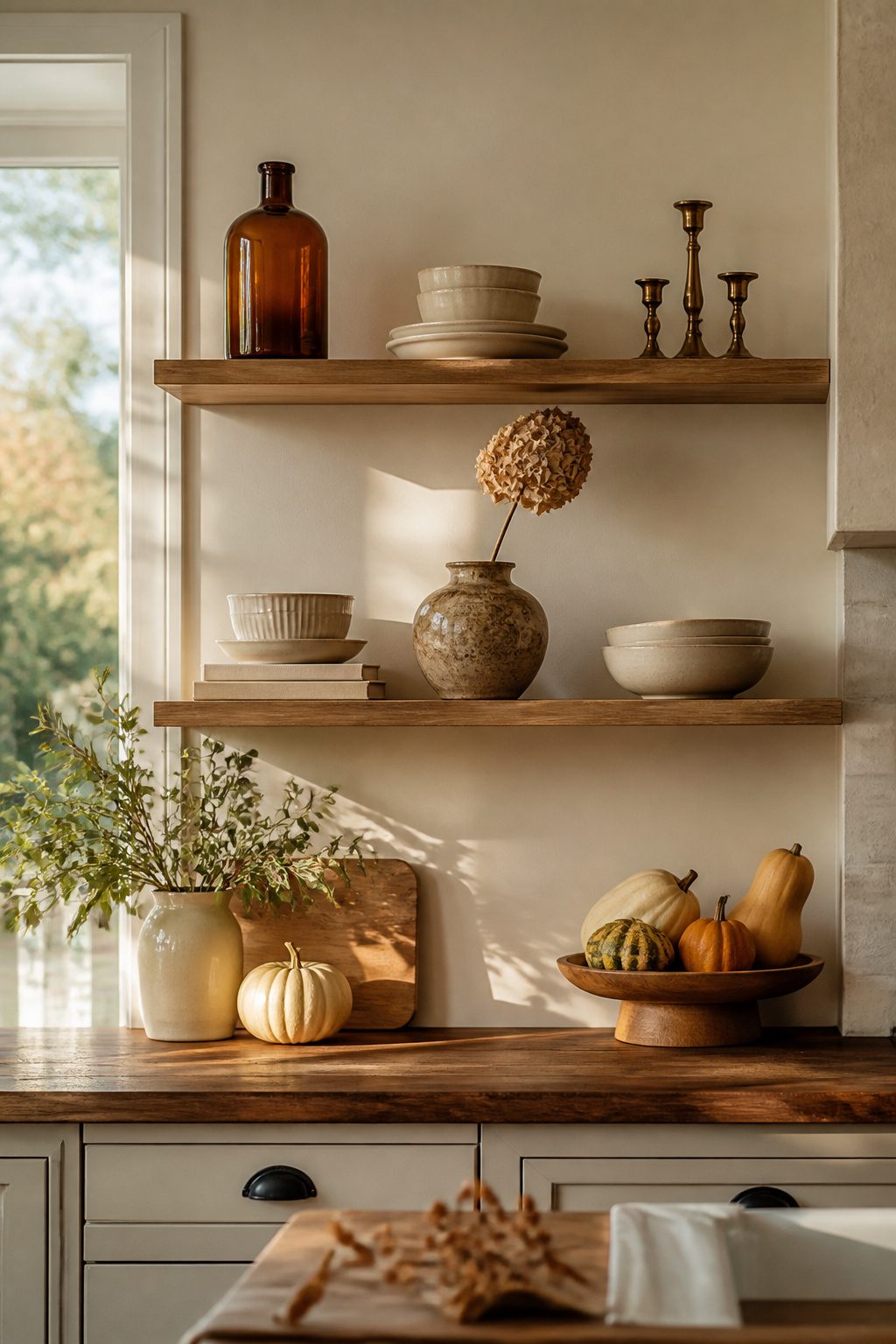
Open shelves turn chaotic fast when every pumpkin and candle you own lands at once.
The vignette that finally worked on my kitchen shelving came after stripping out about half of what I first placed, and the lesson was that editing existing contents matters more than adding new ones.
I started by pulling everything off, then put back only the pieces that already read fall-adjacent without trying: amber glass bottles, worn brass candlesticks, a stack of cream ceramics. The rule of three governed what came next.
One brassy candle, one small dried arrangement, one object with weight, a ceramic pear or a wooden bowl. Grouped in threes, they read as intentional.
Spread out as singles, they looked like clutter I forgot to clear.
The $65 wreath I considered for the wall above the shelves stayed in my cart.
Instead, I spent $12 at a thrift store on a single brass vase with the right patina, placed it off-center in the middle shelf grouping, and let the existing cream plates behind it do the warm work.
Two other groupings of three, no two the same height, finished the run.
The first attempt had five objects per shelf and a mini pumpkin in every gap. It photographed busy and felt worse in person.
Three objects, breathing room between clusters, and the eye finally had a place to rest.
12. Fill a Bucket with Fall Florals
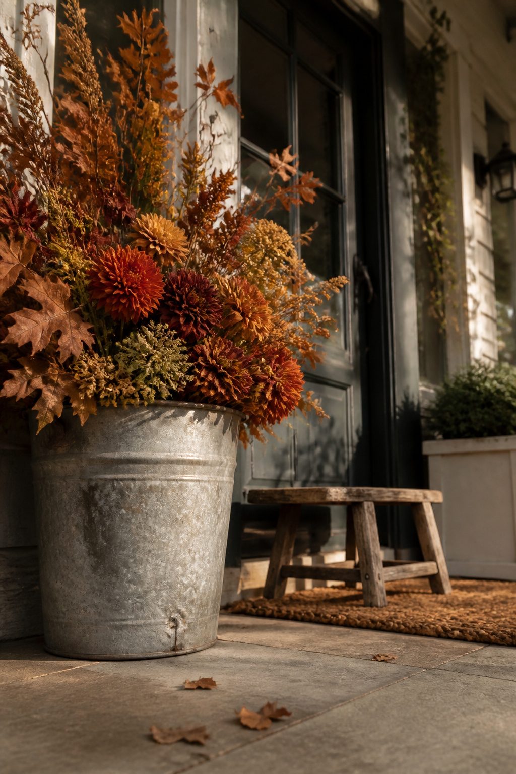
A galvanized bucket full of dried oak leaves and rust-colored dahlias has lived on my porch through three moves now.
The container came from a hardware store clearance bin for $8, and its dented rim is what makes the whole thing feel gathered rather than staged. Ceramic works too, though the weight matters more than the finish.
The first bucket I tried was a thin galvanized pail from a dollar store. Top-heavy with five stems of faux sunflower and two dried artichokes, it tipped in a gust that cost me a ceramic pumpkin.
Now I fill the bottom with river stones or a bag of sand before anything green goes in. A bucket that looks substantial still needs ballast.
For keeping stems upright, floral foam and a tape grid split the difference on cost and permanence.
Foam runs about $4 a block and holds wet stems or dried; the grid, just florist tape across the rim, is free if you have the roll.
I use foam for arrangements that stay up a month, tape for anything I plan to refresh weekly. Both look messy close up, which is why the casual abundance of a bucket helps.
Nothing in here is meant to be examined stem by stem.
My current mix is eight stems of dried eucalyptus, three burgundy mums, and a handful of wheat from the grocery store floral section. Total spend stays under $25, and the whole thing takes ten minutes to assemble on a Saturday morning.
13. Use Pears in Your Fall Decor
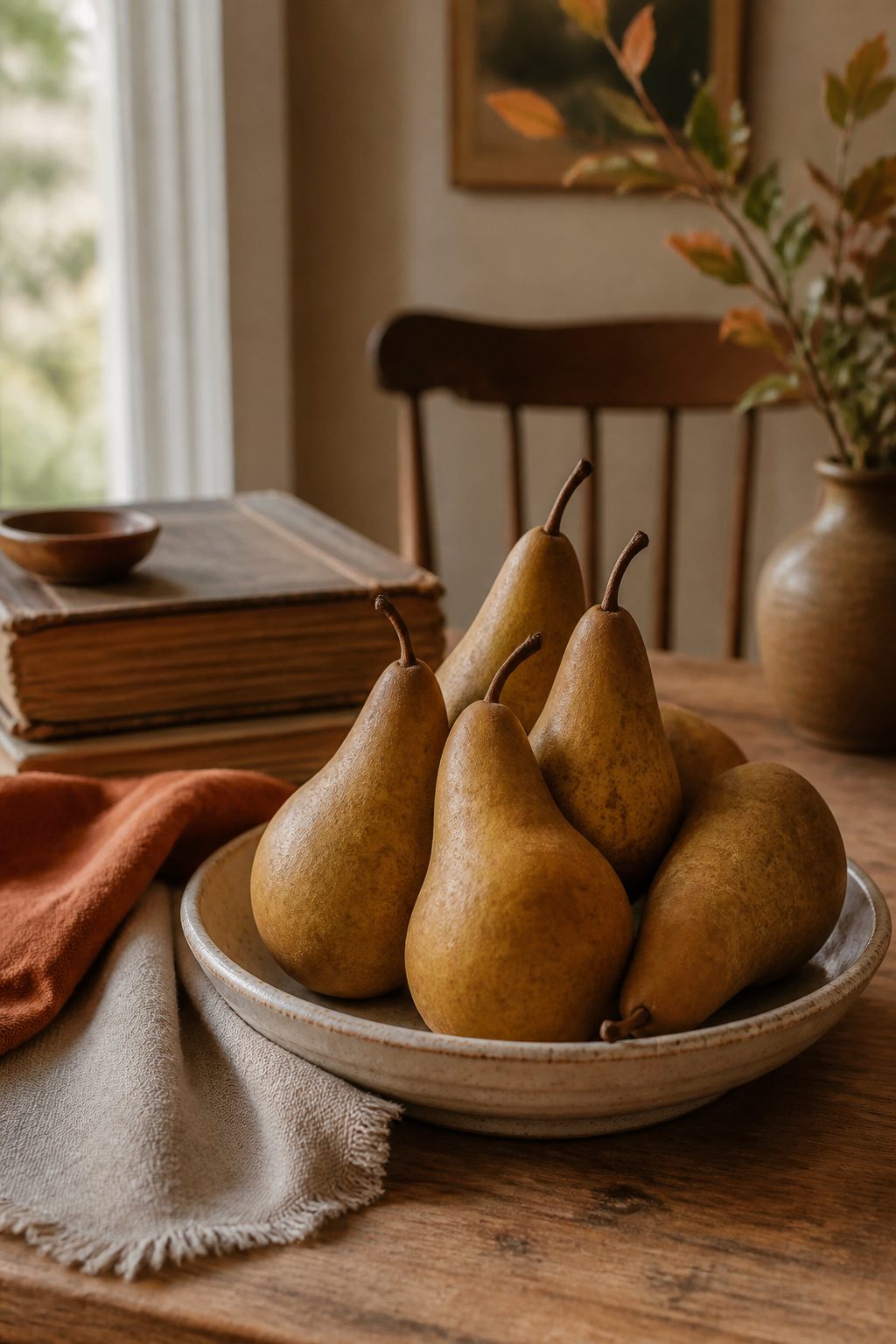
Pears read quieter than apples on a mantel or dining table, and they stay firm for weeks if you choose the right variety.
Bosc and Anjou hold their shape without refrigeration; Bartletts will soften unevenly and surprise you with rot from the inside out. I learned that the hard way after a centerpiece turned fragrant in the wrong direction by day five.
Firmer varieties pair best with unlacquered brass or pale oak, where their brown-green skin looks intentional rather than underripe. A single pear on a small dish works as a sculptural object, almost like a still-life painting you can rotate.
Massed in a low ceramic bowl, they need odd numbers and slightly varied angles or the arrangement goes static fast.
14. Feature a Singular Classy Pumpkin
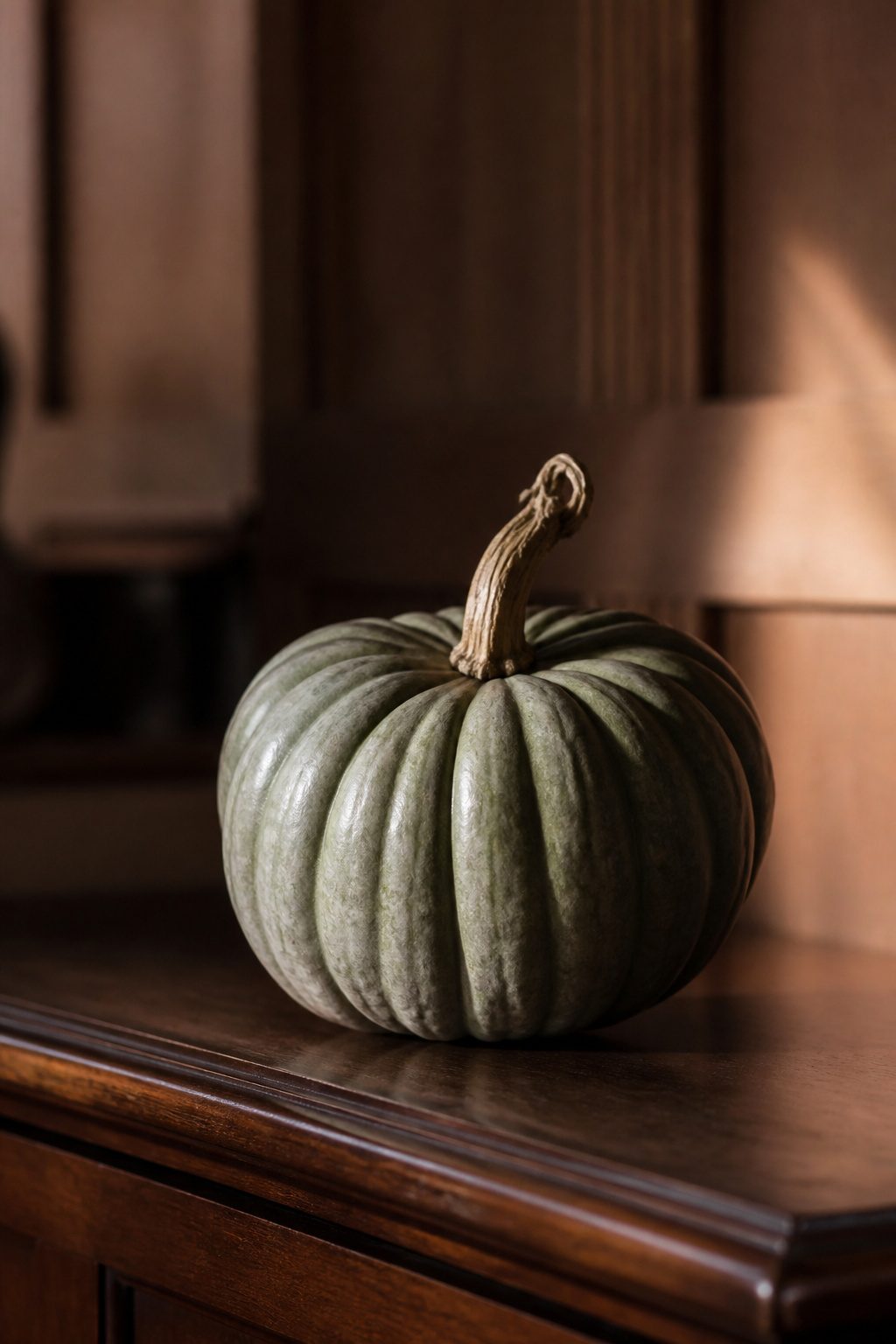
A single pumpkin on a hall table beats a porch full of the usual orange globes every time. One heirloom specimen in white or muted green reads intentional; a pile reads leftover from Halloween.
The trick is sourcing the right shape, and farmer’s markets are where the strange ones hide.
Last October, a vendor at the Union Square Greenmarket had Jarrahdales stacked in milk crates, their blue-gray skin barely ribbed, each one a different impossible silhouette. I carried mine home on the subway like a pet.
The kitchen payoff came later. A Staub Cast-Iron Pumpkin Cocotte sits on my stove from September through November, matte black with a gold stem knob.
It cooks the same soups a Dutch oven would, but the silhouette keeps the mood going when the real pumpkin on the counter finally softens.
The two objects talk to each other across the room: one alive and temporary, one permanent and useful. That pairing is what makes the look feel lived-in rather than staged.
15. Frame Doorways in Garland
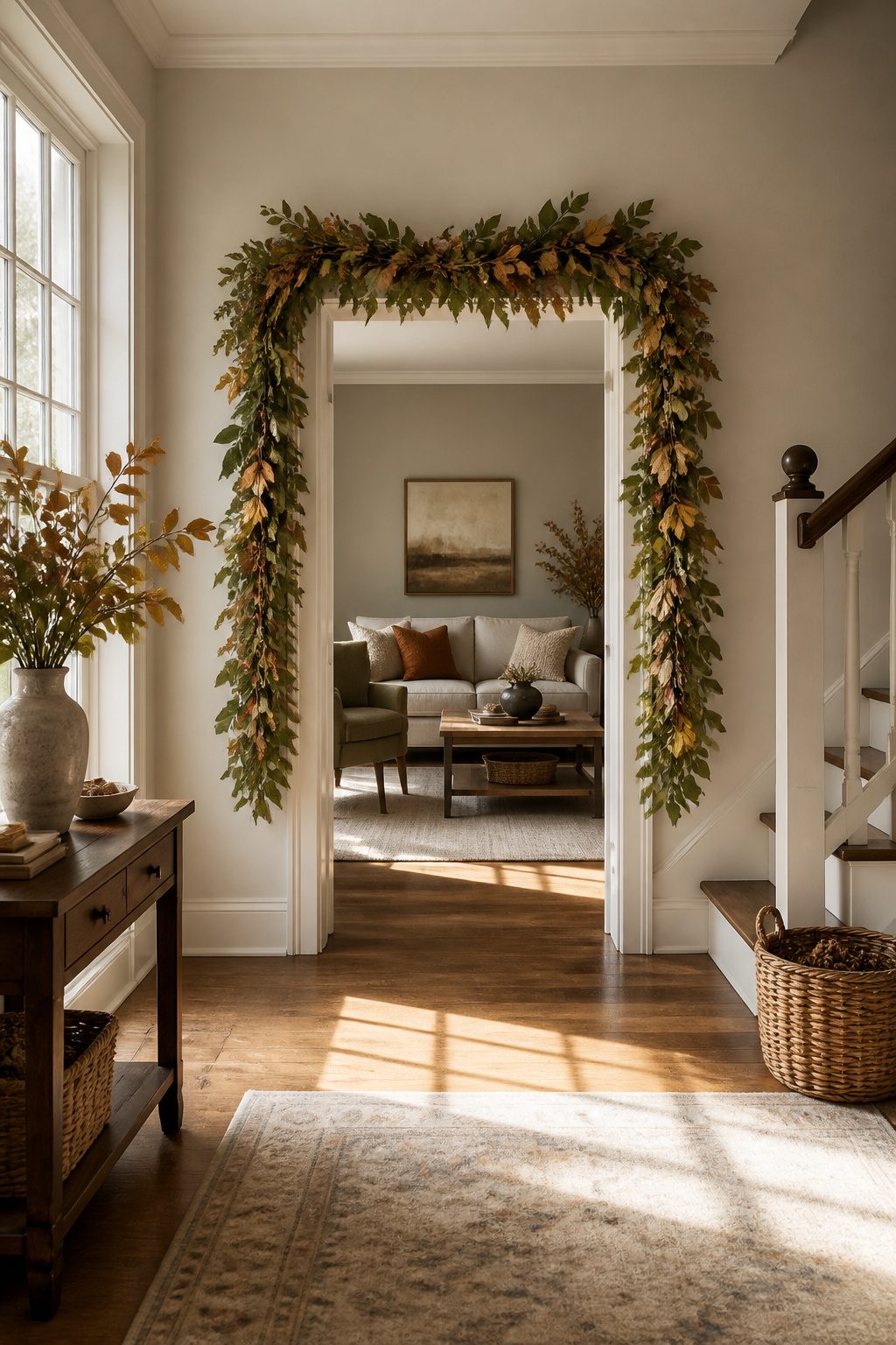
Faux garland around a doorframe reads expensive only if the branches have enough variation in color to not look spray-painted from ten feet away.
The cheap stuff photographs well on a shelf but collapses into a green pipe when you drape it vertically.
For renters, Command strips rated to at least four pounds per hook hold most standard faux garland without chewing the molding.
I used three on a 30-inch header last year and added two more at the midpoint after the first week showed noticeable sag.
Nails leave you filling holes before November; the hooks take thirty seconds to position and an hour to forget about entirely.
Realistic faux garland runs roughly $25–$35 for six feet of decent density. A standard interior door needs about twelve feet if you want fullness at the corners; an exterior door with sidelights can push twenty.
Foraging real branches is free and smells better, but they shed needles across the threshold by week three and the dry fire risk is not worth the savings on an exterior frame with a porch light baking them nightly.
The weight limit that got me was printed on the back of the package, not the front.
A six-pound garland looked identical to the four-pound one, and by mid-October the center hook had peeled clean off, leaving a visible droop I had to rehang in daylight.
Check the total weight against the strip rating before you start, then add one extra hook for the weight of the plug if you are lighting it.
16. Try Pops of Bright Colors
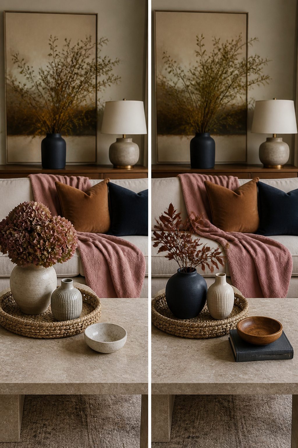
Moody pink against a neutral fall base reads intentional; hot coral reads like August overstayed its welcome. Amy Studebaker grounded her dining room pinks in rattan and collected dishware, which is the move that keeps brights from feeling seasonal tourism.
I would keep the bright accent to about 15% of the visible surface, any more and the eye stops registering fall altogether.
A purple porch can work the same way, but the saturation matters more than the hue itself. The energy reads autumn when the purple carries some weight; go too light and it drifts toward Easter.
Navy and copper is the unexpected pairing that actually holds. It trades the expected orange warmth for something quieter, and copper’s metallic glow does the work that rust would have done in a traditional palette.
The risk is overloading the copper, one too many vessels and the room becomes a brew pub. I would stop at two copper pieces in any single sightline, letting the navy do the heavy lifting of the mood.
17. Use a Chair for Fall Decor
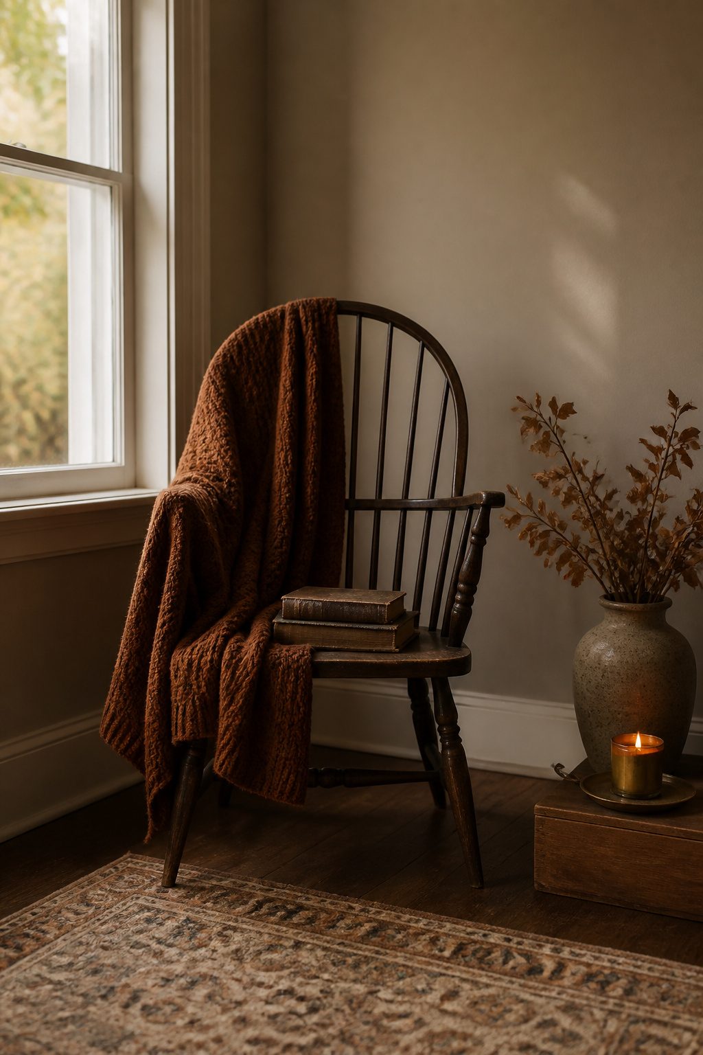
A single chair against a bare wall reads as intentional the moment it carries something other than a backpack.
The ones that work best have visible structure: a spindle back, a woven seat, or clean lines that hold their own without upholstery to soften the silhouette. That shape becomes your frame for layering.
Last year I tried a sheepskin draped over a bentwood chair I found at a Habitat ReStore for $18.
The trick that kept it from sliding was folding the hide in thirds lengthwise and tucking the seat edge under the back rail so gravity worked with me, not against.
A smaller throw in a heavy knit, anchored the same way with the front hem tucked behind the front legs, stayed put through October.
The pile that failed was a stack of three folded blankets with a pumpkin on top; by day four it looked like I was between loads of laundry.
The chair should be the display, not the storage. One textile, one object with weight (a brass pitcher, a stack of two books), and nothing that needs daily fluffing.
If you do not already own the right chair, estate sales and thrift stores move faster than marketplaces for under $40, and a quick wipe with Murphy Oil Soap fixes most finishes without the risk of a full refinish you will never start.
18. Press Autumn Leaves for a Gallery Wall
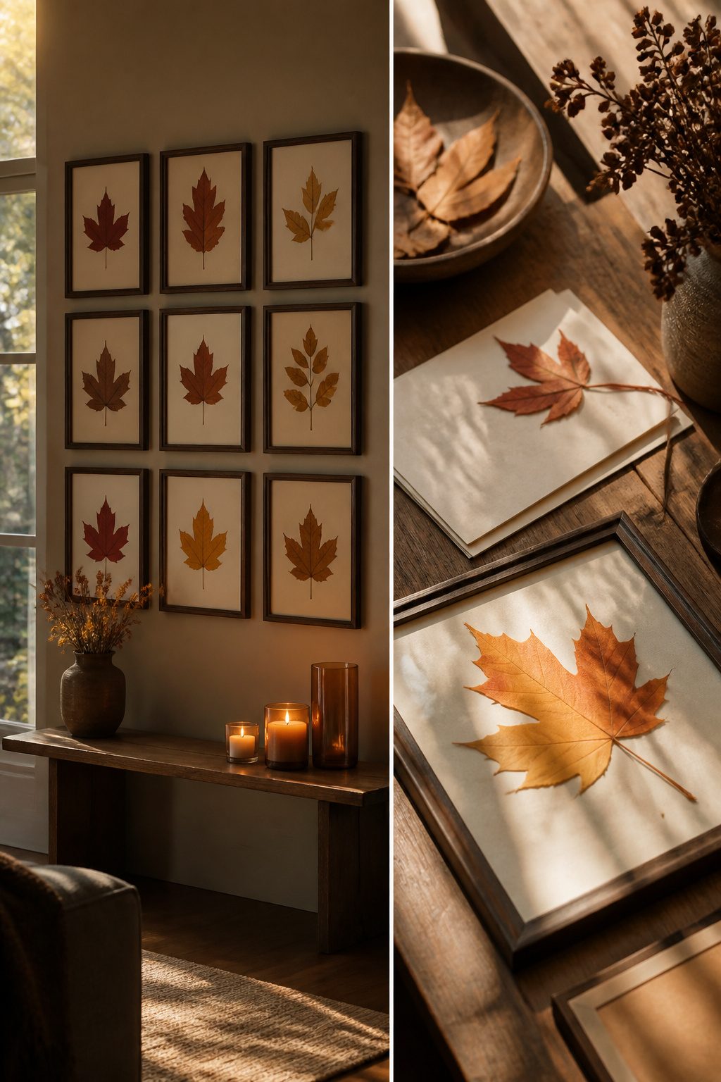
Pressed leaves give a gallery wall color that store prints never match, but the wrong leaf crumbles before Thanksgiving.
Maple and oak press flat and hold pigment for weeks; the red maple I tried three years ago browned inside four days because I sealed it too late.
Press leaves between parchment inside a heavy book for seven to ten days, checking at day five for any soft spots that need more time.
Glass frames float the leaf like a specimen, which feels more modern, but traditional frames with a mat hide torn edges and cost half as much.
I built a grid of six in standard 8-by-10 frames with white mats for about $34 total, skipping the glass float frames that would have run $18 each.
Arrange the grid with two inches between frames, measured at the corners; eyeballing it leaves the whole wall looking tilted even when it is not.
For leaves that brown anyway, a light coat of matte acrylic spray after pressing buys another week or two of color. It is not permanent, but fall decor is not meant to last until spring.
19. Style a Trio of Fall Wreaths
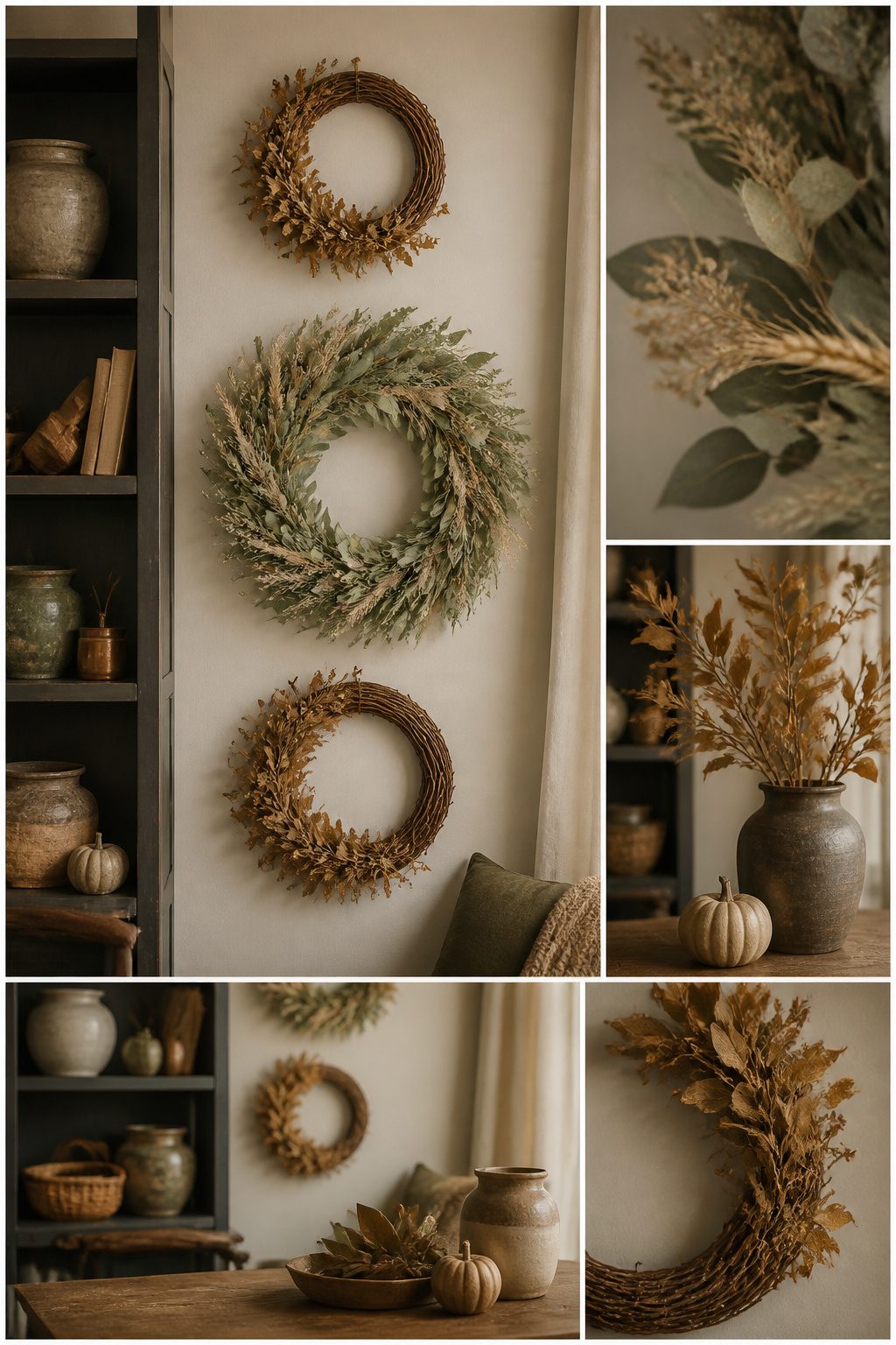
Three wreaths hung in a vertical line down the narrow wall beside my door did more for the entry than any single piece ever managed.
I spaced them 14 inches center to center, which left enough breathing room that each one read as its own moment without the cluster feeling scattered.
The Wanna-Cul Fall Wreath I bought last September hangs at eye level; two smaller grapevine bases flank it above and below, all three in that muted sage and dried wheat palette that reads fall without screaming it.
Renters need to think about what happens in January. I learned this the hard way when command strips rated for five pounds sheared clean off a textured wall after ten days of October humidity.
The adhesive held, but the weight of a wired bow pulled the strip from the paint like a zipper.
Now I use a single small nail in existing door trim for the top wreath, and two pairs of 3M picture-hanging strips per lower wreath, applied to flat painted sections only, never over the bumpy stuff.
20. Go High Contrast with Black and Cream
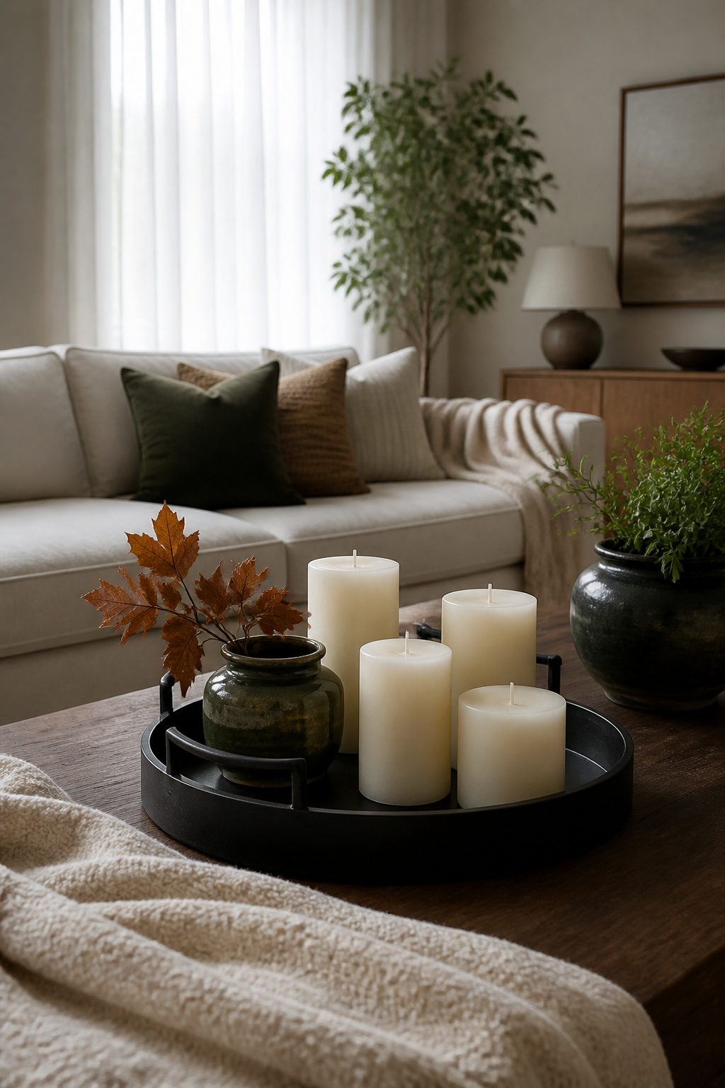
Black reads as Halloween when it shows up in seasonal shapes, but black against warm cream stays inviting when the texture is soft and the lines are geometric.
I learned this the hard way with a set of black ceramic pumpkin candles I placed on a white mantel last fall. The glossy finish and rounded form tipped straight into costume-shop territory.
Moved them to a cream linen runner on the oak console, beside a matte black metal bookend pair holding a stack of neutral art books, and the same color story turned into something I would actually live with past October.
The cream matters as much as the black. Stark white against black feels editorial and cold; cream with a whisper of yellow or ochre underneath keeps the warmth that makes a room feel lived-in.
A paint like Sherwin-Williams Alabaster or Benjamin Moore Swiss Coffee on the wall behind a black iron floor lamp or a few black-framed botanical prints does this without trying. Textiles make the bridge.
A black-and-cream striped cotton throw, or a flatweave rug with the two colors woven rather than printed, keeps the contrast from looking like a graphic design exercise.
The piece that worked best in my place was a simple black metal tray on the coffee table, corraling cream pillar candles and a small stack of oatmeal-colored coasters.
The pumpkin candles only worked once I stripped away every other autumn cliché around them. No orange, no hay, no gourd-shaped anything nearby.
Black and cream gives you permission to edit.
21. Include Subtle Touches in the Entryway
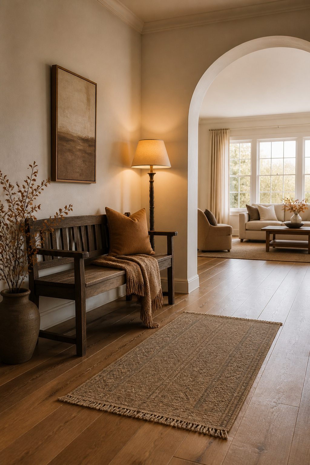
A single object does the work in a narrow entry.
My own measures 34 inches wall-to-wall, barely enough to clear the door swing, so I learned fast that a bench with one folded throw reads intentional and anything more reads like a yard sale.
The textile matters more than the surface.
A 20-inch lumbar pillow in a rust linen or a single sheepskin draped over a painted stool signals autumn without the visual noise of mini pumpkins, pinecones, and that ceramic sign you bought because it was three dollars.
Those small items, grouped, become clutter you stop seeing; the eye skims over them like junk mail. One piece at scale, even 12 inches square, the eye registers.
If you have a shelf or ledge, the rule holds: height, not spread. A five-inch bud vase with one dried stem.
A stack of two books, spine out, color chosen. The mistake I made my first September here was filling a 30-inch console with seven objects I loved individually.
From the sidewalk through the screen door, it looked like storage. I cut to three, then to one leaning mirror propped against the wall.
The space exhaled.
The single object wins when the entry is under 40 inches wide. The bench exists to give it a stage, not to hold a collection.
22. Create a Full Pumpkin Vignette
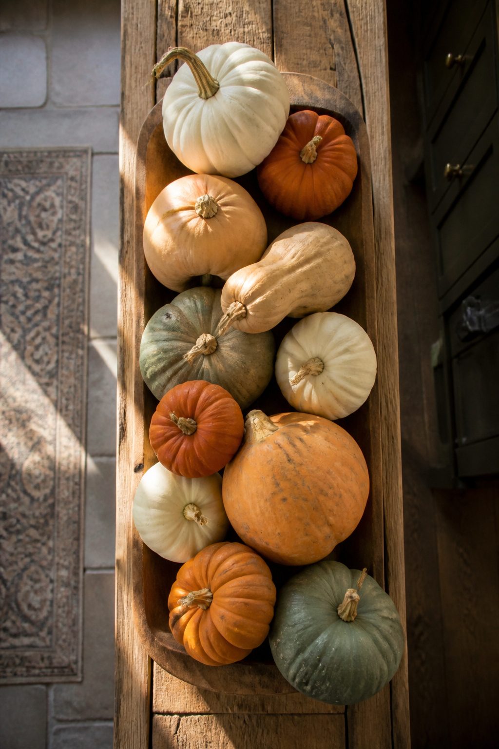
A dense pumpkin display needs at least seven pieces to read intentional rather than accidental.
Last fall I tried six on my kitchen hutch and the gap showed; bumping to nine, mixing a squat sugar pumpkin from the farm stand with taller cheese pumpkins and three faux white ones, finally gave the layered look I wanted.
Grocery store pumpkins run $4–$8, but farm stand heirlooms in odd shapes cost closer to $12–$18 each.
The price gap is real, yet two or three sculptural real ones anchor the whole arrangement while resin and ceramic fillers stretch it through November without rot.
I set mine on the shallow ledge above my radiator, a spot too narrow for books but deep enough for a front-to-back stagger: largest low and center, mediums at the corners, smalls filling the troughs.
Nothing sits in a straight line; each pumpkin catches light from a slightly different angle.
The trick is keeping it off the floor. A windowsill, a sideboard, even the flat top of a tall cabinet reads as curated.
My first attempt spilled onto the entry bench and looked like I’d tripped carrying groceries indoors.
23. Try an Unexpected Color Combo
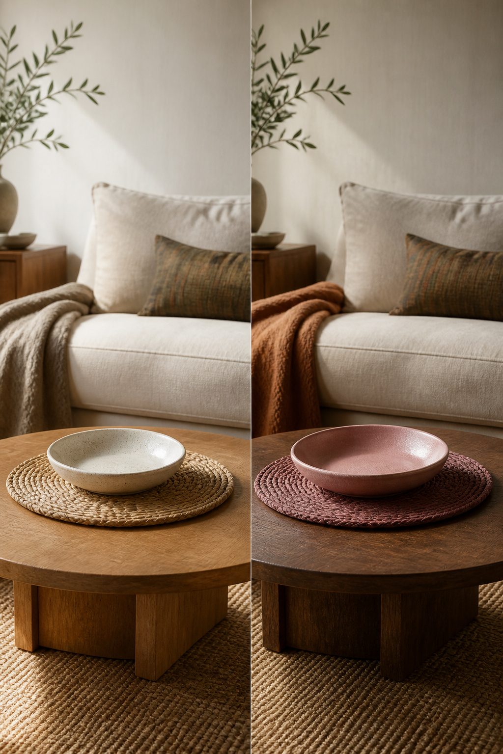
Moody pink against rattan placemats sounds like a mistake until you see it grounded right. The trick is letting one material carry the weight so the color reads as choice, not confusion.
I tried the reverse once, pink ceramic everywhere with natural wood fighting it, and the room looked like two parties arrived at once.
The pairing that works: one color stays quiet while the other does the work.
In my living room last fall I kept the walls and sofa in that ochre-to-mauve range, then dropped a single dusty pink velvet pillow on each end.
The pink sat there like a question someone had actually asked, not like a color wheel thrown at the wall.
Navy and copper taught me the harder lesson. I painted a side table in deep navy and set copper candlesticks on top.
Without enough matte texture, the metallics turned theatrical, a restaurant at 2 a.m. The fix came from switching to copper-toned linen napkins instead, something that absorbed light rather than throwing it back.
The rule I keep now: unexpected colors need unexpected placement. Pink belongs in dishware and florals, not the wall you stare at.
Copper lives better in textiles than metal when the goal is living room, not lounge.
Layer Heavier Textiles
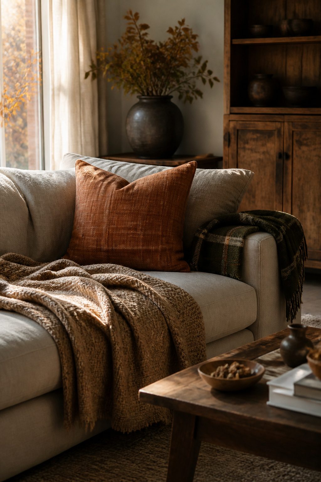
Wool throws in a 50-by-60-inch size from Target’s Threshold line run about $25 each, and two of them layered across a sofa read as intentional rather than accumulated.
The first year I tried this, I bought one thick plaid blanket in red and cream from a farm-style outlet and draped it over the back of the couch. It looked like a ski lodge prop.
The fix was splitting the pattern load: a solid charcoal wool throw on the seat, a narrower plaid in olive and tan folded at the arm, and a linen-look pillow cover in rust pulled from the summer stash.
The combination cost under $80 and took ten minutes to arrange.
Plaid works best at half the visual weight you think you need. One draped piece, one pillow, and the eye registers the pattern without the room shouting "cabin."
Deeper shades of plum or tobacco through small upholstered pieces, as some designers prefer, shift the mood more subtly than seasonal red.
For renters with one closet, washing is the bottleneck. Wool-blend throws survive a delicate cold cycle and air-drying on a folding rack; pure wool wants dry cleaning at $12 to $18 a piece, which erases the budget appeal.
I store folded throws in an under-bed bin with cedar blocks rather than hanging, which stretches the weave. The bin costs $8 and slides out of sight until October.
Add Candles and Seasonal Accents
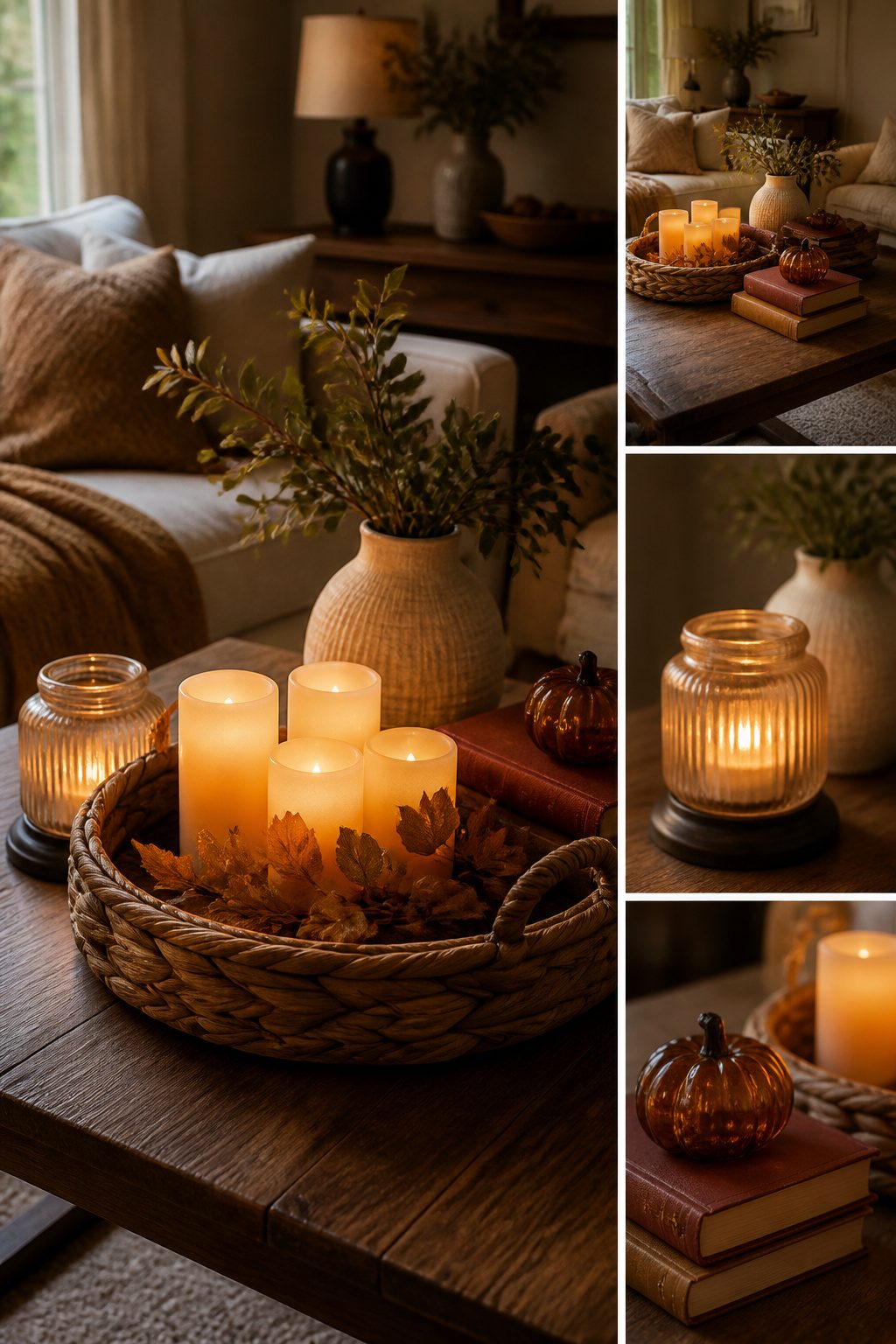
Flameless pillar candles in a woven basket changed how I approach fall evenings.
The remote that comes with the set means no more leaning across furniture to blow out a real flame before bed, and the narrower versions fit standard candlesticks without the wax-drip anxiety that used to ruin my thrifted holders.
Vintage books in auburn and golden shades do more work than seasonal signs ever did for me. The signs read temporary, like a restaurant changing its chalkboard; stacked leather spines or faded cloth covers read collected.
Scented candles layered in with them add the sensory hit without the visual noise.
The FCTWAKS mid-century glass candle warmer lamp at $50 in orange is the piece I point renters toward. It extends votive life, removes the open-flame issue entirely, and the color reads fall without screaming it.
Copper mugs or a small teapot nearby pick up the warmth without requiring a dedicated decor budget.
DIY Fall Projects That Survive a Weekend
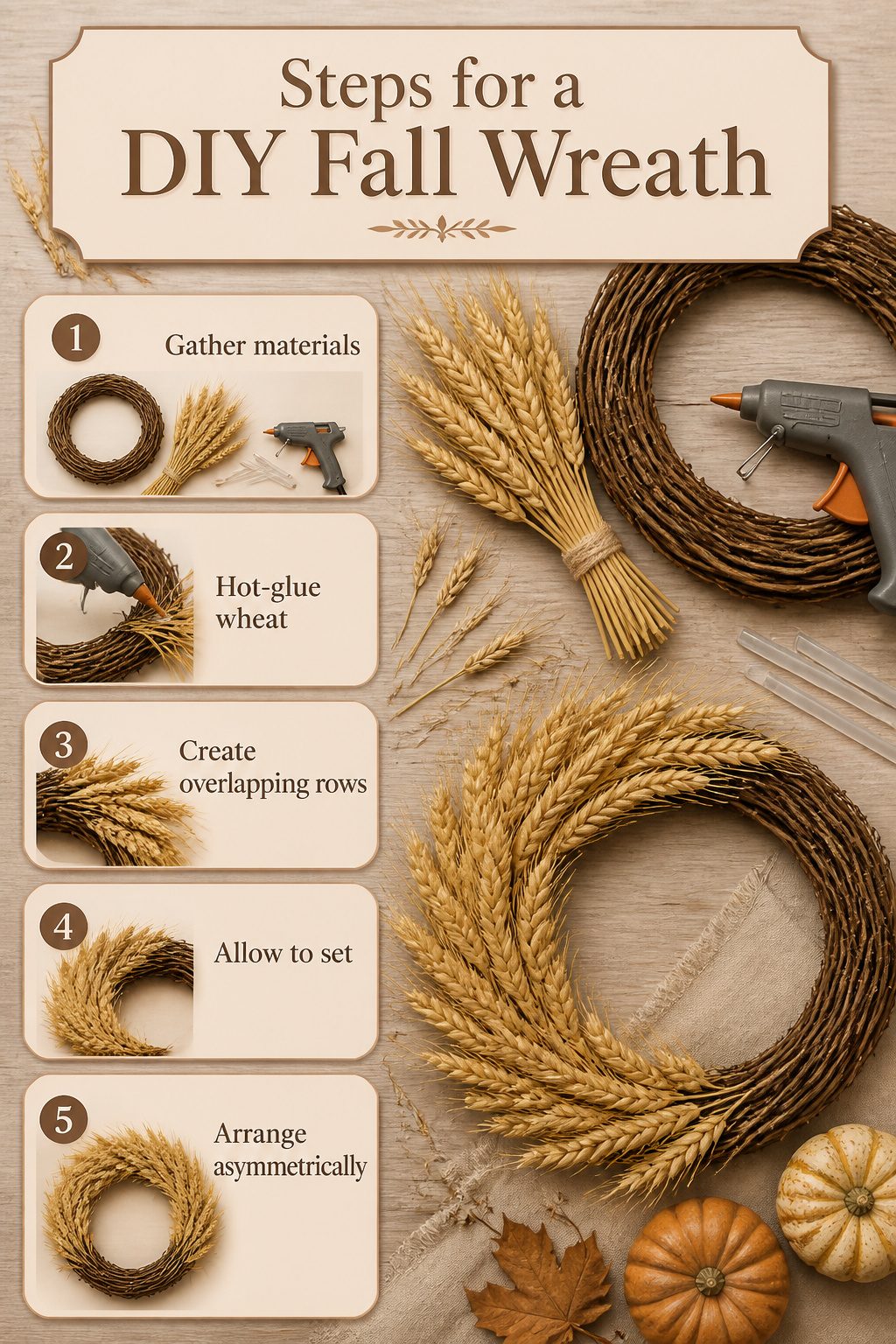
A grapevine wreath base runs about $8 at craft stores, and a plain one with nothing glued to it already looks better than the foam rings that scream preschool fundraiser.
Last October I tried the dried wheat version, which is straightforward in theory: hot-glue wheat stalks in overlapping rows until the base disappears. I budgeted two hours and $22 in materials, counting the $14 wheat bundle from a farm stand.
The wheat had been sprayed with something waxy to prevent shedding, which my source had not mentioned, and the glue set so slowly that each stalk slid out of place while I held the next one.
Three extra hours, three burnt fingertips, and a wreath that still lists slightly to the left.
The mistake projects, the ones that look handmade in the bad way, usually come from visible glue blobs and perfectly even spacing. Natural materials need irregular placement; your eye catches repetition faster than asymmetry.
A grapevine base forgivingly hides attachment points, whereas foam demands perfect coverage. At $46 for a ready-made pumpkin and berries garland versus roughly $30 in supplies and an evening of cursing, the buy-it option wins unless you genuinely want the activity.
The framed landscape art under $70 from the same sources offers a smarter time trade: instant wall presence, no glue gun, and a neutral palette that carries past Thanksgiving without looking like you forgot to undecorate.
Decorate for Fall on a Budget
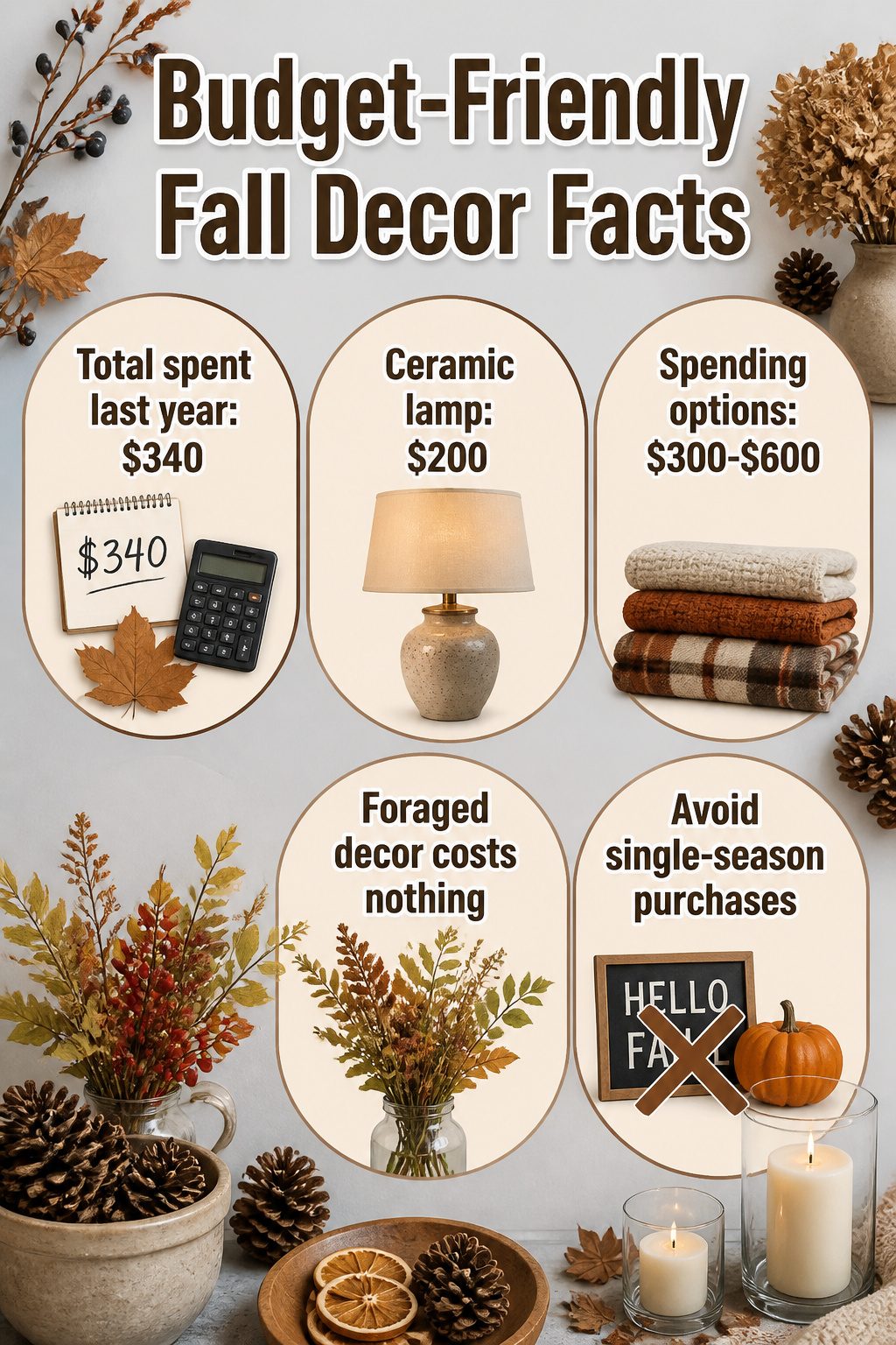
Most of what fills my apartment each October costs nothing at all. Last year I spent $340 total on fall decor, and $200 of that was one ceramic lamp from a estate sale that I use year-round with different shades.
The rest came from a walk through the park with pruning shears, a paper bag of pinecones from my parents’ yard, and the same glass hurricanes I’ve rotated since 2019.
The splurge that paid off was that lamp; its weight and the way the glaze catches evening light makes every cheap dried stem look intentional.
The waste was a $48 cinnamon-scented reed diffuser that turned my entryway into a candle shop for three days before I hid it in a closet.
A few hundred dollars goes further when one piece is heavy enough to anchor everything else.
My typical yearly spend sits between $300 and $600 if I’m replacing worn textiles, under $250 if I’m only adding foraged branches and a new taper candle color.
The math works because I stopped buying single-season signs and plastic gourds that read as grocery store afterthoughts.
Reuse and Source Vintage for Sustainability
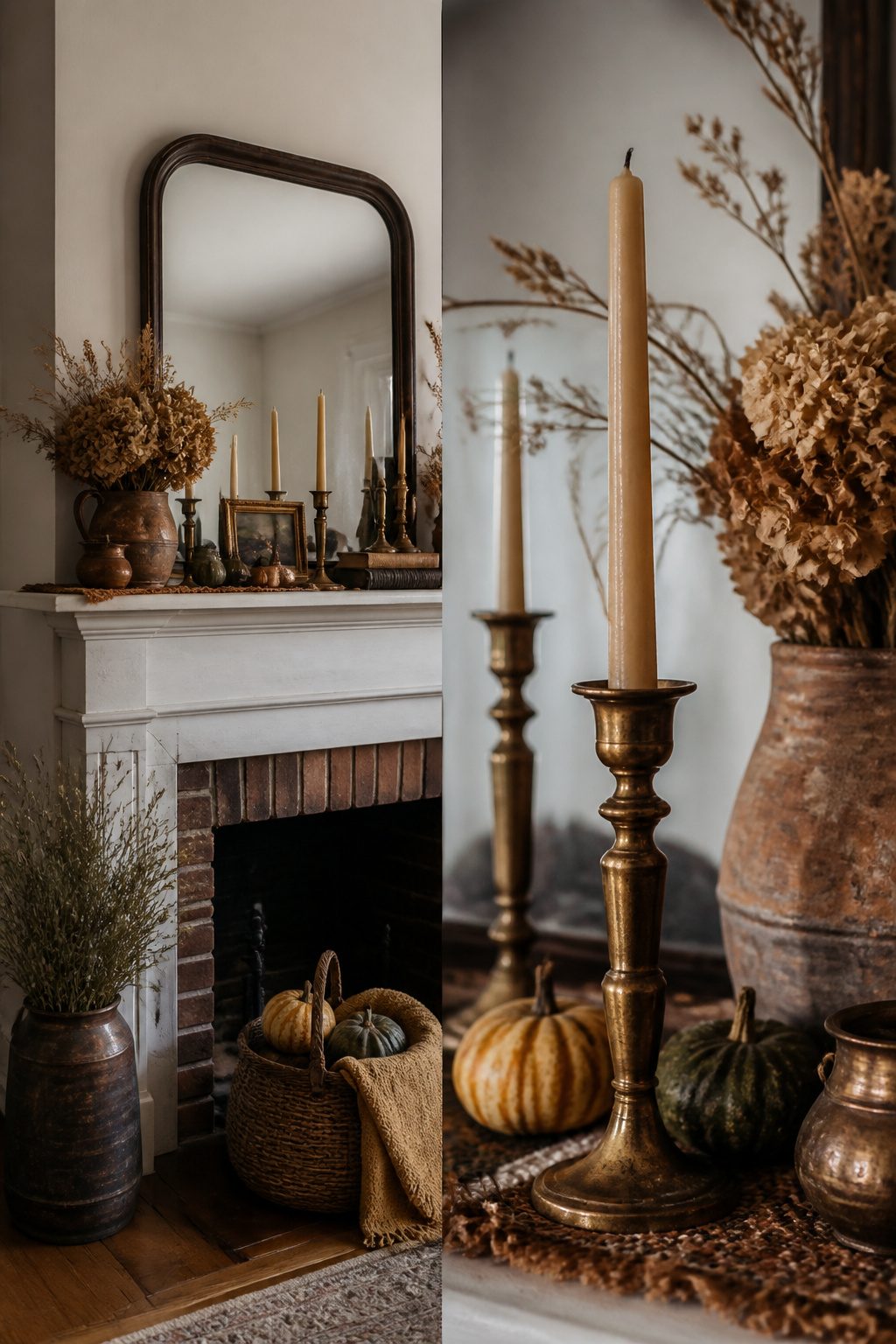
Brass candlesticks from my grandmother’s attic became the spine of my fall mantel three years ago, and that repetition is what makes the look feel intentional rather than leftover.
The first season I paired them with grocery-store gourds; by year two I had stripped the lacquer and let the tarnish show, which reads warmer against late-autumn light.
Skip anything with chipped enamel or a motor, even at two dollars, estate sale junk drawers are full of broken appliances dressed up as vintage.
I have paid between eight and fifteen dollars for solid brass candlesticks that would run forty new, and the environmental math is straightforward: no new ore mined, no overseas shipping, no packaging to break down.
The aesthetic argument is weaker than people pretend. A 1970s amber glass vase is not automatically chic; it becomes chic when you place it where the afternoon sun turns it into a lantern.
That takes noticing, not money. Arrive at estate sales in the final hour when prices drop, but carry a flashlight to check for cracks the overhead bulbs hide.
Frequently Asked Questions
When should you start decorating for fall?
Start when the air feels cooler outdoors, which for many people means late August with rustic items like baskets filled with dried stems. Others wait until September becomes October.
The article suggests leaning into materials that catch autumn light, such as pampas grass and dried florals, rather than rushing the calendar.
How do you decorate for fall in a chic style?
Focus on cream, taupe, rust, and brown instead of traditional orange, and mix natural materials like wood, brass, and linen.
The article recommends pulling real elements that rot beautifully, like pears and dried wheat, while using faux stems for spots where maintenance would fail. Keep the palette neutral and let texture do the seasonal work.
How do you decorate a front porch for fall?
Frame the doorway in garland with enough branch variation to avoid a spray-painted look, and use Command strips rated to at least four pounds per hook for renters who want fullness without nail holes.
The article notes that farm-stand corn stalks under six feet tall work indoors for standard ceilings, while steel rebar and zip ties keep outdoor stalks upright through October wind.
How do you decorate a dining room table for fall?
The article does not specifically address dining tables, but the principles carry over: use odd numbers of objects, keep heights varied, and choose vessels with weight.
A low ceramic bowl of Bosc or Anjou pears, perhaps with a single brass candlestick or a few dried oat grass plumes, reads as intentional without blocking sightlines across the table.
How do you decorate a fireplace mantel for fall?
Fight the instinct to center everything. Build layers that pull the eye sideways with one heavy piece off-center, then let the rest trail lower on the opposite side.
The article recommends three layers max, a low vessel in front, something medium behind it, and one taller form at the back, with simple black metal bookends to anchor short stacks of vintage books.