
A neutral dining room is a space built on whites, grays, beiges, and light browns, where the absence of strong color puts texture and light to work instead. The catch is that flat beige walls with flat beige furniture read as neglect rather than restraint, as the article notes, layering three textures minimum before buying a second paint swatch. Colonnade Gray by Sherwin-Williams is one specific paint that shifts under different lighting, reading warmer at brunch and cooler by candlelight.
Modern Minimalist
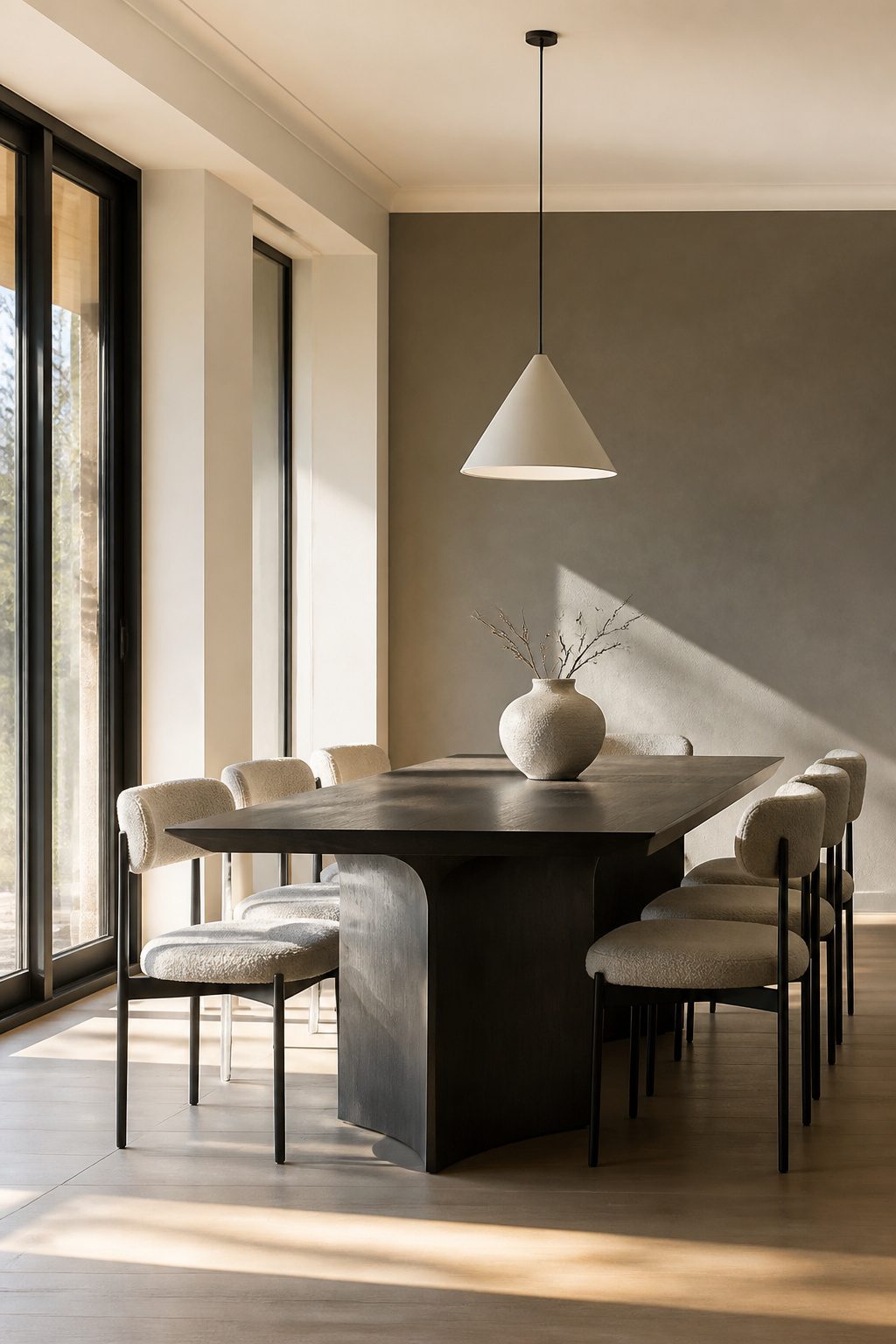
Clean lines and a monochromatic palette work best when restraint serves the room rather than punishing it. Colonnade Gray by Sherwin-Williams shifts gracefully under different lighting, so the same wall reads warmer at brunch and cooler by candlelight without ever fighting the furniture. I test paint at three times of day before committing; the color that looks calm at 10 a.m. can turn flat by evening if the undertones skew wrong.
Farrow & Ball’s School House White No. 291 sits at the warmer end of white, which keeps a stripped-back space from feeling like a gallery you are afraid to sit in. Pair it with negative space and one or two pieces that earn their place: a single pendant, a table with a profile worth seeing from every angle. The mistake is filling the quiet with small objects that break the calm without adding function. Let the architecture do the work. A feature wall in a subtle geometric print or soft metallic sheen adds depth if the room feels too still, but the print should read as texture from across the room, not pattern up close.
Farmhouse Chic
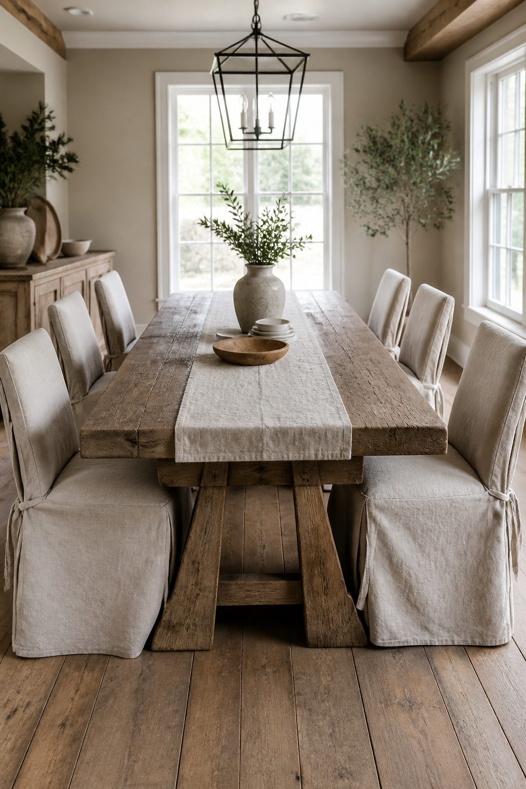
Distressed wood tables and soft linen runners built the farmhouse look I keep coming back to for rental dining rooms. The style works because the wear becomes part of the charm: a ring from a hot dish or a snag in the fabric just adds to the lived-in feel rather than ruining the room. Cream and beige grounds keep the palette neutral, while reclaimed wood or a table with visible grain gives the space something to rest your eyes on.
The balance between rustic and polished matters more in a first home than in magazines. I have seen rooms fail when every surface looks deliberately beaten up, like a stage set. One genuinely distressed piece, a table or a beam if you are lucky enough to have one, does more than five matching "distressed" items from the same catalog. Soft linens on the chairs or a checkered runner soften the edges without competing. In a rental, where you cannot install beams, a single reclaimed wood table against clean walls gives you the warmth without the commitment. Swap the linens seasonally and the room refreshes for the cost of a yard of fabric, not a furniture set.
Transitional
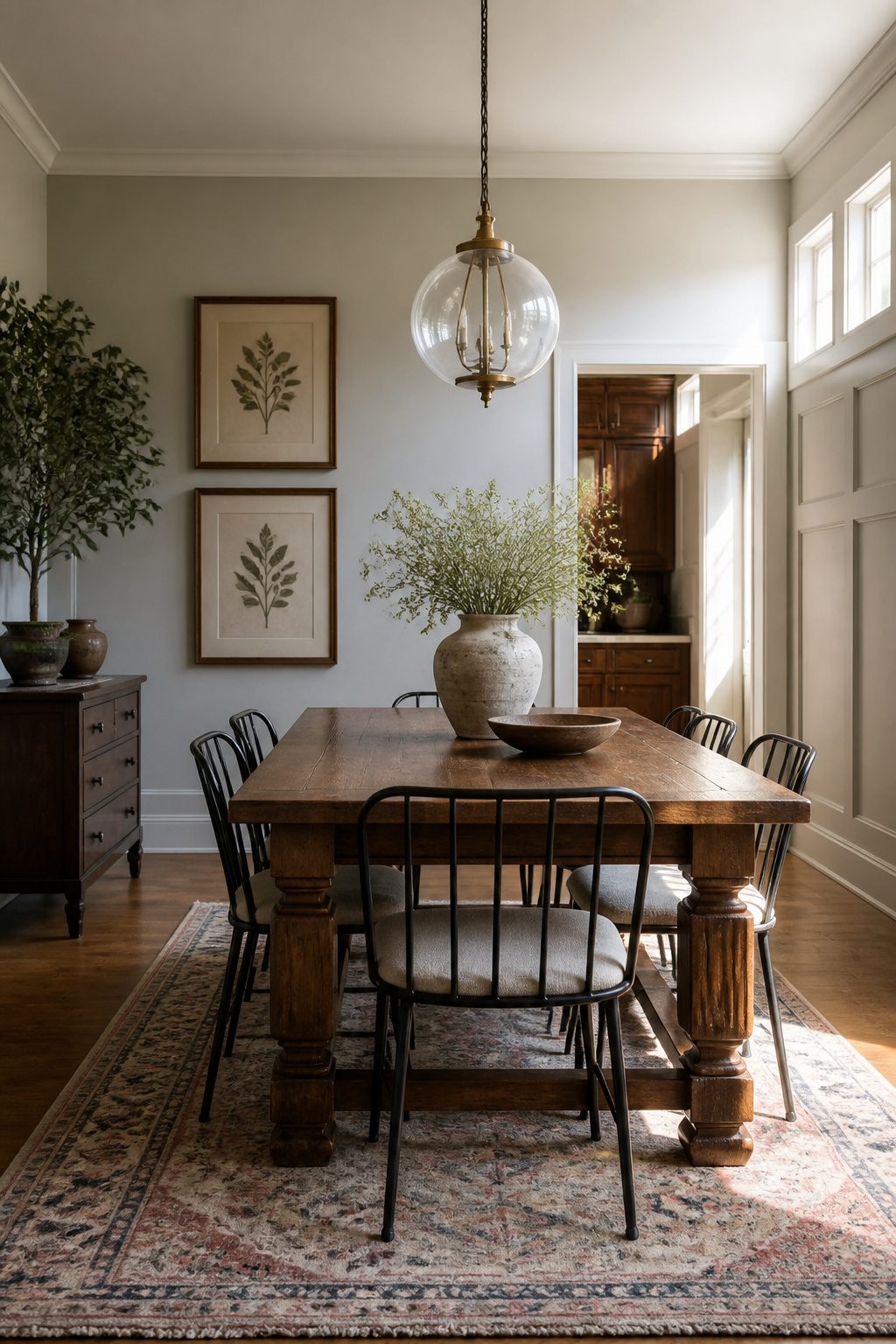
A transitional neutral dining room works best when one era carries about sixty percent of the visual weight and the other fills in around it. I learned this the hard way after inheriting my grandmother’s mahogany table and trying to pair it with a glass chandelier and acrylic chairs I found on sale. The room felt like two households arguing.
Traditional elements usually want to lead in dining rooms because they are heavier visually. A carved wood table, a Persian rug in faded neutrals, or wainscoting on the walls anchors the space. Contemporary pieces then act as relief: a slim metal pendant, linen curtains with clean edges, a simple ceramic vase. Swap that ratio and the modern pieces start looking like mistakes rather than choices.
Color is what actually bridges the gap. Keeping walls and large textiles in warm whites, greys, or greige lets a carved leg and a powder-coated frame sit in the same room without shouting at each other. The neutral palette becomes the common language.
For renters or first-home owners piecing things together over time, this approach saves money. You do not have to replace every hand-me-down at once. Buy the contemporary light fixture this year, live with the old table until you find something better, and let the paint do the work of holding them together.
Beachy Coastal
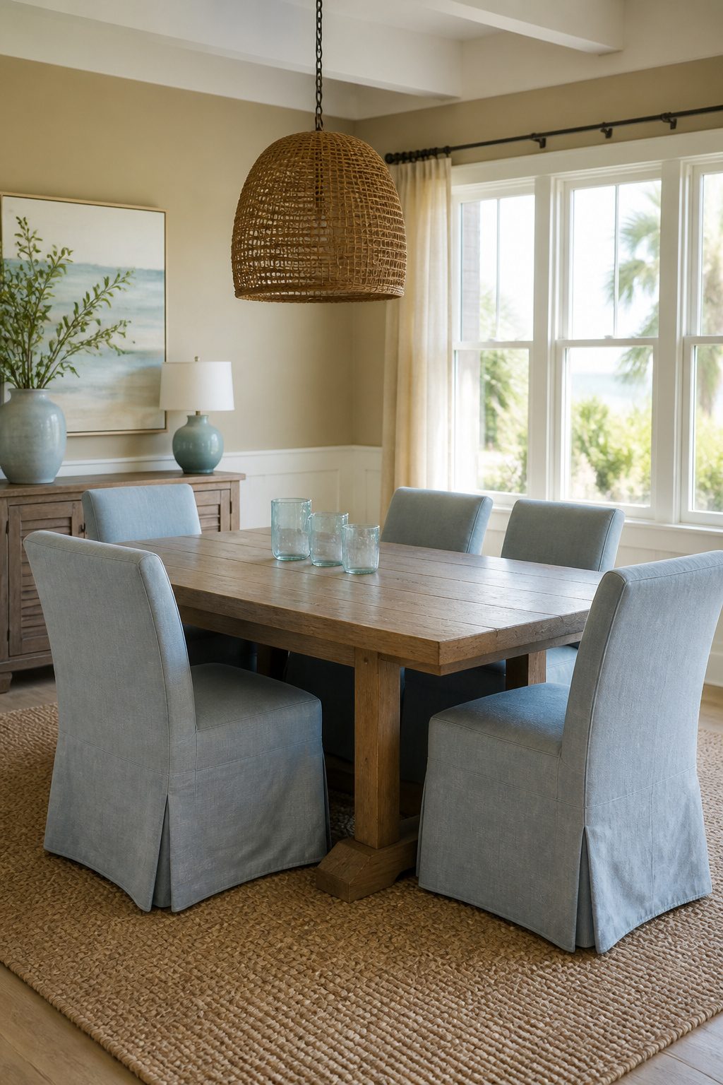
Sand tones read warmer than greige on dining room walls, and pairing them with the softest blue, something like a sky just before it turns gray, keeps the coastal suggestion from tipping into beach house costume. I learned this the hard way in my first apartment, where I painted an accent wall a seafaring navy and spent two years explaining to guests that no, I did not vacation in Cape Cod.
The restraint matters most in textiles. A woven jute rug grounds the palette without shouting nautical, and natural linen curtains in oatmeal or foggy blue-gray feel lived-in rather than staged. Skip rope detailing, anchor prints, or anything that would read coastal in a vacation rental listing. Slipcovered chairs in washed cotton or light canvas work better than glossy teak or weathered-look furniture, which tends to feel like set dressing the moment you landlock it. What sold me on this approach was noticing how a friend’s Ohio dining room still managed to feel quietly shore-adjacent: sand-colored walls, pale blue glass votives she’d collected from actual beach trips mixed with plain white ceramics, and a cotton flatweave that had softened over years of real dinners. The coastal reference was in the color story, not the props.
Scandinavian
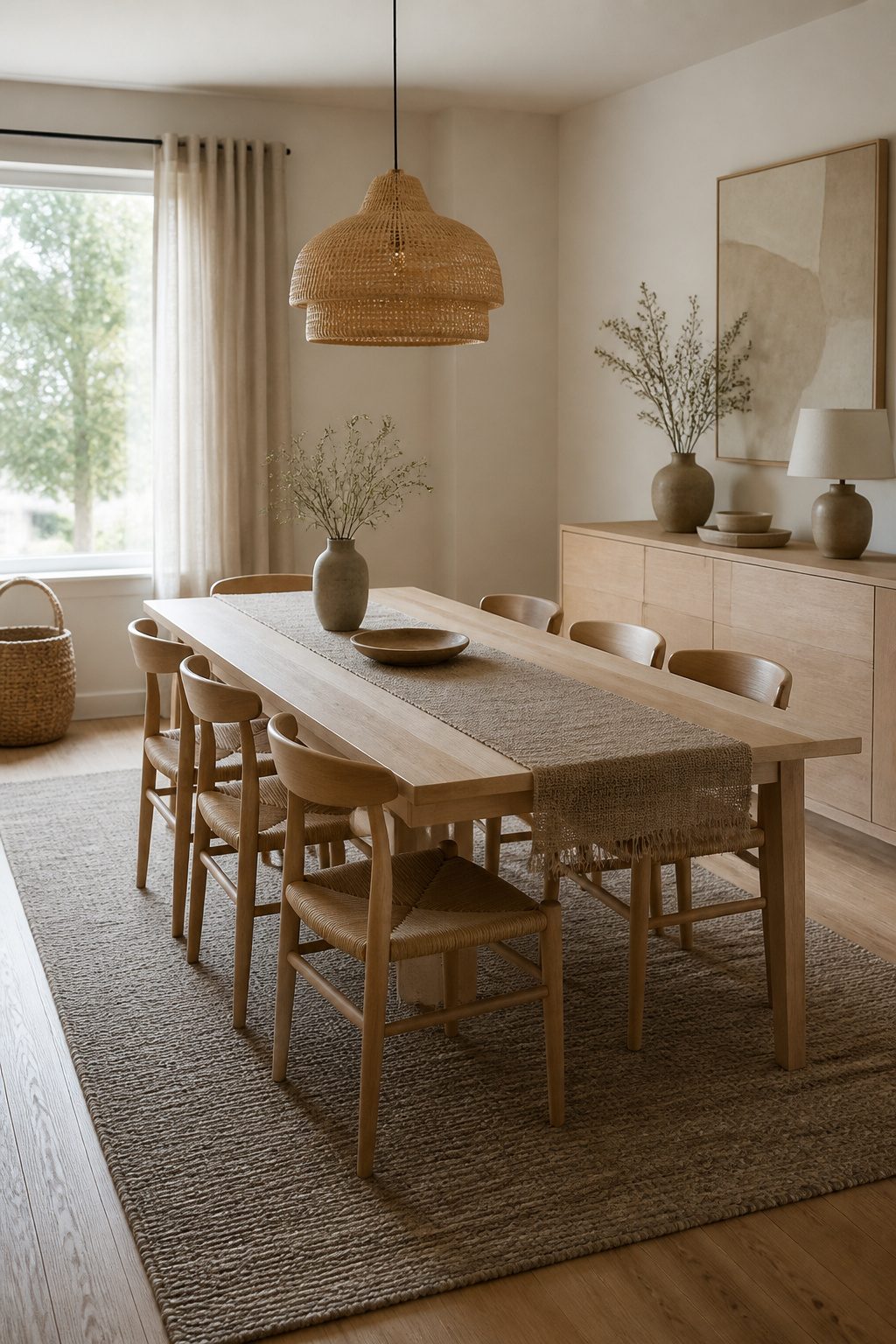
Pale ash and white oak set the tone in a Scandinavian neutral dining room, but the real work is keeping those light woods from reading as sterile. The mistake most people make is stopping at the furniture and calling it done. A bare birch table under a bare white pendant looks like a showroom floor, not a room anyone actually eats in.
The fix is in the weight of what you layer on top. Heavy linen curtains in an unbleached oatmeal, a wool runner with some actual loft to it, and ceramic pieces with a hand-thrown unevenness all add the warmth that raw wood alone cannot. I have seen rooms where the wood was perfect and the feeling was still cold because every textile was too thin, too sheer, too afraid of blocking light. Linen at 200 gsm or heavier, wool blankets folded over chair backs, a single sheepskin on the bench: these are the specific weights that shift the room from laboratory to lunch.
Wood tone matters too. Stay in the 60–70 range on the Janka hardness scale if you want the pale look without the yellow cast that cheaper pine picks up under LED bulbs. Ash hits that mark cleanly, and so does white oak if you avoid the rift-sawn grades that run too uniform. The grain itself is the decoration; let it stay visible with a matte oil finish rather than sealing it under polyurethane that turns plastic-bright.
For a weekend project, swap out hardware-store pendant shades for something in washi paper or woven reed. The diffused light does more for the mood than any paint color change, and the swap takes an afternoon.
Relaxed Neutrals
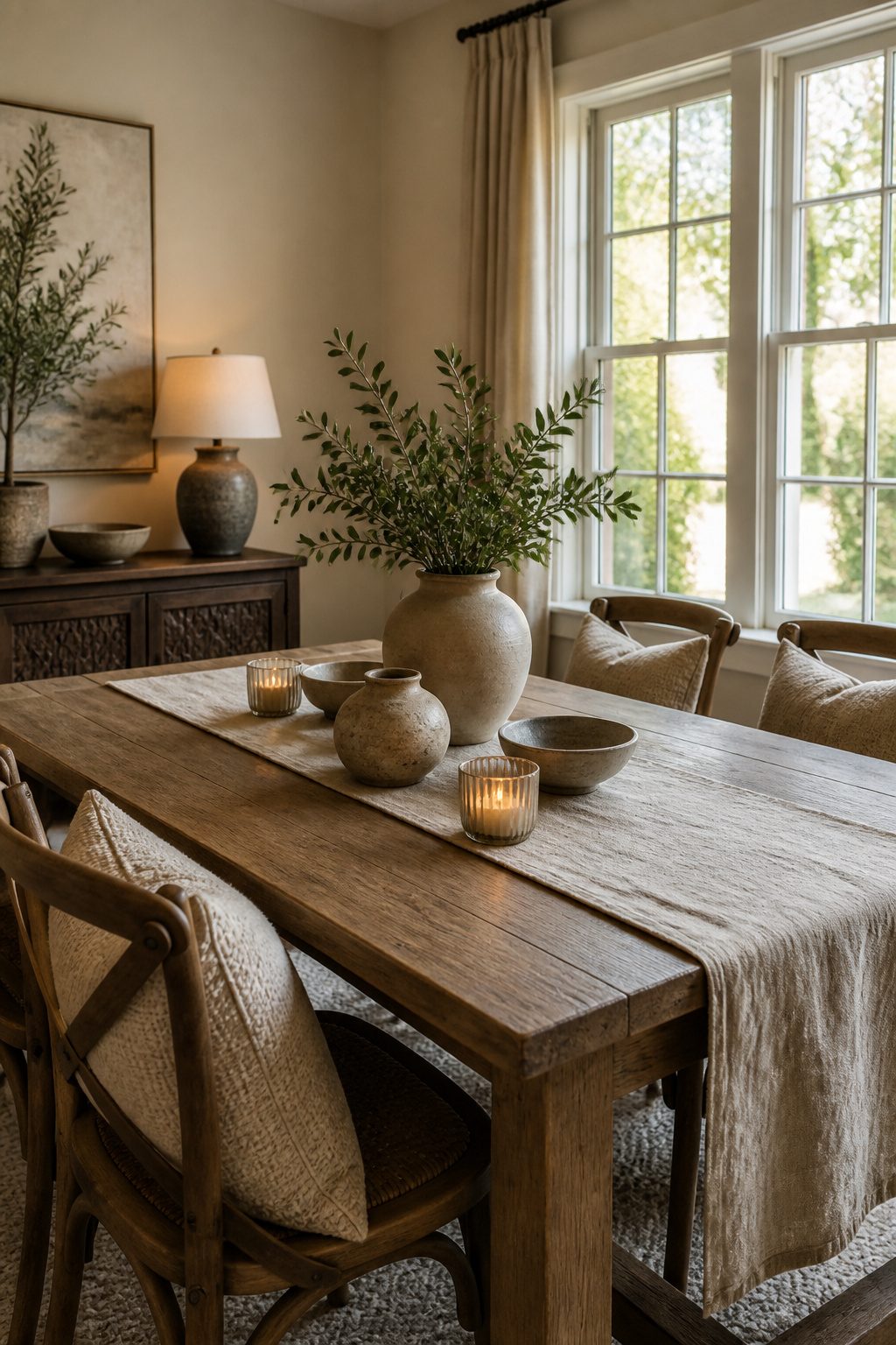
Soft hues read as unfinished when they sit alone on flat walls. The difference between a room that feels lived-in and one that looks like a project paused halfway is layering texture before you worry about color. Wood grain, nubby linen, matte ceramic, and the soft reflection of glass each do work that paint cannot.
Minimalist approaches keep surfaces quiet and edges sharp. Relaxed neutrals do the opposite: they let the drywall show its hand-taped seams, leave the plaster slightly uneven, and choose bulbs that warm toward amber rather than clinical white. The result is comfort over crispness, a space that invites bare feet and second helpings rather than gallery behavior.
Lighting makes or breaks this. Natural light through large windows softens edges all morning; warm-toned fixtures carry that into evening so the room never snaps into something colder after sunset.
These soft hues make every room feel cosy and comfortable, perfect for casual family meals or more formal occasions.
What this means in practice: start with three textures minimum before you buy a second paint swatch. A linen runner, earthenware plates, and a wooden bowl accomplish more than another coat of greige.
Architectural Neutrals
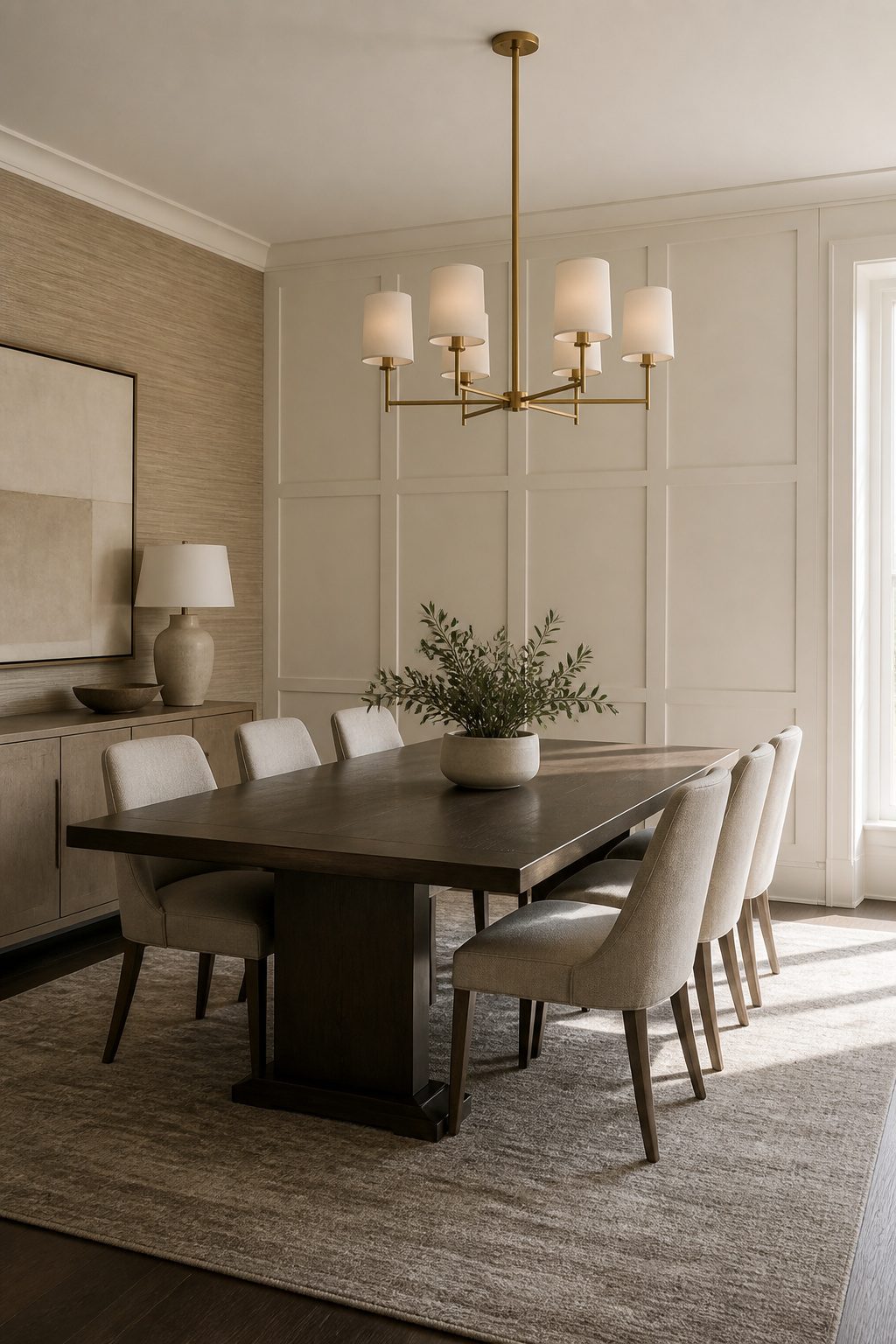
Rental dining rooms usually arrive with flat drywall and a single ceiling fixture, so the architecture has to be invented rather than celebrated. I learned this in my own place, where the only "detail" was a popcorn texture I would have paid to remove.
Paneling applied with construction adhesive and a nail gun into studs creates the shadow lines that read as built-in character. Board-and-batten in particular scales well to dining room proportions: three-inch battens on sixteen-inch centers, topped with a horizontal rail at chair-rail height, break a blank wall into intentional geometry. The adhesive means it survives a lease; the nails mean it does not shift when someone brushes past with a laundry basket.
Wallpaper functions as fake architecture too. Grasscloth adds actual fiber depth where paint would sit flat, and tone-on-tone geometrics read as paneling from across the room without the carpentry. One accent wall is usually enough; four walls of pattern fight the neutrality you came for.
Lighting temperature matters more here than in busier rooms. Warm bulbs around 2700K keep pale walls from reading as institutional, while cooler 3000K–4000K sources flatten cream into gray. I swap bulbs before I swap fixtures, since the fixture itself is often replaceable but the wiring is not.
Moldings installed with removable caulk trace doorways and ceilings the same way eyeliner defines an eye. One-inch picture molding just below crown height, painted to match the wall, casts a thin shadow that reads as depth rather than decoration. It takes a Saturday and a miter box, and it leaves a nail hole every sixteen inches that spackle fixes in an hour at move-out.
Timeless Neutrals
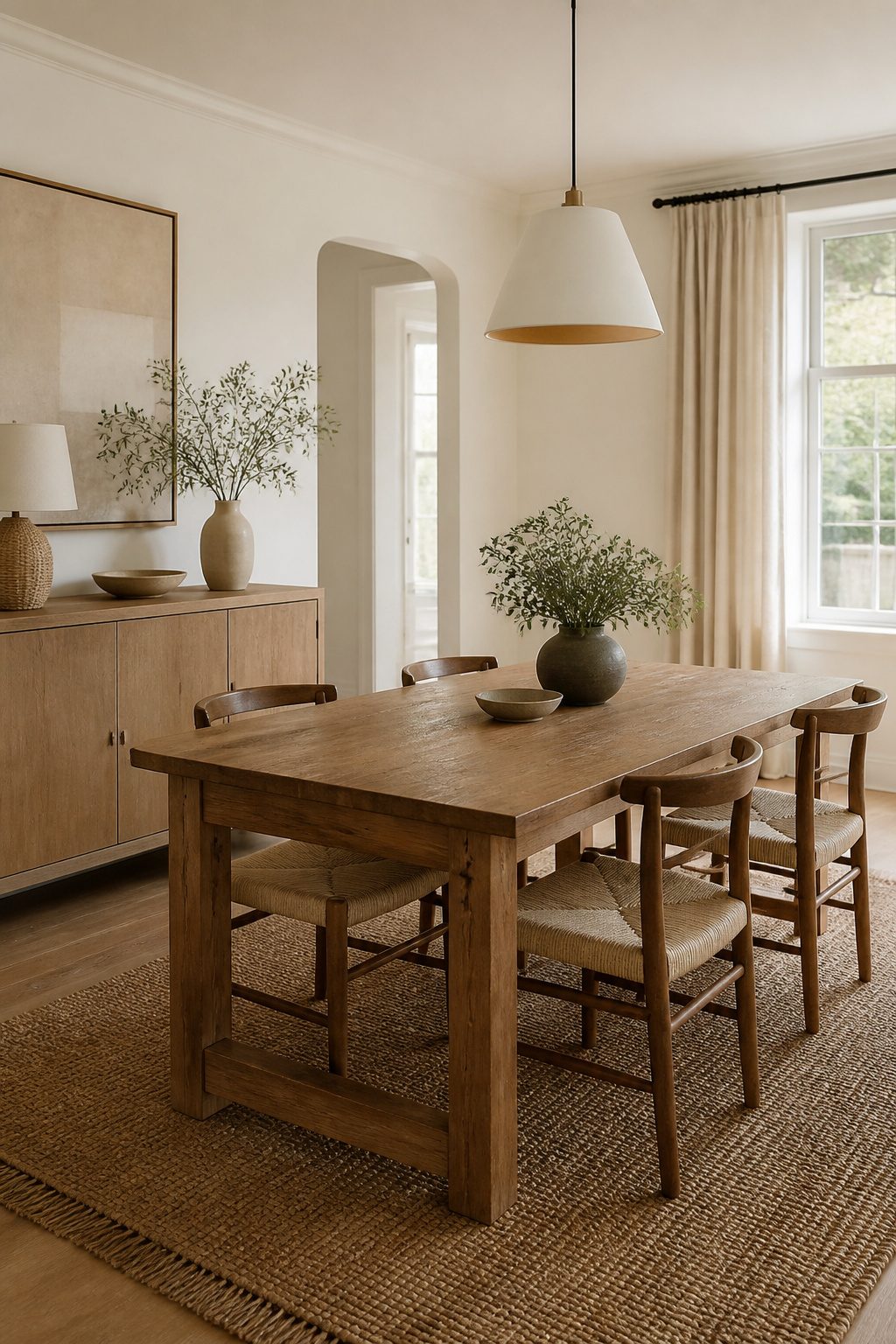
A dining room built on whites, beiges, grays, and light browns stays readable through every trend cycle because the palette does not compete with the architecture or the company. What separates genuinely timeless from merely safe is layered texture: wood grain against linen, matte plaster beside glass, metal catching warm-toned light. Without that variation, the same neutral set goes flat and forgettable.
The payoff is in the math. A neutral shell means swapping table runners, lamps, or a vase arrangement refreshes the room for the cost of accessories, not furniture. I have watched friends repaint bold feature walls every three years while the understated base they started with only needed new textiles to feel current. Natural and artificial light both matter here; large windows or fixtures with warmth in the bulb keep pale walls from reading sterile after sundown. The enduring appeal is not in playing it safe but in building a ground flexible enough to outlast your next dozen mood boards.
Warm Neutrals
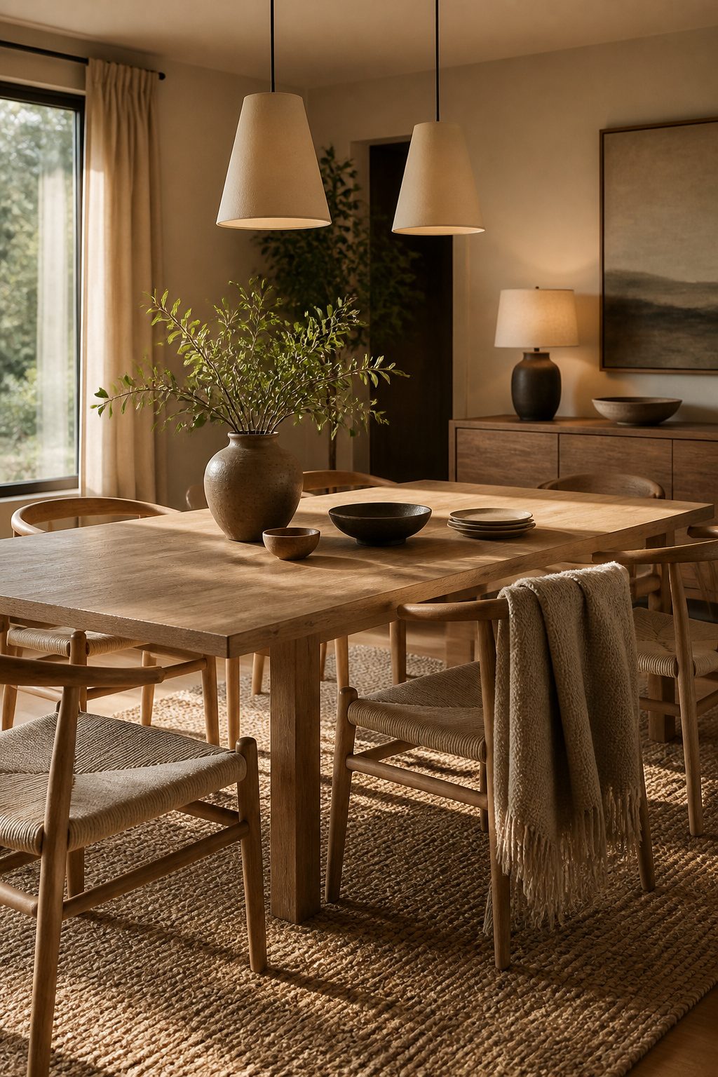
Warm paint undertones run yellow, pink, or green rather than blue or gray, and that distinction matters more in a dining room than almost anywhere else because you see the space at two extremes: morning light pouring in sidelong, and evening light dropping to nothing but whatever bulbs you installed. I learned this the hard way with a greige that read cozy at 10 a.m. and sterile by dinner. Test samples on multiple walls and check them at both times; a color that balances warm and cool under one condition will usually pick a side under another.
Bulb temperature finishes the job the sun starts. Around 2700K pulls out whatever warmth lives in the paint, while 3000K–4000K can flatten the same color into something institutional. My rule now is to match the bulb to the undertone: if the wall leans warm, commit with 2700K everywhere. Mixing color temperatures in one room, which happens easily with a dimmer or a stray LED replacement, makes the walls look like two different paints.
Texture keeps warm neutrals from sliding into monotony. A flat beige room with flat beige furniture reads as neglect, not restraint. Layering wood grain, a woven neutral rug with a subtle pattern, and whatever soft goods the budget allows gives the eye somewhere to rest without breaking the palette. The sources I trust on this point to linen and unlacquered brass as reliable warm-leaning materials, neither of which fights a creamy wall.
Traditional Neutrals
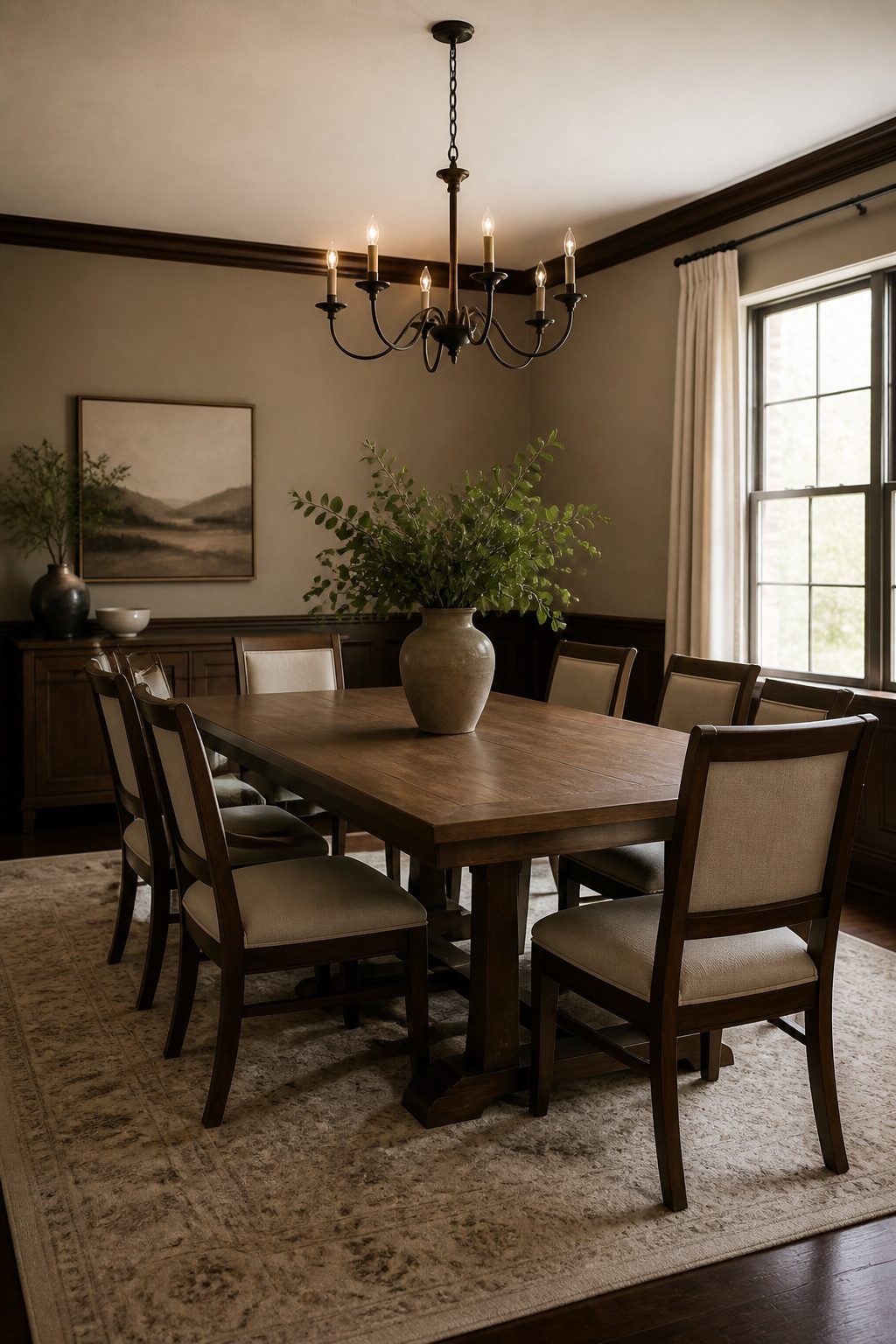
Traditional neutrals carry a quiet formality that works because it does not insist on itself. A room painted in these understated shades still reads as a dining room when the table is set for guests, yet it softens into something more relaxed the rest of the week when the same surface holds laptop chargers and half-finished puzzles. The familiar, reassuring quality of these tones comes from their long association with gathering spaces; they signal occasion without demanding one.
The balance to strike is between backdrop and atmosphere. Too cool a neutral and the room turns sterile when candlelight hits it; too warm and it collapses into the background of daily life. The shades that last lean slightly warm, with enough gray in the base to keep them from yellowing as evening comes on.
For furniture, solid wood in natural or lightly stained finishes holds this line better than painted pieces, which can read as either too casual or too deliberate depending on the surrounding architecture. A wooden table and matching chairs ground the space in something that honors conventional dining room formality without stiffness. The same set works for a quick Tuesday breakfast and a Saturday dinner that runs late; the material does the shifting, not your schedule.
Where this palette risks falling flat is in texture. Flat walls and flat upholstery in similar values will flatten the room. Varying the surface quality, even subtly, does more than varying the shade.
Color Selection
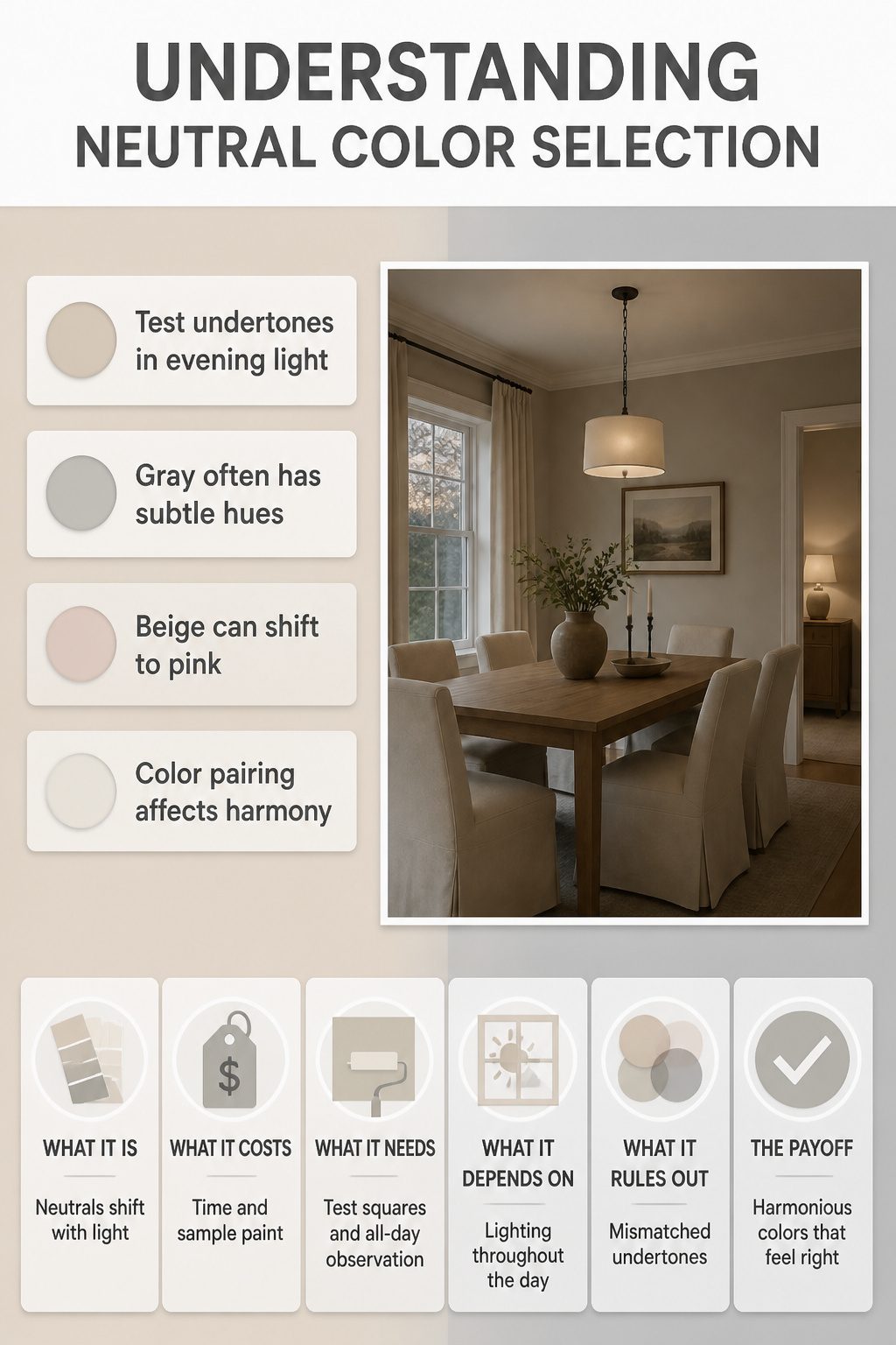
Beige, gray, and white each read as neutral on a swatch card and then shift dramatically under your actual bulbs. The beige that looked warm and breakfast-nook ready at the paint store can turn pink and tired by evening lamplight. Cornforth White No. 228 from Farrow & Ball is the color that finally taught me this. I had pinned it as a safe warm gray, rolled it on a test patch, and watched it go almost lavender at dusk before settling to a calm putty by morning window light. Test undertones at the hour you actually use the room, not at noon when the light is forgiving.
Gray splits into green-gray, blue-gray, and violet-gray camps, and white is rarely just white. Pairing a green-undertone gray with a pink-undertone beige is the fastest way to make trim and walls argue without knowing why. The fix is simpler than the problem sounds: paint two-foot squares, live with them through a full day, and eliminate anything that sours after sunset.
Furniture Choices
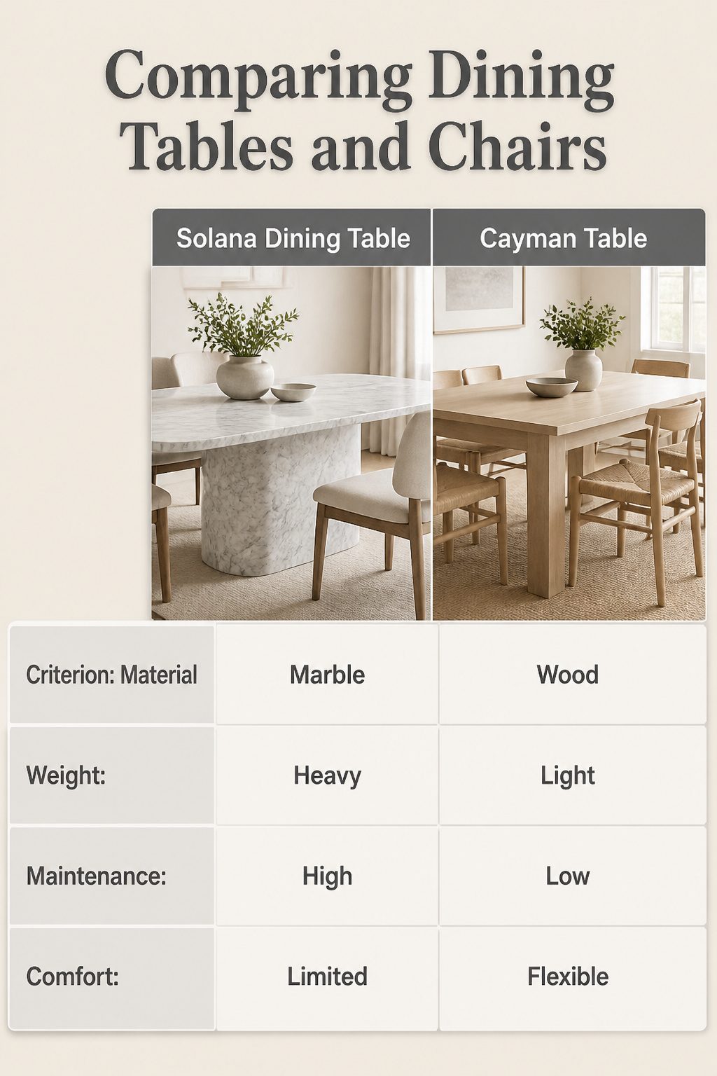
The table sets the whole tone for a neutral dining room before anything else in the space gets a say. A Carrara marble top like the Solana Dining Table catches light in a way that adds depth without adding color, and the veining gives you something organic to build around. Marble’s weight and coldness are real tradeoffs, though. I’ve watched friends treat theirs like a kitchen island, and the etching shows within a year.
The Pottery Barn Cayman Table runs in the opposite direction: lighter in color, simpler in silhouette, and long enough to seat eight without dominating the room. For families who actually eat at the table rather than stage it, that simplicity is the smarter foundation. The light wood reads as neutral without the maintenance anxiety marble carries.
Chairs are where comfort either survives or dies on a weekend project budget. The woven Walmart chairs one homeowner paired with her Cayman table cost less than upholstery and held up to daily use, which matters more than catalog styling when you’re hosting Thanksgiving and everyone’s still sitting there two hours after the pie.
Lighting
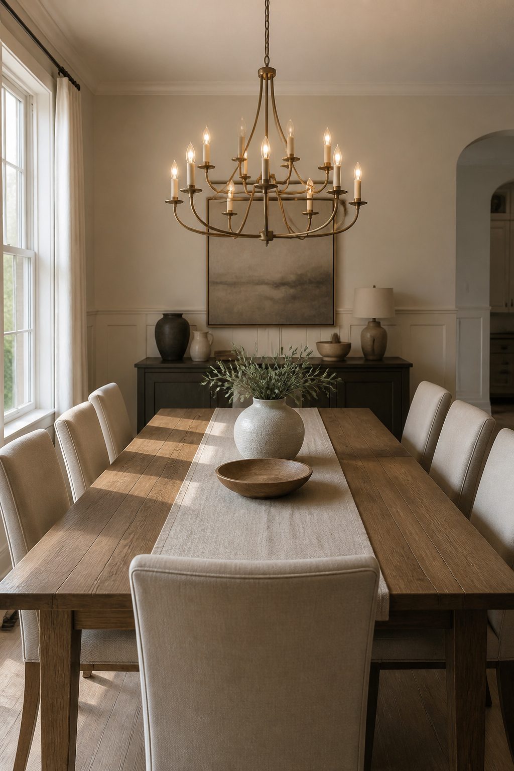
Lighting in a neutral dining room lives or dies by what you can control after sunset. The palette already strips away color drama, so the fixture becomes the focal point almost by default. I learned this the hard way in my first apartment, where a flush-mount dome turned every dinner into a dentist’s office.
Center the chandelier directly over the table, not the room. That single decision determines whether light pools on plates or bleeds uselessly into corners. The Aurora Brass and Glass Chandelier handles this well; its soft luminosity reads as jewelry against beige or gray walls without shouting for attention. For something rougher, the Pottery Barn Rattan Pendant layers in texture that keeps a neutral space from going flat.
The dimmer switch matters more than the fixture itself. A neutral room at full blast looks sterile; dialed to thirty percent, the same space turns intimate. Installation takes an afternoon and about fifteen dollars in parts. Without it, you’re stuck with one mood, and neutral palettes do not forgive that rigidity. Wall sconces or a table lamp at the sideboard help, but only after the main light is tamed.
Textiles and Accents
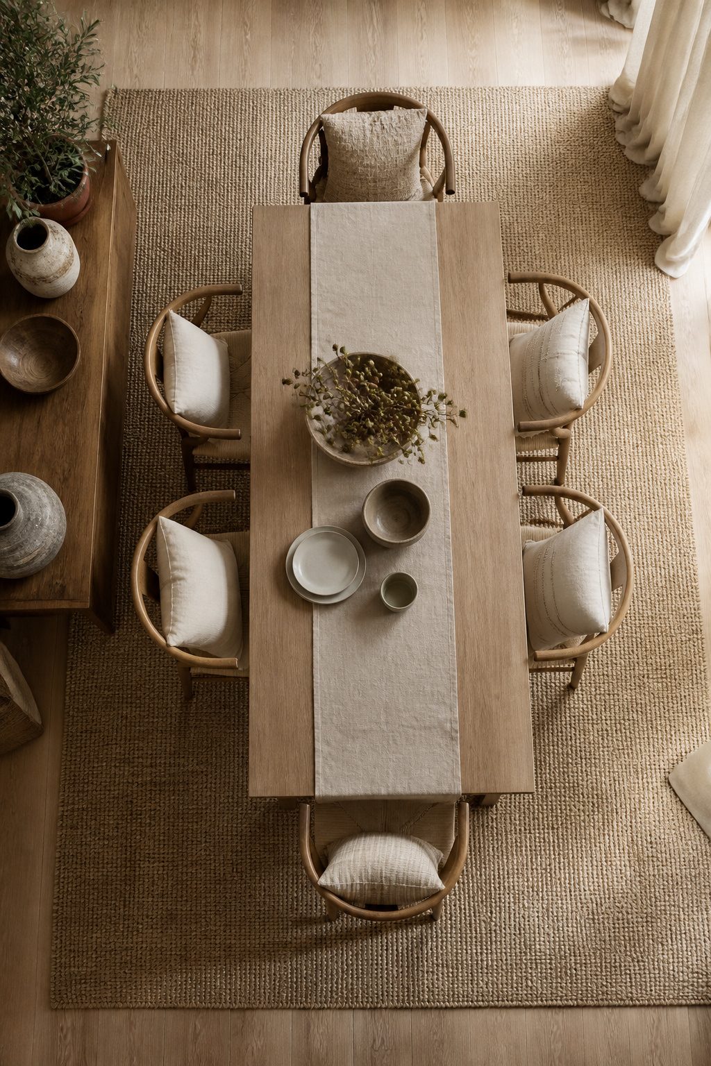
Textiles do the quiet work in a neutral dining room. Walls and furniture set the stage, but rugs, curtains, and table linens add the layers that keep the palette from going flat.
I learned to hang curtains closer to the ceiling than the window frame itself. That height draws the eye up and the room feels larger for it. The Crossweave Curtains from West Elm work well here: their neutral, slightly textured fabric adds softness without competing with anything else in the space. Linen blends or soft cotton in warm grays or creamy whites give that breezy, lived-in quality that makes people want to linger at the table.
The rug under a dining table takes more abuse than most people account for. Chairs scrape back dozens of times a week, crumbs grind in, and a spilled glass of red wine is not a question of if. A low-pile or flatweave rug cleans easier and the chairs glide without catching. The Ruggable Maral Heriz Creme Rug suits this because the machine-washable backing separates from the top layer; when something spills, you lift the top and wash it rather than spot-treating for an hour. That feature matters more than pattern or pile height once you have lived with it for six months.
Table linens finish the layering. A runner in a tone slightly lighter or darker than the walls adds contrast without introducing color, and the shift in texture against a wood or marble surface keeps the eye moving. Swap them out seasonally if you want; the foundation stays the same.
Decorative Accents
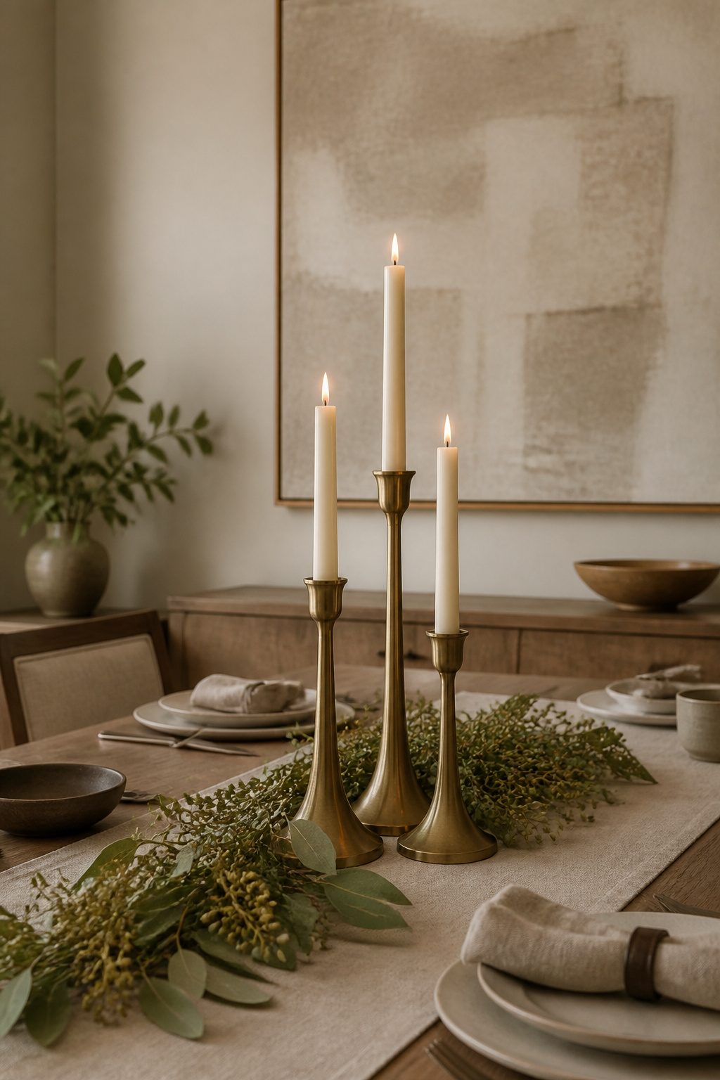
A neutral dining room lives or dies by what sits on the surfaces. The Hammond Metal Taper Holders from West Elm do the heavy lifting year-round: brass tones that pick up chandelier hardware without shouting for attention. I keep mine on the table even when the candles are unlit, and they still read as sculpture.
Rotate three times a year, not four. Spring greenery, nothing in summer when the light does the work, then gourds or bare branches through fall and winter. More frequent swaps and the room starts feeling like a staging rotation, not a home. The same rule applies to the gallery wall: a single large canvas in a monochromatic theme holds steady, while smaller frames on a side console can change out with the seasons. Two anchor pieces that never move, one shelf or corner that shifts. That ratio keeps the space from going static without turning it into a display case.
Table linens in complementary neutrals finish the layering. A runner and cloth napkins in a tone slightly warmer or cooler than the walls add depth without breaking the palette. The fabric catches light differently than wood or metal, which is exactly what keeps a subdued room from going flat.
Frequently Asked Questions
What are the best neutral colors for a dining room?
Beige, gray, and white are the go-to neutrals, but the specific undertone matters more than the color family name. A gray can carry green, blue, or violet undertones, while white rarely stays truly neutral under actual bulbs. Test a two-foot square on multiple walls and check it at the hour you actually use the room, since the same paint can read warm at brunch and flat or lavender by candlelight.
How do you keep a neutral dining room from looking boring?
Layer texture before you worry about color variation. Start with three textures minimum: a linen runner, earthenware plates, and a wooden bowl, or heavy linen curtains, a wool runner with loft, and hand-thrown ceramics. Flat walls and flat upholstery in similar values flatten the room; varying surface quality does more than varying shade. Rotate decorative accents two or three times a year, not four, so the room stays alive without feeling like a staging rotation.
What rug works best under a dining table?
A low-pile or flatweave rug in a neutral tone, with enough margin that chairs pull out without catching the edge. Machine-washable options with a separable top layer suit real life better than spot-treat-only pieces, since crumbs and spills are inevitable. The rug should add texture underfoot without introducing competing color.