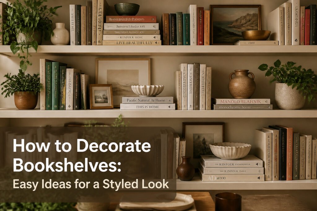
A styled bookshelf takes about an hour and costs nothing if you already own books. The place most people fail is treating every object as its own moment instead of building blocks.
That changes once you see the shelf as a plane to compose, not a container to fill. Emily Henderson’s team builds almost every vignette around the same move: two or three books laid flat, with something personal on top. The trick is not the stack itself, but the contrast in shape between straight edges and whatever sits above them.
1. Stacked Books with Objects on Top
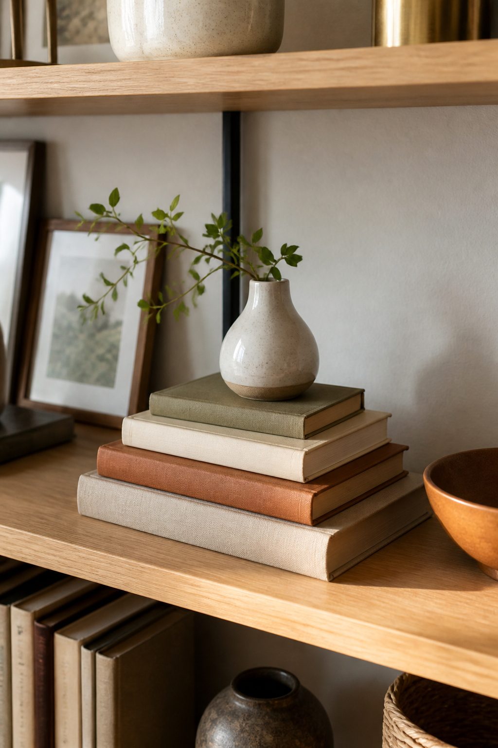
Horizontally stacked books break up the vertical lines that make shelves feel like a grid. Laying two or three books flat creates a natural platform, and that unused space above the stack is where a small object belongs. Emily Henderson’s team calls this the core move they return to most often, and four other professional stylists treat it the same way: a short stack plus something on top is the formula that makes a shelf look considered rather than cluttered.
The object itself can be almost anything shorter than your upright books. A lidded bowl, a small framed photo, a sculptural piece from a trip. What matters is the contrast in shape. Rounded or irregular forms against the straight edges of books add movement that rows of spines alone never achieve. A woven owl, a small bust planter, a ceramic vessel. These toppers read as personal because they sit at eye level and invite a closer look.
The stack itself works best with books in ascending size, the largest on the bottom. This keeps the platform stable and gives the topper a wider stage. Three books is the usual ceiling before the stack starts to look like storage rather than styling. Keep the topper narrower than the book beneath it so the silhouette stays clean and nothing feels ready to tip.
2. Leaning Art with Layered Objects
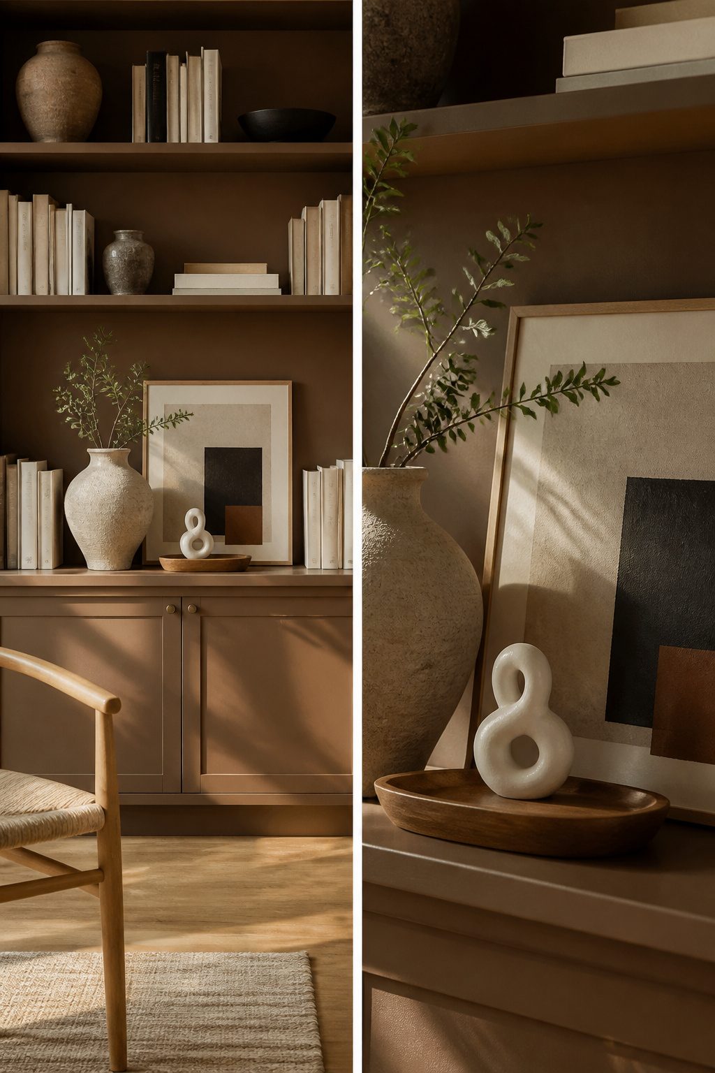
Leaning a framed print against the back wall of a shelf, then stacking smaller objects in front of it, pulls the eye deep into the unit so the whole thing reads as deeper and more open than it actually is. The trick is the layering: one to three pieces in front of the art, each varying in height, shape, and scale so the grouping looks collected rather than cluttered. A small silver vase that would disappear on its own gains presence when it sits on a tray or is paired with something taller directly in front of the frame.
This approach works especially well for renters who cannot put nails in walls. The shelf itself becomes the display surface, and the art stays fully portable. If you have several pieces, you can even lean a smaller frame in front of a larger one; just keep the frame sizes different so the overlap reads as intentional. Start from the top shelf and work downward, running the arrangement most of the way across but leaving a little empty space at each end for breathing room. None of the three objects in a grouping should share the same height; overlap the edges of the frame with the pieces at either end to knit the layers together.
3. Collections of Objects
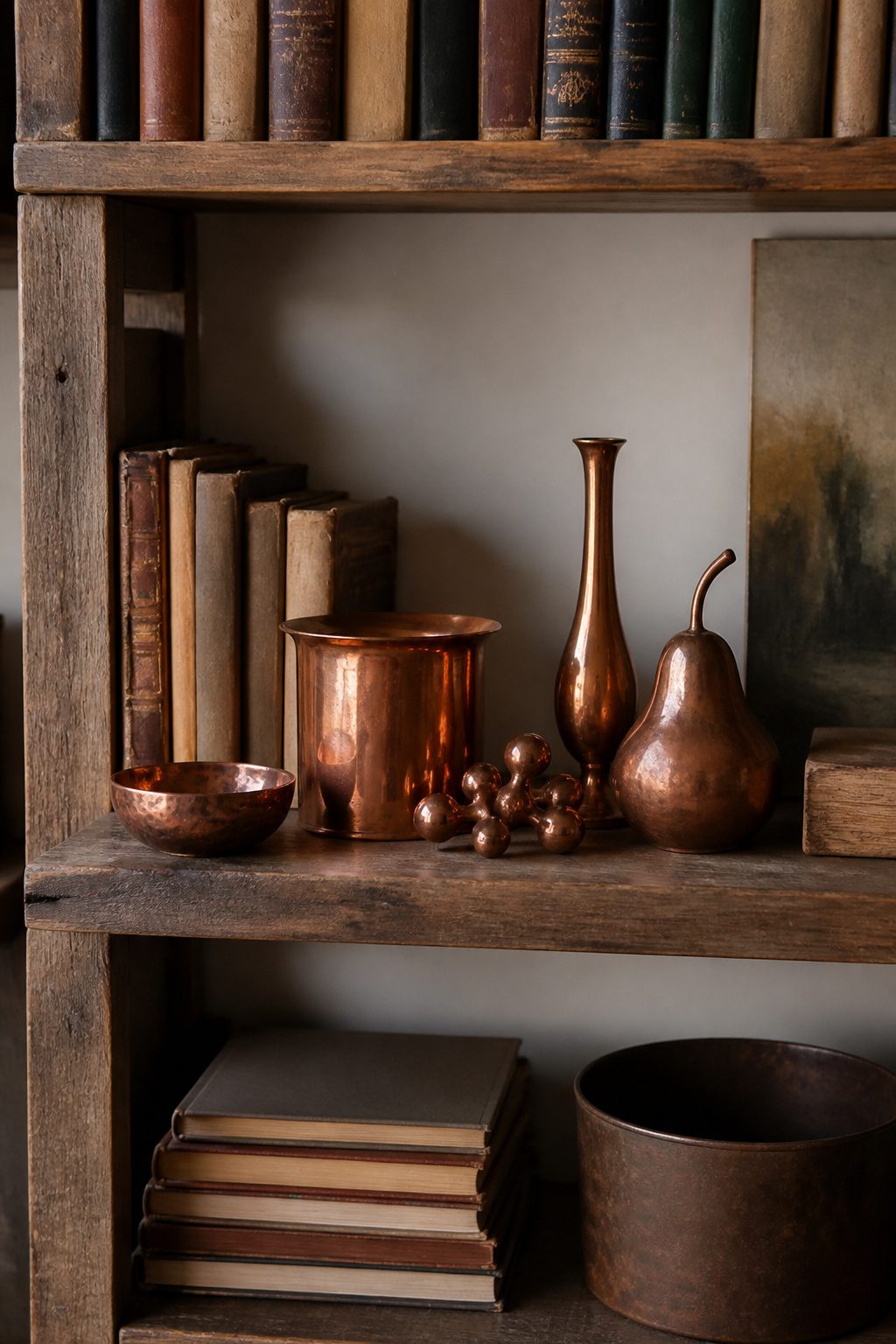
A shelf of scattered souvenirs reads like junk. The same pieces, pulled into a cluster, start to look like a collection worth noticing. I learned this the hard way after spreading a dozen small copper pieces across three rooms; gathered onto one shelf with the oldest, greenest patina beside newer shinier ones, they finally looked like something I meant to own.
Grouping beats scattering every time. Five to seven objects of varying heights do the work of one tall vase and three lonely trinkets. Set the tallest piece at the back, step down to medium, finish with the smallest in front. A tiny silver vase on its own disappears; the same vase on a tray, layered in front of a larger frame, suddenly carries weight.
Thrifted pottery, travel-market baskets, or inherited stoneware work better here than bought-for-display pieces. The shapes are already irregular, the heights already uneven. That variation saves you from the too-matchy look of a single shopping trip. A cluster of mini chairs, a stack of mismatched canisters, a row of patinated copper: the common thread is you, not the store.
4. Vertical and Horizontal Book Stacks
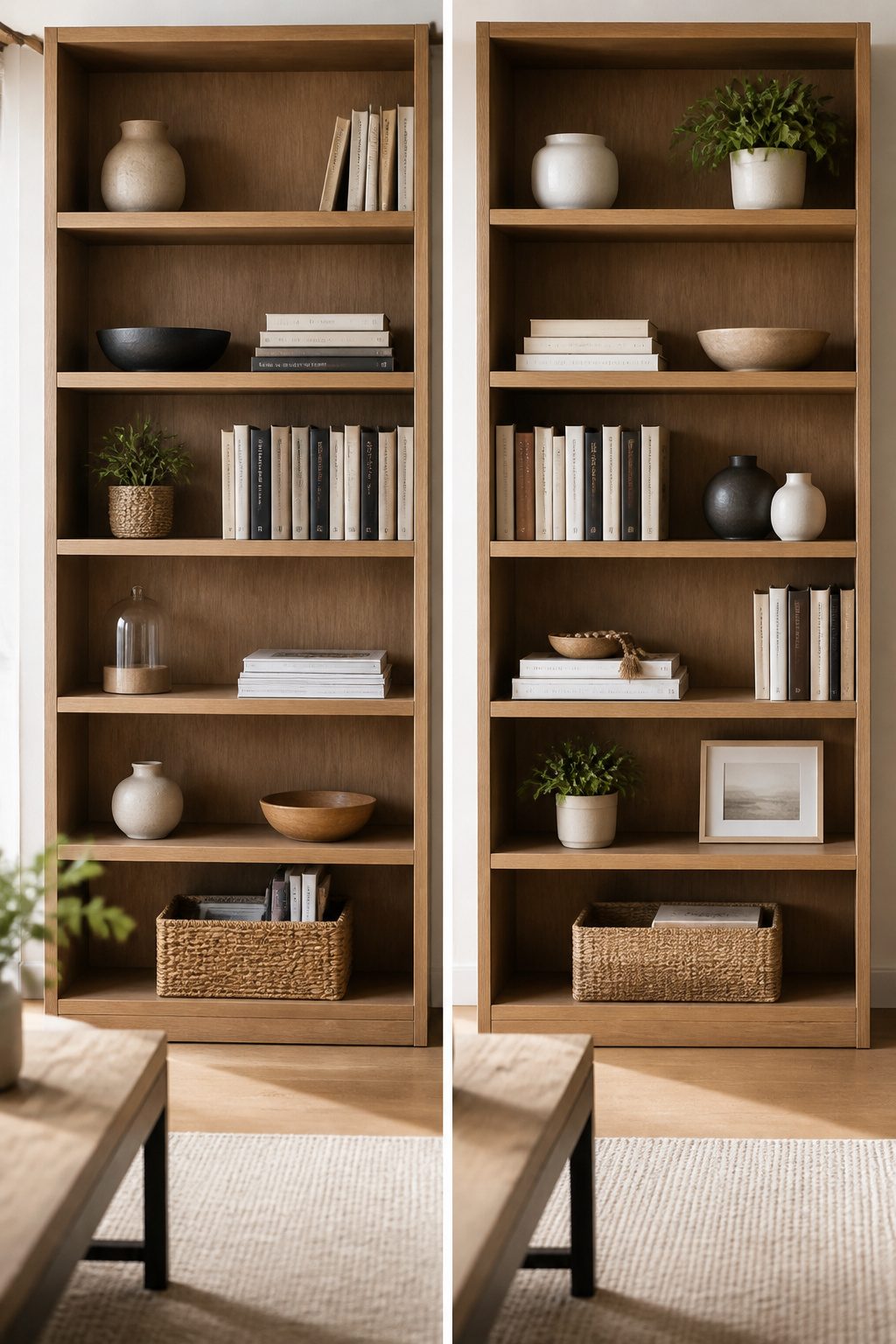
The vertical-and-horizontal mix is the move that actually makes a bookshelf look styled rather than just stored. Standing books spine-out reads as a wall of color; laying a short stack flat breaks that wall into blocks the eye can rest on. Across a single shelf, three or four vertical books flanked by a horizontal stack of two or three creates a natural pause. Across the whole unit, alternating that rhythm, shelf by shelf, keeps the pattern from going stale.
A horizontal stack also buys you usable real estate. The flat top becomes a pedestal for a small object: a bowl, a small vase, whatever you already own. That object then acts as a bookend for the vertical group beside it, so the shelf holds together without matching hardware.
What convinced me, reading through the guidance on this, was the emphasis on reading these groupings as single blocks. Three candlesticks clustered tight register as one shape; a vertical pair of books plus a horizontal stack beside them does the same. The mistake is treating every item as its own moment. The shelf gets busy fast. Two blocks per shelf, tops, whether each block is books alone or books plus one object, is the limit that keeps it collected.
5. Decorative Bookends
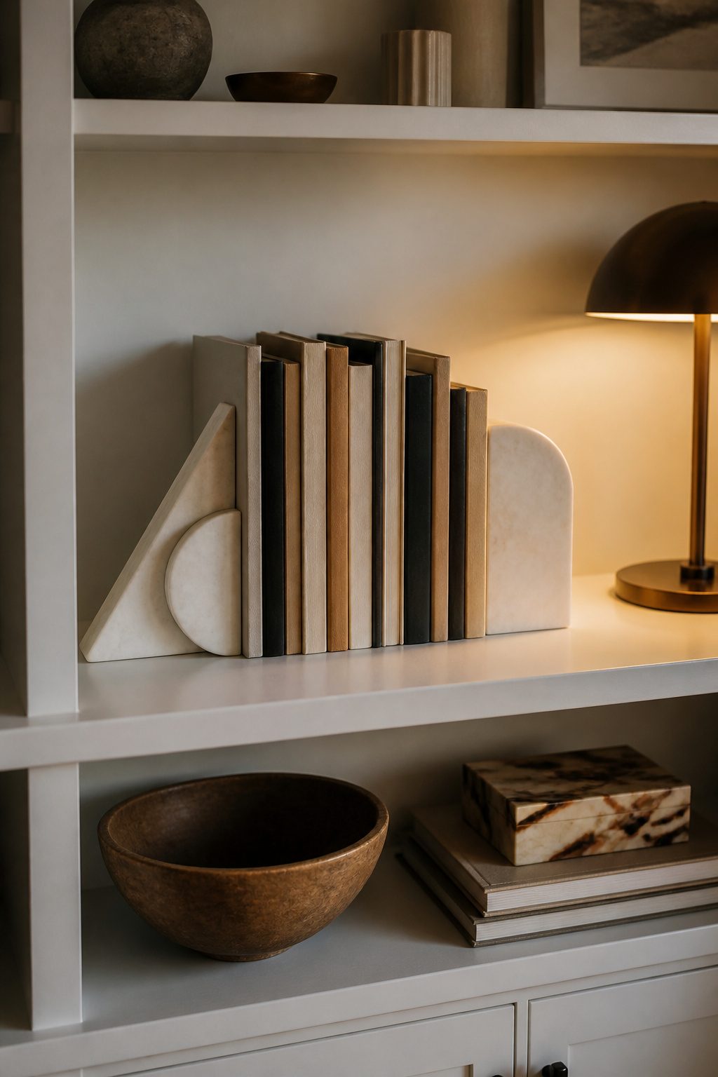
Sculptural bookends turn a functional necessity into the shelf’s quiet focal point. A vintage brass animal pair or even an old stirrup can hold vertical books upright while adding something personal to the arrangement. The sources that rank for this topic agree on two things: the object needs real weight to do its job, and the more unexpected the shape, the more movement it brings to the grid of spines.
My own brass bookends failed on deep shelves, which taught me that the center of gravity matters more than the look. They looked substantial but tipped forward on anything over twelve inches deep. I swapped them for a heavier marble pair, the kind Chris Loves Julia sources for narrow study bookcases, and the difference was immediate. The marble sits low and stays put.
Flanking a short vertical stack with two sculptural pieces also creates breathing room between vignettes. Emily Henderson’s team uses this to break a shelf into zones without cramming every inch. Leave a gap between those zones; the negative space keeps the eye from tiring.
6. Incorporating Plants
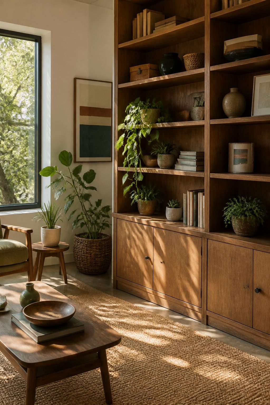
Greenery does what no object can. A trailing pothos spilling from the second shelf to the first breaks up all those straight lines and adds movement without costing more than a six-inch nursery pot. Succulents work for tight spots where a book won’t stand upright, and a small fern tucked behind a stack adds softness that reads as intentional, not cluttered.
Light is the part nobody checks until the leaves brown. I killed a Boston fern this way, setting it on the top shelf of a built-in that looked dramatic against the white molding but got no direct sun and barely any ambient light from the room’s single north window. Six weeks of crispy fronds taught me that high shelves are often the darkest shelves, blocked by the shelf above and whatever sits in front.
Low-light tolerant plants are the realistic choice for most shelf placement. Pothos, snake plants, and ZZ plants handle the dim conditions typical of interior shelves, especially the lower ones where light has to travel farthest. One plant for every three shelves is a workable rule of thumb, enough to feel alive without turning the unit into a greenhouse. Fake plants are an option no one will scrutinize if the light truly isn’t there.
7. Decorative Boxes
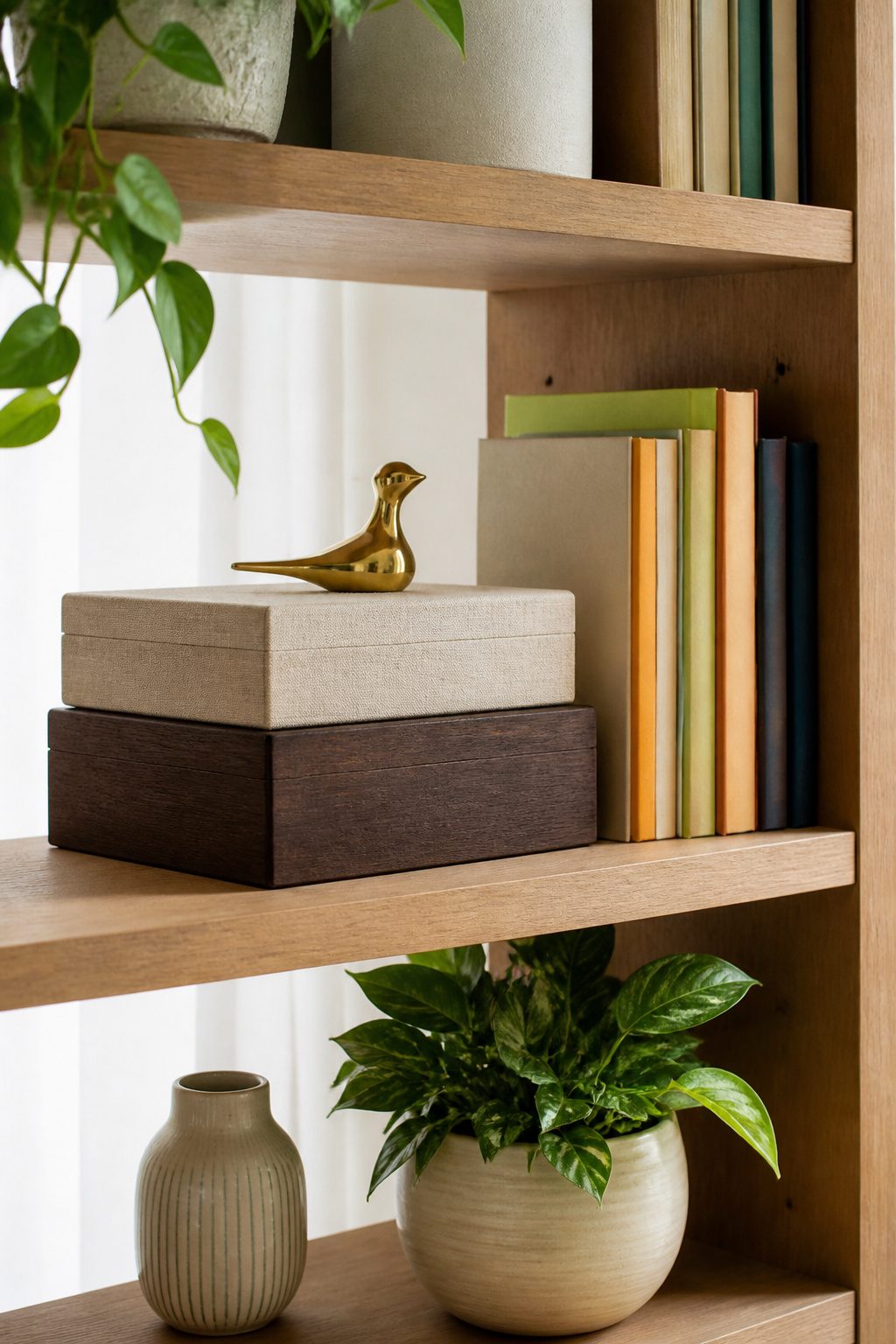
Decorative boxes turn a messy shelf into a solid block of color that actually earns its keep. A stack of two or three, mixed or matched in size, hides the remotes, cables, and papers renters accumulate but never want on display. The function matters more in small spaces where every inch of a bookcase doubles as closet, desk, and charging station.
Color is the reason this trick works visually. Where books run to mismatched spines, boxes give you clean planes you can repeat across the whole unit. They read as architecture, not clutter. Set a small object on top, something shorter and narrower than the box itself, and the stack becomes a little pedestal that breaks up the row without adding chaos. A woven figure, a small framed photo, a bowl from your own collection, anything that sits low enough not to teeter. The box does the heavy lifting of storage; the topper does the light work of personality.
8. Candles and Lighting
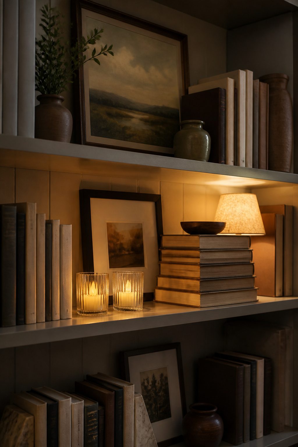
Candles look beautiful on shelves until you remember what heat does to lacquer and stain over time. Open flames sit too close to wood grain for my comfort, so I keep real candles for the coffee table and use battery-operated ones here instead. The newer flickering LEDs run on a timer and cost about the same as a few weeks of replacing burned-down pillars.
A small lamp changes the whole mood in the hour when most people actually see your shelves. A 6-inch cordless lamp tucked behind a row of books throws upward light that makes everything feel intentional rather than leftover. I tried string lights first and found them fussy; one warm bulb at eye level does more than ten scattered pinpricks.
Evening is when bookshelves earn their keep. Daylight shows your arrangement, but lamplight shows your home.
9. Artwork and Photos
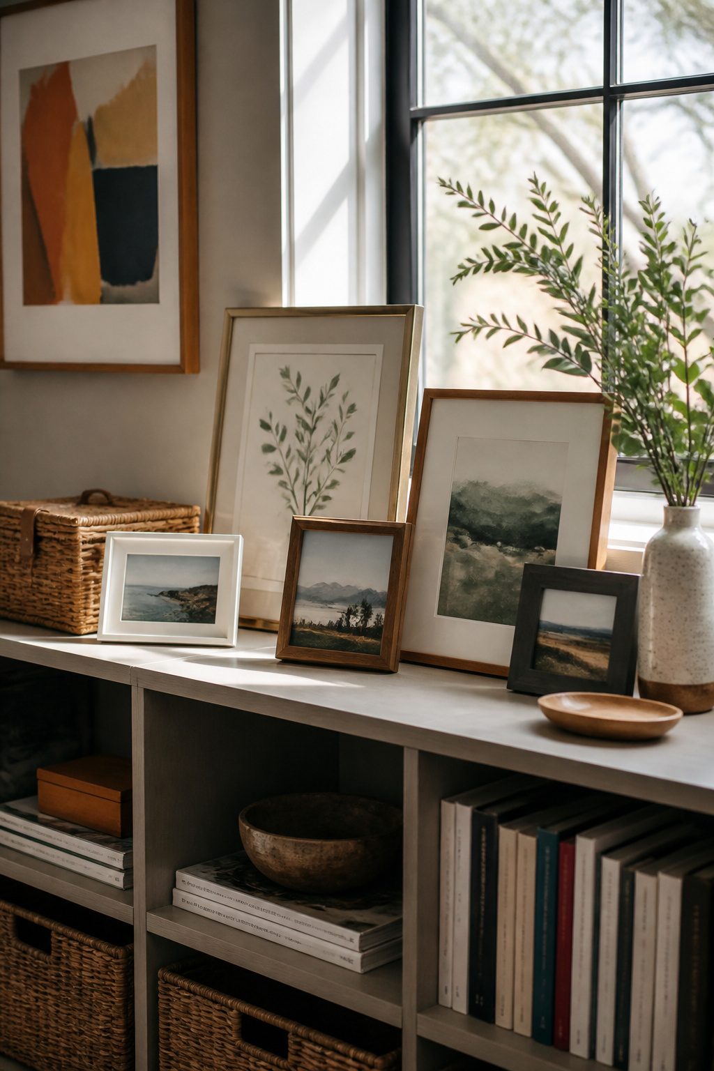
Framed photos and small originals are where a shelf starts to feel like yours instead of a store display. I lean toward mixing frame finishes rather than matching them; brass beside black beside raw wood keeps the eye moving and reads as collected over time, not bought in a single afternoon. A square frame around 8.3 inches paired with a larger rectangular one, maybe 11-by-13, gives you the height variation that makes grouping work without trying too hard.
Printed artwork does the same job for less. I have seen renters build a whole shelf personality from $15 prints in thrifted frames, and the mix of old gold with scuffed silver is what sells the story. Small originals from local markets or student sales fit the same formula; scale them to sit inside the shelf depth rather than hang above it, so they become part of the arrangement instead of floating in front of it.
This is the point where your actual life shows up. Travel photos, a portrait with bad lighting but good memory, a print you cropped yourself because the full image cost too much to frame; these are the things no styled shelf can fake. Six separate guides I read while planning my own shelves all landed here eventually, and every one treated it as the step that mattered most.
10. Empty Space for Balance
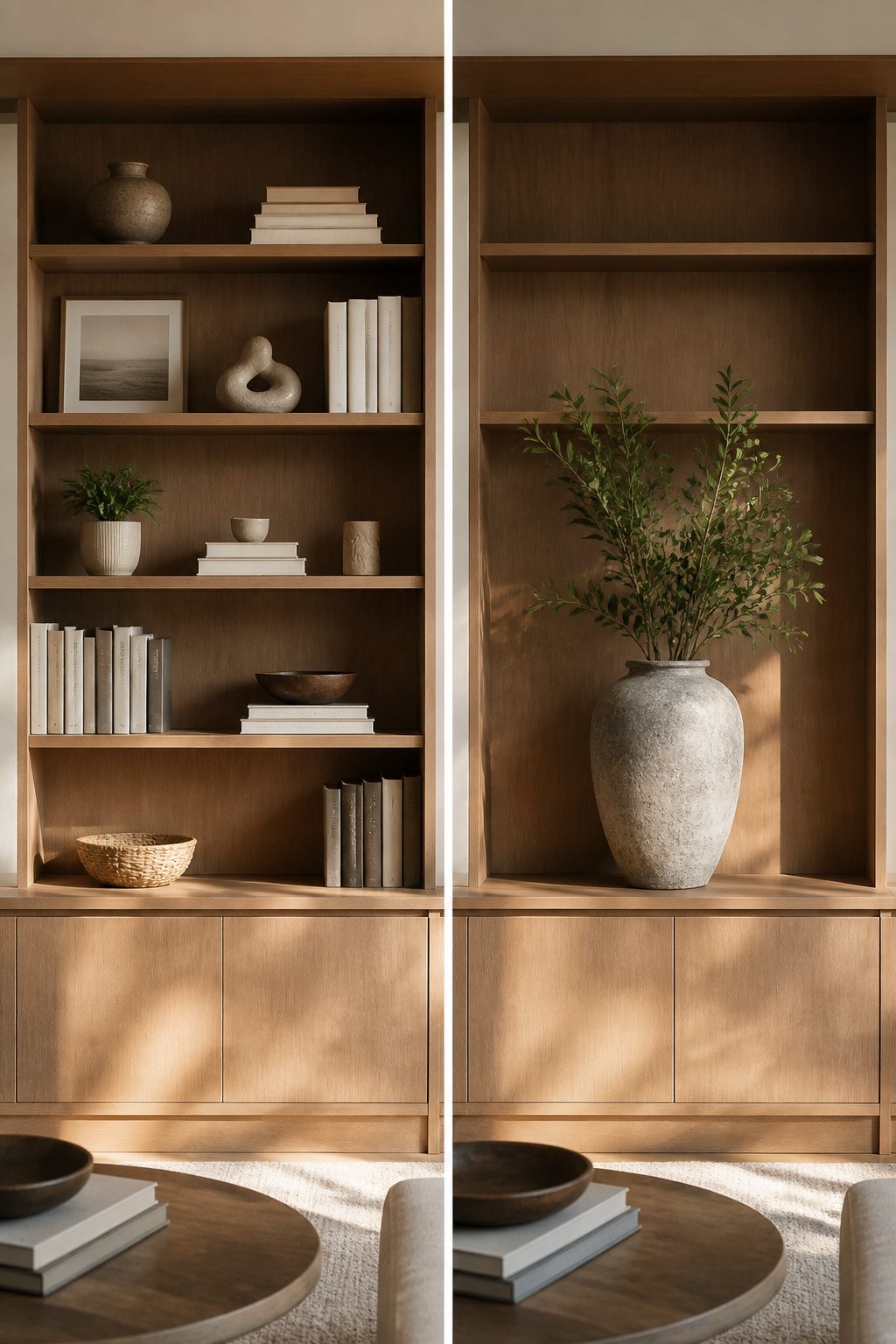
My first bookshelf project looked like a storage unit that happened to live in my living room. Every shelf sat packed to the front edge, books wedged upright, horizontal stacks filling gaps, decorative objects fighting for the last two inches of real estate. I thought fullness was the goal. Five sources later, the pattern is clear: negative space is what separates styled shelves from utilitarian ones.
A single sizable accessory on a shelf, or even an entirely bare surface, gives the eye somewhere to rest. The arch over my top shelf made that unavoidable on one unit, so I placed one large handled vase there and left the surrounding area open. The other bookcase got a piece of coral, same principle. That forced restraint looked intentional; the crowded shelves below looked accidental.
Balance means considering size, color, and spacing together, not cramming until the geometry works out. A shelf with breathing room reads as curated because someone chose to stop adding. One approach keeps a third of each shelf clear, varying which side or center holds the emptiness so the rhythm stays uneven and human. Another lets one shelf stay almost bare while neighbors carry the load. The mistake is treating every shelf as a container to fill rather than a plane to compose.
Color Palette
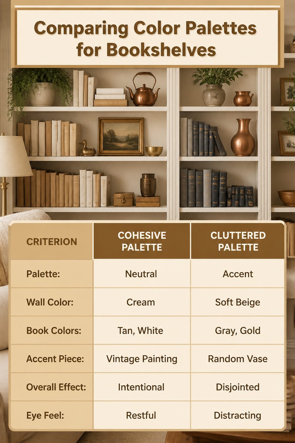
A cohesive color palette is what keeps a shelf from looking like a yard sale. Pull your colors from what is already in the room, not from a fresh paint chip. The wall color, the sofa, even the copper kettle you already own, those are your starting points. On my own shelves, I have stuck to cream, white, gold, black, and tan for the books themselves, then let a small vintage painting carry the single accent.
Two colors, maybe three, is the practical ceiling. More than that and the eye has nowhere to rest. Varying the shades and textures within those two colors adds depth without adding chaos. A steely gray-blue against copper, repeated from top shelf to bottom, reads as intentional. A random red vase in that same arrangement would stick out like a sore thumb.
The exception that proves the rule: green from actual plants, or the natural tone of wood, reads as neutral because it is alive. Everything else gets a vote. If it does not match the palette, it goes somewhere else.
Layering and Grouping
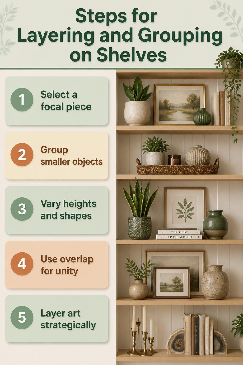
A single small object on a shelf reads as leftover clutter; the same piece set on a tray in front of something larger suddenly looks chosen. Layering and grouping are what separate arranged shelves from random placement. The technique is simple: nothing stands alone. A tiny vase belongs on a tray with other objects, or paired with something taller, or placed in front of a larger piece so it gains a frame.
I build these moments in clusters of three, varying the heights so no two pieces match. A tall snake plant in a decorative planter, a framed print, and one shorter accessory create a stable triangle. The objects at the ends should overlap the frame edges slightly; the overlap is what knits them together visually.
Leaning art against the back wall adds depth because it draws the eye rearward, making the shelf feel deeper and more open. The trick is what goes in front: one to three pieces layered in, each different in height, shape, and scale. If you have several art pieces, layer a smaller frame in front of a larger one, but keep the frame sizes distinct so the eye reads the order instantly.
Grouping like objects, such as three candlesticks, creates a single visual block that reads as one larger form. Two adjacent blocks per shelf is usually enough; more than that and the rhythm breaks into noise. I rotate pieces until the blocks feel balanced, not symmetrical. The goal is curated, not piled.
Height Variation
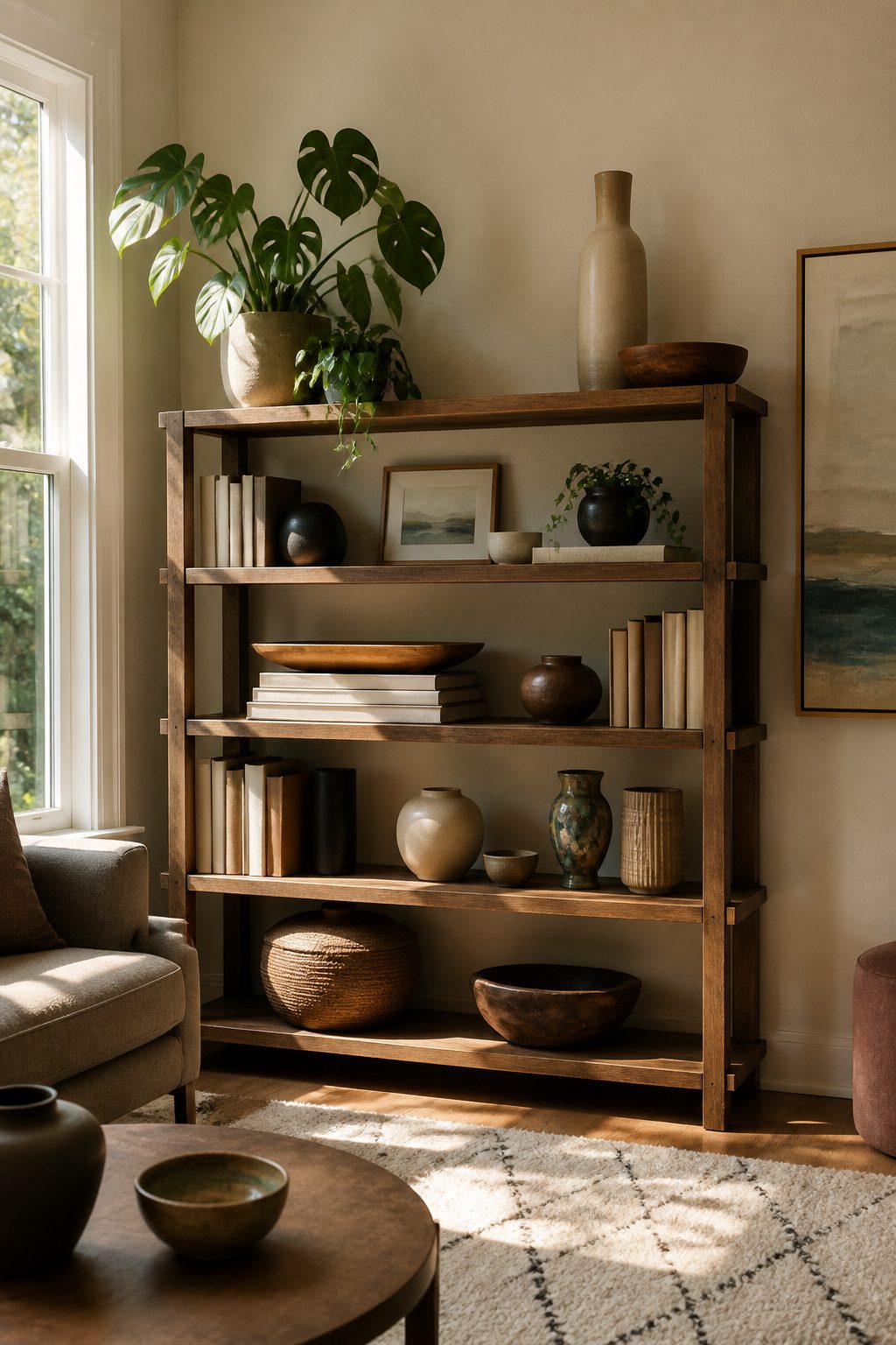
A flat shelf reads like a horizon line you can’t escape. Every source that seriously covers how to decorate bookshelves lists height variation as non-negotiable, and the mistake I kept making early on was treating each object as a solo act instead of a trio.
The fix that finally stuck: stack two books under anything shorter than its neighbors. A shallow basket or round tray that sits too low suddenly enters the conversation once you raise it half an inch. On my own shelves, I group in threes, a tall plant or framed print at one end, the book-elevated piece in the middle, and a shorter object completing the triangle. The frame can run vertical, horizontal, or square; what matters is that no two pieces share the same skyline.
Overlap helps too. Let the tall object and the short one break past the frame edges rather than lining up polite and separate. The eye reads that stagger as movement, not clutter, and the whole shelf starts to breathe.
Functional Decor
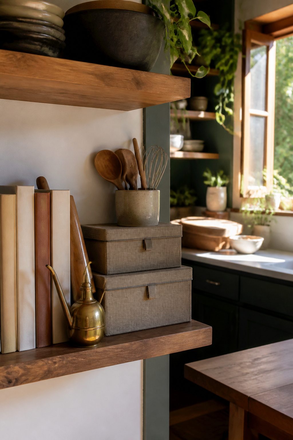
A shelf that earns its keep holds more than display pieces. In my last rental, the kitchen had no pantry, so I lined a narrow bookcase with cookbooks and the bowls I reached for daily. A brass oil cruet sat where a vase might have, and a wooden rolling pin leaned against the spine of a bread-baking manual. The shelf looked styled because the tools themselves were the most beautiful version of what I already used, not props bought for the job.
Stacked boxes do the same work in a living room. Two or three nested lidded boxes hide cables or remotes while their varied heights break up a row of books. The trick is choosing boxes you would open without wincing: fabric that frays or cardboard that bows makes the whole shelf feel temporary, which defeats the point for a space you live in.
Renters and small-space dwellers rarely have the luxury of a shelf that does not pull weight. Every piece out in the open should answer to at least one daily need, or it competes with the storage you actually require.
Personal Touches
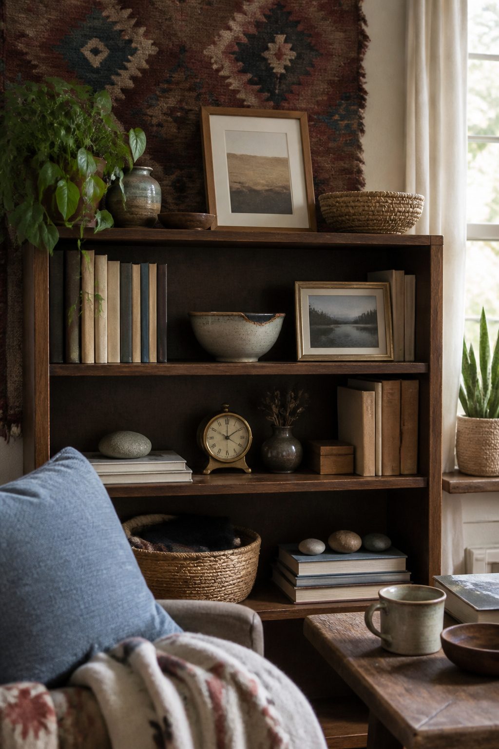
The shelf stops looking like a store display the moment something on it only makes sense to the person who lives there. A chipped ceramic bowl from a trip to Portugal, a framed photo of your grandmother, a rock you pocketed on a hike you still think about: these are the things that turn styled shelves into yours.
Interspersing books with something as simple as travel photos is a great way to subtly tell the world about you. That line stuck with me when I read it, because it names exactly what the personal items are doing. They are not clutter; they are the point.
Interspersing books with something as simple as travel photos is a great way to subtly tell the world about you.
The risk is letting sentiment run the shelf. My own rule is one memory per zone, maybe two if the objects share a color or scale. Any more and the eye skims past all of them; the brain registers "stuff" instead of "that trip." Edit like you are choosing what to mention in a conversation, not what to archive. The shelf is a highlight reel, not a storage unit.
Frequently Asked Questions
How do I style my bookshelf?
Start with a game plan before you place anything, then build in layers. Stack two or three books horizontally and top them with a small object, alternate vertical and horizontal arrangements shelf by shelf, and keep height variation in every grouping. Leave about a third of each shelf clear so the eye has somewhere to rest.
What should I put on my bookshelf?
Books arranged both vertically and in flat stacks, one plant for every three shelves, decorative objects with personal meaning, and framed art or photos leaned against the back wall. Sculptural bookends, lidded boxes for hidden storage, and a single lamp for evening light also earn their place.
How can I make my bookshelf look less cluttered?
Group objects into clusters rather than scattering them, limit yourself to two visual blocks per shelf, and intentionally leave empty space. A bare shelf or a single large accessory surrounded by openness reads as curated, while packed edges look accidental.
How do I choose a color palette for my shelves?
Pull from what already exists in your room: wall color, upholstery, or a favorite object you own. Two colors, maybe three, is the practical ceiling. Green from living plants and natural wood tones read as neutral and do not count toward that limit.
What are some tips for arranging books on a shelf?
Mix vertical spines with horizontal stacks of two or three books, and treat each combination as a single block. Place the largest book on the bottom of a horizontal stack for stability, and let a small object sit on top to break up the grid of spines.