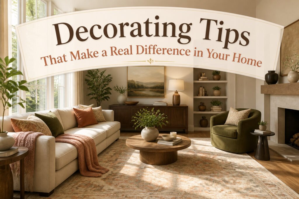
The difference between a room that looks finished and one that looks forgotten usually comes down to scale, not budget. A 5-by-7-foot rug on clearance will shrink your seating area every time, while the right 8-by-10 or 9-by-12 leaves furniture grounded and the space intentional. The same rule holds for light: one overhead fixture reads like a waiting room, but three sources, mapped before a single chair moves, give a room actual dimension.
1. Use a Large Area Rug to Define Spaces
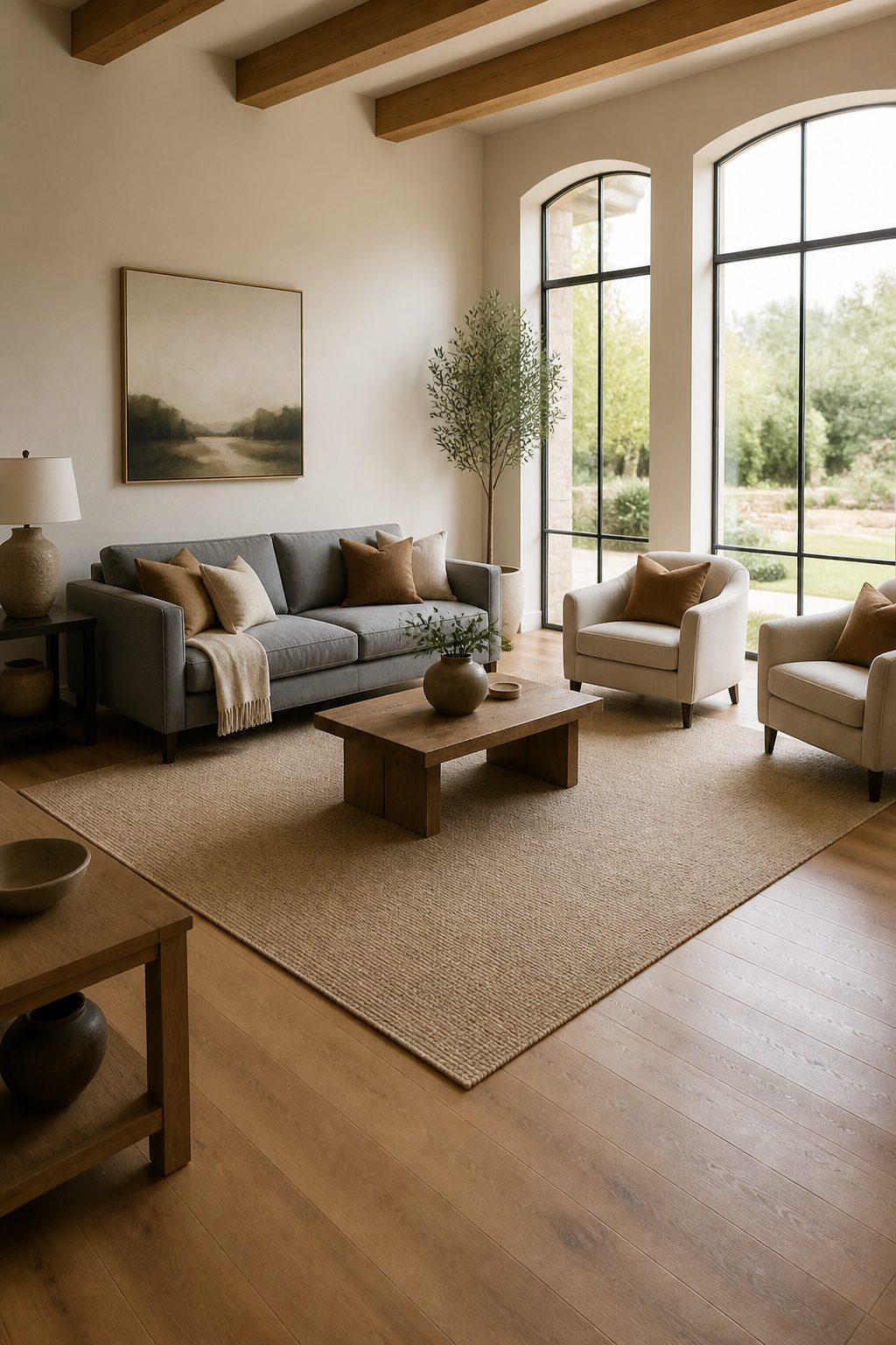
A rug that stops eighteen inches short of your sofa does nothing but float in the middle of the floor like a misplaced doormat. The front two legs of every sofa and chair in the grouping should rest on the rug so the seating area reads as one connected piece. Go smaller and the furniture shrinks the rug instead of the rug anchoring the furniture.
Even a modest living room usually needs an 8-by-10-foot or 9-by-12-foot rug to pull this off. The 5-by-7-foot rugs that dominate clearance sales are the most common mistake; they leave too much bare floor between the rug edge and the furniture, and the whole room ends up looking like you measured nothing before you clicked buy.
"At the very least, the front two legs of the sofa and chairs should rest on it."
That minimum is where to start, not where to stop. If the rug can take all four legs of every piece, the space feels even more intentional and grounded.
2. Layer Light Sources for Dimension
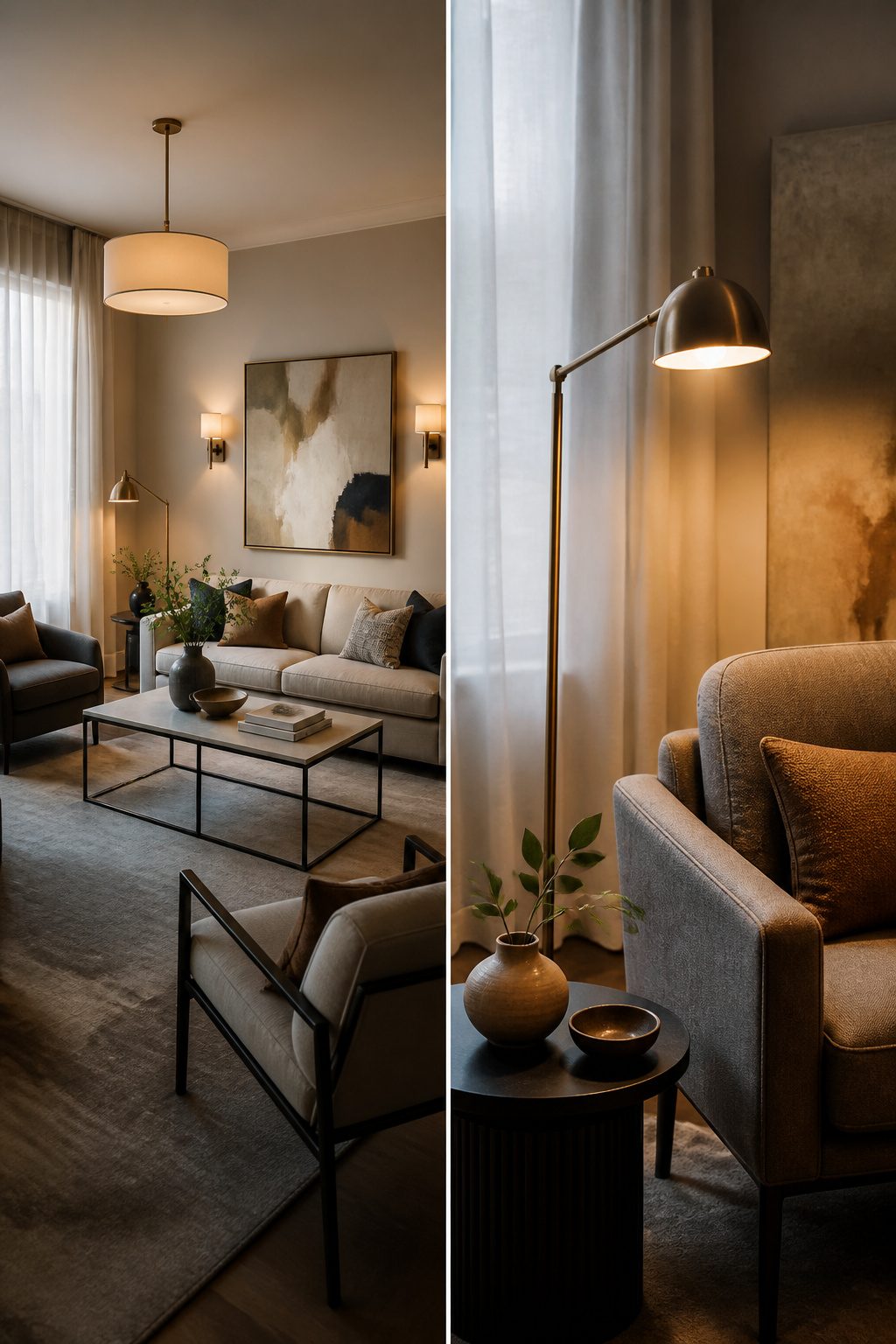
Overhead lighting alone leaves a room feeling flat, almost like a waiting area. I learned this the hard way in my first apartment, where a single ceiling fixture made every evening feel like a fluorescent-lit timeout. Three sources minimum changed that: ambient for overall glow, task for reading or chopping, and accent to pull the eye toward a painting or a textured wall.
Lamps do the heavy lifting for softness. A torchiere tucked in a corner throws light upward onto the ceiling, and that bounce tricks the eye into seeing more height than the walls actually give you. Breining swears by this move, and I get why now. The wattage math is straightforward enough: plan for about 3 watts per square foot in a living room, which translates to roughly 42 lumens. That figure kept me from buying bulbs that looked pretty but did nothing.
The real mistake is treating light as an afterthought. I once painted a bedroom, arranged furniture, hung curtains, and only then realized I had no plug where a reading lamp belonged. Rewiring was not in that weekend’s budget. Now I map outlets before I move a single chair, because lighting either layers in from the start or it does not layer in at all.
3. Edit Decorative Items Regularly
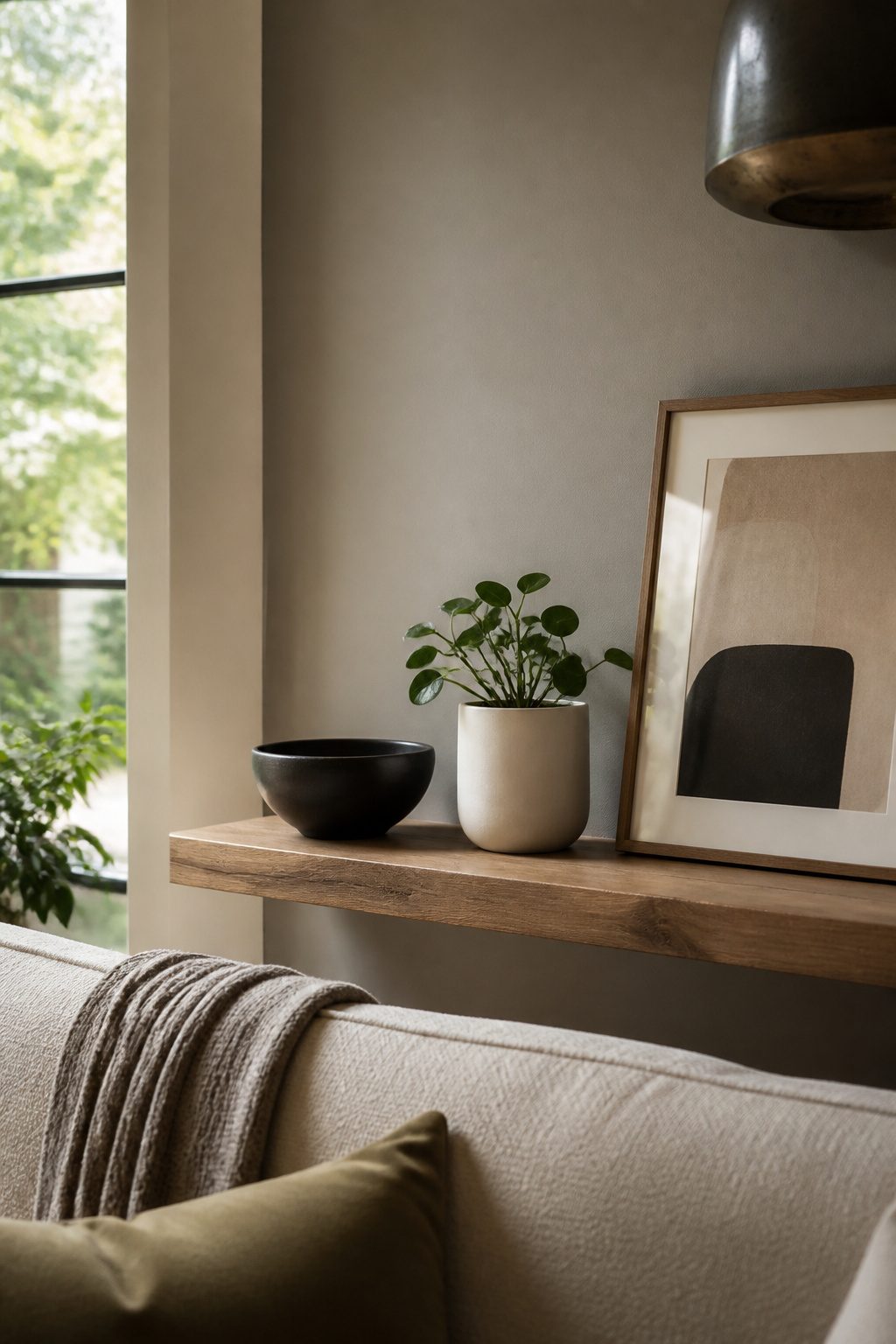
The shelf above my television used to hold everything at once: a candle, a small plant, a stack of books, a ceramic bowl from a trip, a framed photo, a second framed photo, a tiny sculpture a friend gave me. Each piece was something I liked. Together they made the whole wall feel anxious, like the objects were competing for attention and none were winning.
Editing decorative items is an ongoing practice, not a one-time purge. I clear that shelf about twice a year now, and the rule that keeps me honest is odd numbers. Three objects grouped together, or five if the surface is wide enough. Two feels like a pair waiting for a third; four splits into two pairs and the eye bounces between them. Three items of different heights, arranged so your gaze moves down like a slow waterfall, holds the brain differently. The asymmetry leaves something unresolved, and you keep looking.
Overcrowding with furniture works the same way. A room packed to the walls feels chaotic even when every piece is tasteful. I leave more floor visible now than I used to, and the breathing room reads as intentional rather than empty.
4. Add Plants for Life and Freshness
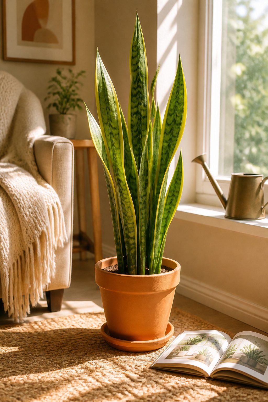
Live plants do what no throw pillow can: they shift a room from staged to alive. The trouble is most advice skips the part about which ones actually survive the dry air and inconsistent light of a rental. Pothos, snake plant, and ZZ plant are the three that have lived through my own neglect and still looked presentable when guests came over.
Pothos trails nicely from a high shelf and forgives missed waterings better than anything else I have tried. Snake plant stands upright in tight corners where floor space is scarce and only needs attention every few weeks. ZZ plant handles the dim hallway outside my bathroom where even succulents gave up.
A six-inch nursery pot runs about $15 to $20 at most hardware stores, and plain terracotta keeps the look clean without extra cost. Skip the decorative cachepots unless drainage holes are already drilled; root rot from standing water is the fastest way to turn a low-maintenance plant into compost.
One honest limit: if you travel for weeks at a stretch, even these three will suffer. A neighbor with a spare key or a simple self-watering spike buys enough margin to keep them going.
5. Create Focal Points with Art or Statement Pieces
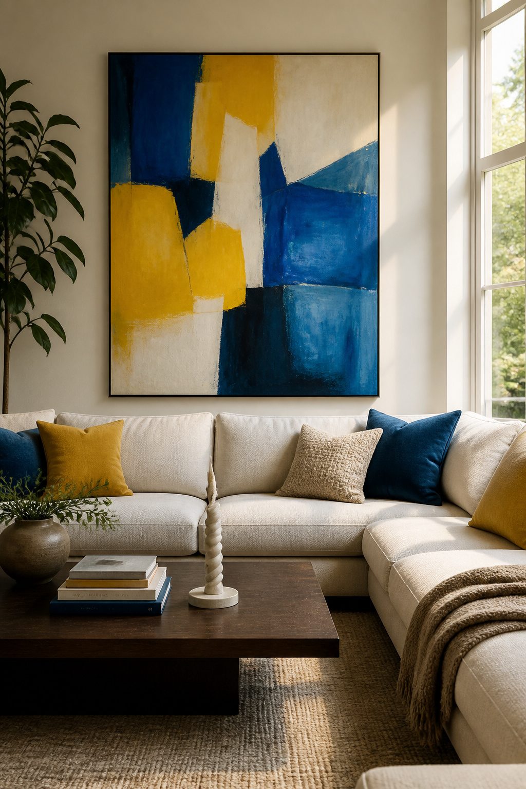
A single large piece does more for a room than a cluster of small frames that fight for attention. I learned this the hard way after years of collecting postcards and mini-prints that looked busy from the doorway and invisible from the sofa. The middle of a picture should hang at eye level, which means averaging heights if you share walls with someone taller or shorter. For a large wall, one oversize piece beats a scattering of dinky frames hung too high, which looks ridiculous. If you do group smaller pieces, keep them 2 to 4 inches apart so they read as one unit instead of accidental. What makes a piece a true anchor is not its size alone but the story behind it. A promo poster from a show you worked, a print from a friend who needed rent money, a photo you took on the worst vacation you still laugh about. These turn a wall into something that starts conversation instead of just filling space. The rule is one strong statement per wall, hung low enough that someone seated can meet its eyes.
6. Arrange Furniture for Conversation
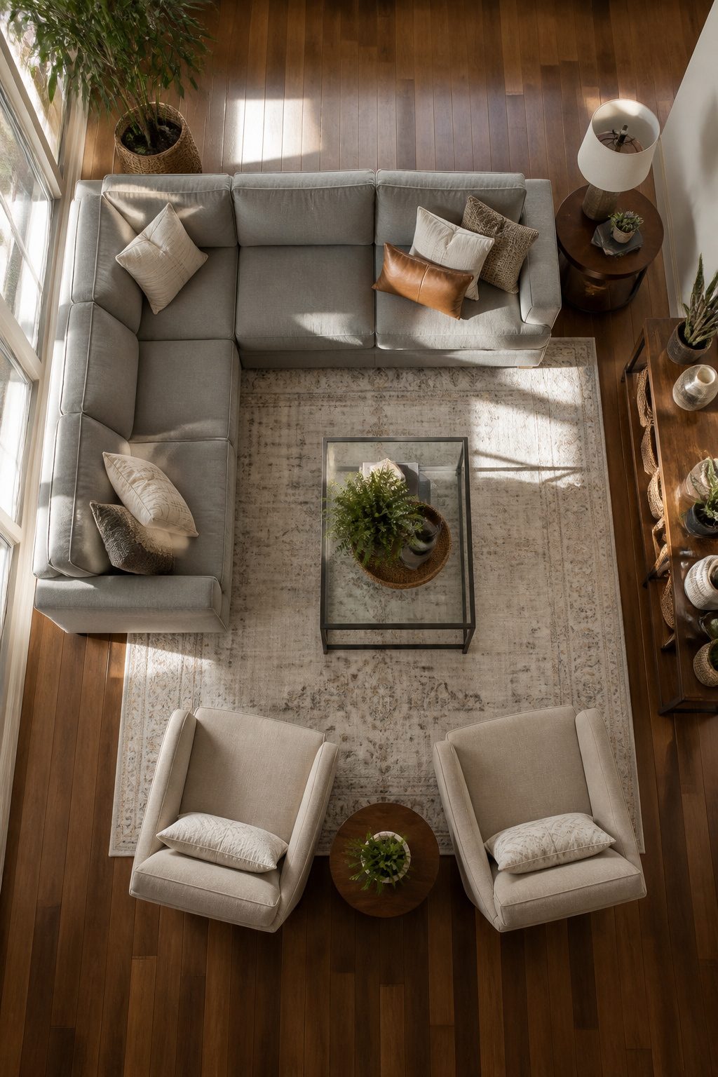
A U-shaped layout, with a sofa and two chairs facing each other across a coffee table, pulls people in toward the middle of the room. The H-shape works the same way but with the sofa directly across from two chairs. Either one beats the reflex to push everything against the walls, which only flattens the space instead of opening it up.
The sweet spot between couch and coffee table is 18 inches. Close enough to set down a drink without leaning, wide enough to walk through without the shin-knock dance. For chairs sitting side by side, 42 inches keeps conversation comfortable without that crowded-cocktail-party tension.
Testing a layout is simple. Sit in each seat and actually talk to someone in the others. If you’re craning your neck or raising your voice, the geometry is off. Walk the paths too: the routes between pieces should feel obvious, not like a maze you solve after moving in.
7. Hang Mirrors to Enhance Light
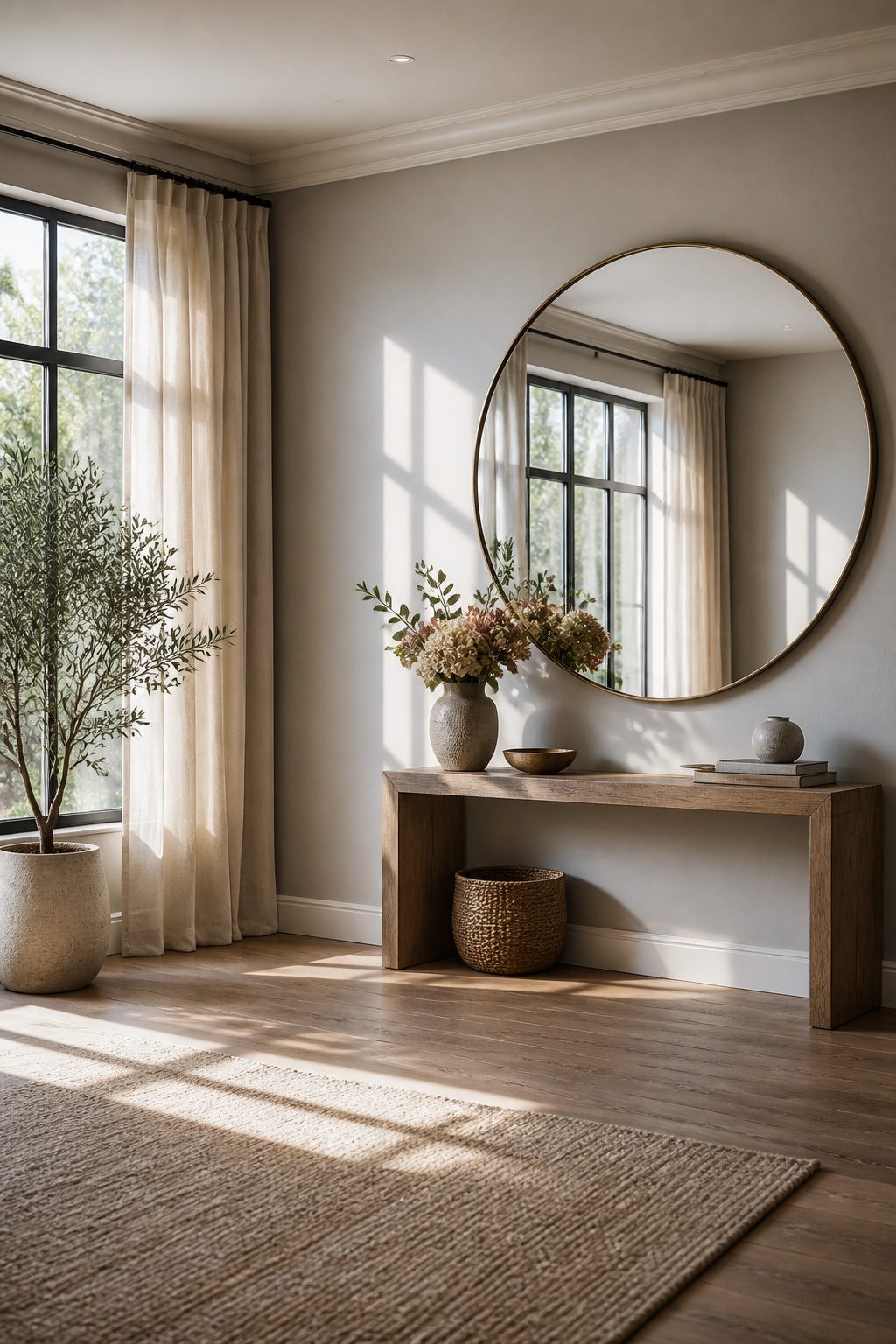
A mirror hung opposite a window doubles the daylight that reaches the room. Match the mirror’s size to the window it faces, or go slightly bigger, and the wall seems to open into another space. In a narrow hallway or a cramped bedroom, that reflected depth matters more than any paint color.
The placement is not as obvious as it sounds. One school of thought puts the mirror directly across from the glass, bouncing light deeper into the room. Another argues for a wall perpendicular to the window, catching what exists and spreading it sideways rather than sending it straight back out. Both work, but the perpendicular angle saves you from a head-on glare at certain hours of the day.
Sizing is where renters usually hesitate. A small mirror above a console reads as decoration; a mirror that rivals the window reads as architecture. The latter is the one that changes how the room breathes. Lean a tall frame against the wall if drilling is not an option, or hang it with proper anchors if the landlord allows. Either way, the mirror should face something worth seeing: a window, a lamp, or even a doorway that borrows light from the next room.
8. Layer Textures and Materials
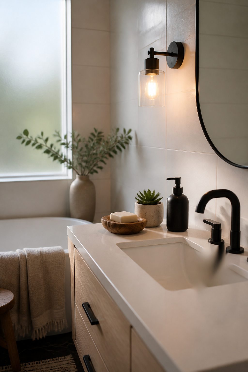
The bathroom in my last rental was all glossy tile and chrome fixtures, which read as clean but never quite comfortable. Adding a warm wood soap dish and a small clay pot with a succulent changed the temperature of the room without pushing toward cabin decor. The Rule of Three for texture groupings keeps this from becoming a pile of random objects: one organic material, one manufactured, and one that bridges both, like glazed pottery or a matte metal pump you refill yourself.
Kitchens work the same way. A wood cutting board propped against a ceramic backsplash, with a steel utensil crock nearby, hits three textures in a footprint that still functions for actual cooking. Bathrooms tend toward hard surfaces by necessity, so the warmth has to come from smaller insertions: a woven tray corralling bottles, a single branch in a narrow vase. The manufactured elements, the tile and fiberglass and sealed countertops, provide the restraint that keeps natural materials from reading as theme. Without that tension, you end up with a space that looks styled for a catalog rather than lived in.
9. Hang Curtains High for Taller Ceilings
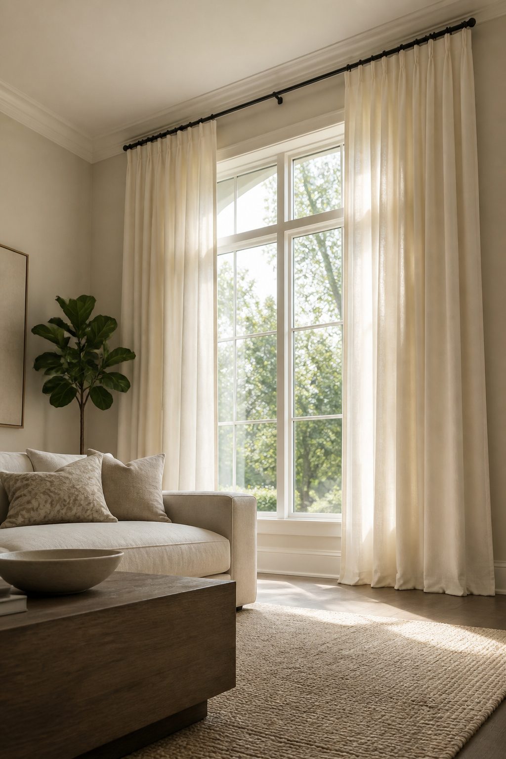
Most apartments come with 84-inch curtain panels and windows that sit low on the wall, which makes the ceiling feel lower than it is. The fix costs nothing but a few extra holes in the drywall. Hang the rod 4–6 inches above the window frame and let the fabric fall to the floor. The eye reads the whole vertical strip as window, so the glass looks larger and the wall stretches upward.
Rod width matters too. Extending the hardware 10–12 inches past each side of the frame keeps the stack of fabric from blocking daylight when the panels are open. That extra width also frames the view like a photograph, not a porthole.
Standard 84-inch or 96-inch panels usually give enough length for this, though at 6 inches above the casing you are pushing the bottom of the range. Custom drapes solve it if you go higher, but the ready-made lengths at IKEA, Target, or Amazon Basics cover most windows for under $40 a panel. I buy the longest cheap set I can find and hem with iron-on tape if the floor pools too much.
10. Weave In Personal Items With Intention
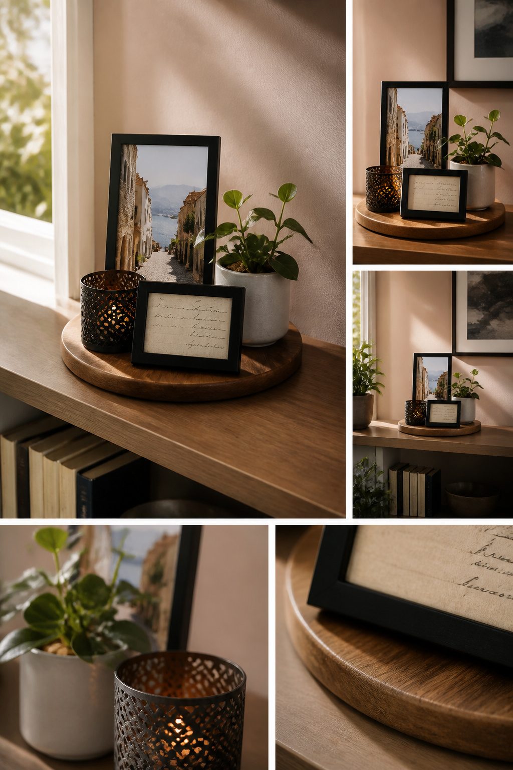
A single shelf reserved for rotating objects keeps sentimental clutter from swallowing the room. I swap pieces seasonally, which costs nothing and makes old items feel found again. When the shelf is full, one piece comes out before another goes in, a rule I treat as non-negotiable. Frames in one finish, even cheap black metal from the hardware store, tie together travel photos, a child’s drawing, and a pressed fern so they read as one arrangement rather than visual noise. I learned this after mixing wood tones for two years and watching every wall feel accidental. The unifying finish does the work; the objects themselves stay personal. For pieces that carry real weight, a birthday card from someone gone, the one-in-one-out rule still applies, but the outgoing item gets stored, not discarded. A shoebox under the bed holds what the shelf cannot, and I open it maybe once a year. That limit forces me to choose what actually matters now, not what mattered in 2019.
Stick to a 2-3 Color Palette
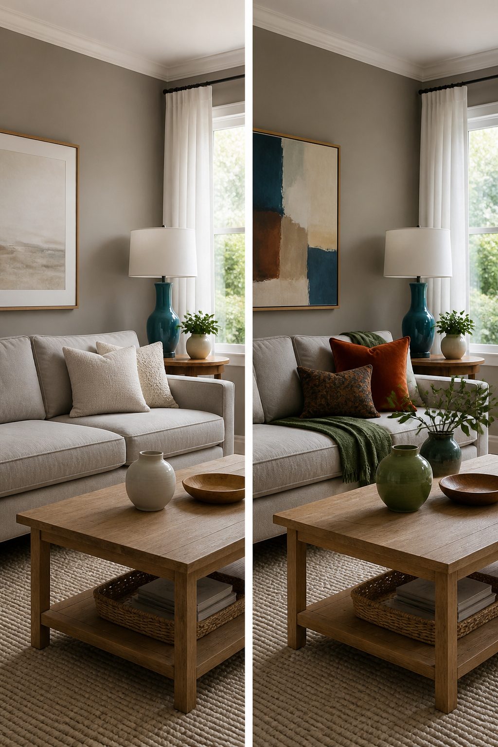
Neutrals with deliberate pops of color are what finally made my rooms feel connected instead of competing. I learned this after buying a bright teal lamp, a rust velvet pillow, and a sage ceramic vase across three different weekends, each piece exciting on its own and completely wrong together. The eye kept landing on each object like a separate argument. Paint became my cheapest palette fix: two coats of a warm gray on the living room wall let those one-off colors fade into accessories I could swap rather than anchors I was stuck with. For the first floor especially, where rooms flow into one another, a single neutral thread running wall to wall minimizes the jarring transitions that break a small space into smaller pieces. If you want variation without chaos, move up or down a shade or two on the same paint strip from room to room.
Decorate on a Few Hundred Dollars
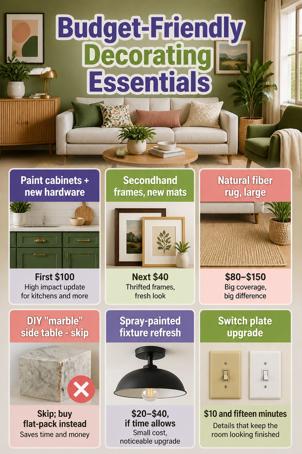
A weekend and around $400 can reset a room if the money lands in the right order. Paint and hardware eat the first half of the budget every time. Two coats on cabinets plus new pulls runs roughly $80–$120 and changes how the whole kitchen reads. I would rather spend there than on a DIY marble side table that costs more in hours and mis-cuts than a flat-pack version from Target.
Frames from a thrift store, mats swapped out or repainted, and photos rearranged read as new art for under $40. One plant and one rug fill the remaining space. Natural fiber rugs run large for cheap, and that matters more than pile height in a rental you might leave in two years.
| What you do | Saves money? | Where it fits in the $400 |
|---|---|---|
| Paint cabinets + new hardware | Yes | First $100 |
| Secondhand frames, new mats | Yes | Next $40 |
| Natural fiber rug, large | Yes | $80–$150 |
| DIY "marble" side table | No | Skip; buy flat-pack instead |
| Spray-painted fixture refresh | Yes | $20–$40, if time allows |
Cracked switch plates in almond or yellowed white drag a room back down the minute the paint dries. New covers are $10 and fifteen minutes. I have watched a finished room feel half-done because of three wall plates someone decided to "get later."
What Makes Rooms Feel Bigger
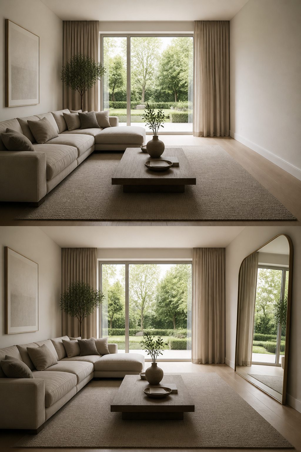
A mirror hung straight across from a window will double the light that reaches your eye and, with it, the sense of depth in the room. Match the mirror to the window size or go bigger; anything smaller reads as an afterthought and breaks the illusion.
Matte paint finishes help here too, because they soften glare and spread light more evenly than satin or gloss. The catch is that color shifts across the day, so a swatch needs to live on the wall through morning, afternoon, and lamplight before you commit.
The mistakes that undo this are easy to spot once you’ve made them once. Dark walls in a room that already lacks natural light swallow the corners you just tried to open up. An oversized sectional in a 10-by-12-foot living room leaves you squeezing past the arm to reach the window. I used to think a big couch made a space feel luxurious; really, it just makes the walls close in.
Grouping in Threes
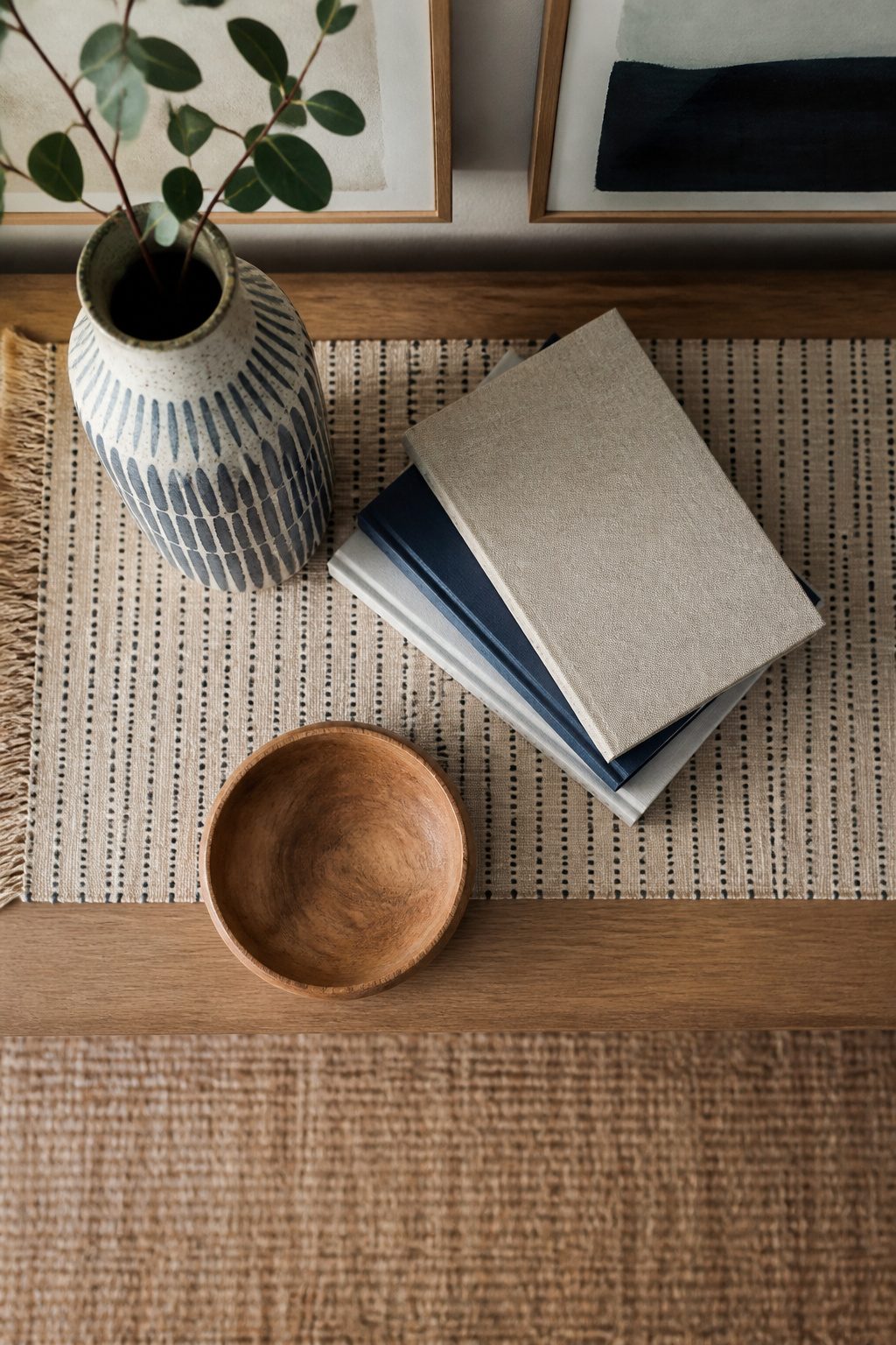
Odd numbers catch the eye because the brain keeps moving, trying to resolve the asymmetry. Three items of different heights arranged in a loose triangle creates that visual waterfall on a shelf or coffee table: one tall, one mid, one low. The tall piece gives the eye a place to land, while the smaller items keep it roaming.
I learned this the hard way with a console table that looked scattered until I pulled everything off and rebuilt around three objects: a ceramic vase, a stack of books, and a small wooden bowl. Adding a fourth piece, even a candle, flattened the energy every time. The exception proves the rule: a tray or low basket can anchor smaller bits into a single unit, so your trio reads as one intentional story rather than clutter.
Breaking the rule works when you need stillness instead of movement. A pair of matching lamps flanking a bed reads as calm and symmetrical; five objects on a crowded desk just reads as mess. The test is stepping back across the room. If the grouping holds together from ten feet away, the count is right.
Frequently Asked Questions
How do I make my room feel bigger?
Hang a mirror opposite a window and match or exceed the window’s size so the reflected light doubles the sense of depth. Matte paint spreads that light evenly without glare, and furniture scaled to the room keeps the walls from closing in. A 10-by-12-foot living room cannot handle an oversized sectional; the pieces you choose should let you walk to the window without squeezing.
What are some common decorating mistakes to avoid?
The most common mistake is a rug too small for the seating area; the front two legs of every sofa and chair need to rest on it, which usually means 8-by-10 feet or larger. Another is relying on a single overhead light, which flattens a room into something like a waiting area. Pushing all furniture against the walls also hurts more than it helps, breaking conversation and wasting the middle of the room.
How can I decorate on a budget?
Spend the first half of a $400 budget on paint and hardware, which runs about $80–$120 to transform cabinets and pulls. Thrifted frames with new mats cost under $40 for fresh art, and a large natural-fiber rug fills space cheaply. Skip the DIY marble table; the hours and mis-cuts cost more than a flat-pack version, and $10 of new switch plates finishes the room where cracked almond ones would drag it back down.